Blue Social Media Website Color Systems
- 1. Twitter- Hex: #1da1f2 RGB: 29, 161, 242
- 2. Facebook- Hex: #3B5998 RGB: 59, 89, 152
- 3. Skype- Hex: #00AFF0 RGB: 0, 175, 240
- 4. WordPress- Hex: #21759b RGB: 33, 117, 155
- 5. Pandora- Hex: #00A0EE RGB: 0, 160, 238
- 6. LinkedIn- Hex: #35465d RGB: 0, 119, 181
- 7. Vimeo- Hex: #007bb5 RGB 26, 183, 234
- 8. Tumblr- Hex: #32506d RGB: 50, 80, 109
- 9. Foursquare- Hex: #32506d RGB: 50, 80, 109
Sometimes called “the Nirvana color,” blue symbolizes the comfort, sky, water, sleep, the mind, trustworthiness, and safety (think police officer uniforms). From surfing the waves to surfing the internet, blue is everywhere.
Have you ever wondered why most of the major social media platforms, like Facebook, Twitter, and LinkedIn, utilize various shades of the color blue?
Blue is truly a fan favorite color on the web. Let's discuss what makes this color a popular marketing tool.
The Importance of Color Psychology
You are probably aware of the fact that colors mean something. Different colors can even provoke various physiological responses that impact human behavior.
This means that the colors you select for your office, your home, your website, or clothing matters to onlookers.
Color psychology is the study of colors and how they stir people's emotions. Due to the discoveries of color psychology, businesses can discover which colors match with their brand personality best.
The colors you use with your marketing materials can help you to use them as emotional triggers to help spark a purchasing decision. Colors stick out the most in our minds, which means your brand will often be associated with the color you choose for your logo, website, packaging, and other business related items.
Each color has a different psychology, but on the web, blue is the most prevalent. Let's dive into blue color psychology further.
Blue Color Psychology: Why It's Popular In Website Design
Every shade of blue evokes a different emotion. Therefore, you should contemplate what the "perfect" blue is for your brand.
Here's a look at a few types of blue to consider:
- Light blue: Refreshing, inviting, and friendly.
- Bright blue: Captivating colors that can promote creativity and productivity.
- Dark blue: Indicates strength and reliability.
- Muted blue: Has an antique feel that represents respect and trustworthiness.
Which shade of blue would best represent your business? Who you are trying to reach? These are important questions to answer when you're deciding on a brand color.
Incorporating multiple shades of blue can create a cohesive look on your website and can represent fluidity and structure.
Blue is a calming, relaxing color that accompanies red and yellow as primaries. Here are three reasons why blue seems to take over the web:
It Encourages Communication and Promotes Interaction.
This makes sense in regards to websites designed for communication and engagement. Blue is the color most commonly associated with communication – it's fluid and calm and evokes a safe feeling that every person should love having.
Most other colors tend to distract the consumer, whereas the color blue disappears as a transparent background. Each website uses a different shade of blue on the color spectrum that suits their needs best.
It Appeals to Men and Women.
Contrary to popular belief, both men and women prefer blue over other colors. Companies can benefit from using blue in their brand logo and website because basically everyone likes it and it carries very positive emotions. In fact, blue is the world's most popular color.
Whether the reason is due to the sense of welcoming, the evolving sense of transparency as the consumer reads through the website, or the symbolism behind the color, each website chooses their design for a reason.
The list below shows popular social websites and why they chose blue for their web design.
It Is an Inclusive Color.
About 10 percent of the population is red-green colorblind. This means that blue is a good cool-toned color to use so individuals that are red-green colorblind can see text, logos, and other web content.
Social Media Sites: How They Use Blue
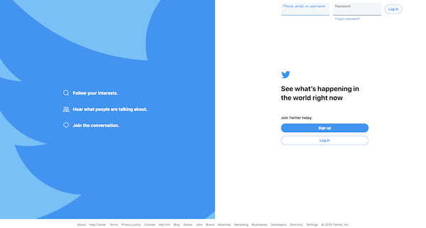
Twitter’s mascot is a bird, so it only makes sense that their blue represents the sky on a perfect day.
Blue feels dependable – just like you can depend on Twitter to feed you information on trending topics and current events in real time.
What Color Is Twitter Blue?
Hex: #1da1f2
RGB: 29, 161, 242
A bright, inviting blue is Twitter's main color, but they also utilize shades of blue throughout their site, including a faint blue background.
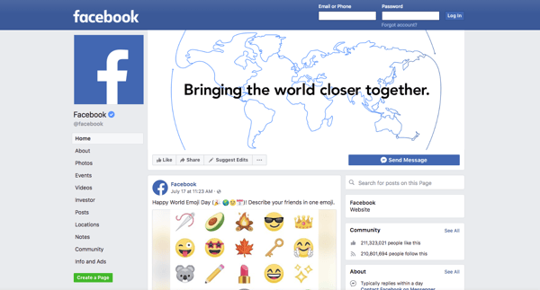
Facebook is blue simply because the founder, Mark Zuckerberg, is red-green colorblind. This means that blue is the clearest color for him to see.
Besides the obvious reason, blue can be used to promote communication and interaction – two things Facebook is best at. It's no wonder why Facebook has over 2.2 billion monthly active users.
What Color Is Facebook Blue?
Hex: #3B5998
RGB: 59, 89, 152
Facebook blue is a medium-dark blue color that is about 23 percent red, 34 percent green, and 59 percent blue. Some other blue colors on Facebook include a dark blue, medium blue, and light blue. These shades are found throughout their site.
Skype
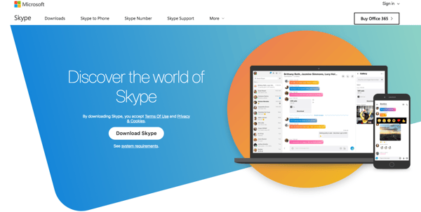
Skype previously used blue on their website effectively to convey a sense of innovation. Their current site includes some blue in their CTA buttons against a blue-gray background.
As you know, Skype lets you easily connect to anybody with the app through video or text. It makes the company look sleek and modern. A lot of other tech companies, like Telecom, HP, Dell, and AT&T, also take advantage of using the color blue in their marketing to attract visitors.
It gives these companies a sense of stability that is appealing, unlike red or orange, which command your attention and symbolize energy and passion. Rather, use these colors to create strong complementary colors for blue – just take a look at how Skype kills the complementary color game.
What Color Is Skype Blue?
Hex: #00AFF0
RGB: 0, 175, 240
Skype blue is a shade of cyan that is comprised of 0 percent red, 94.12 percent blue, and 68.63 percent green.
WordPress
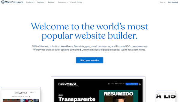
WordPress also utilizes blue on their homepage to give visitors a feeling of trustworthiness and stability. The company wants visitors to have confidence in them as a blogging platform.
Other shades of blue are used as accent colors to bring attention to their navigation and calls to action. This is a great practice because this is where you want to guide visitors.
What Color Is WordPress Blue?
Hex: #21759b
RGB: 33, 117, 155
WordPress blue is a blue sapphire color. It is comprised of 60.78 percent blue, 45.88 percent green, and 12.94 percent red.
Pandora
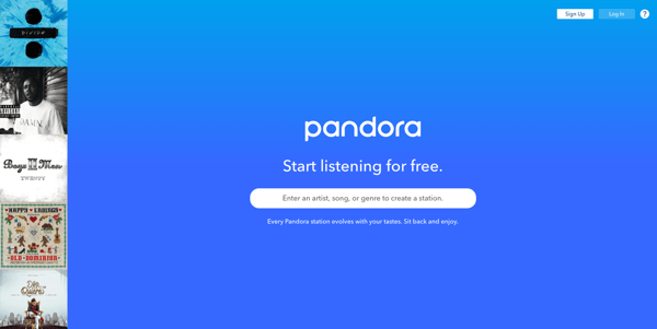
Pandora uses blue to demonstrate creativity to users. Their homepage features a slight blue gradience, which is a nice way to add interest to a page that is predominantly one color.
Even though when we were younger, we were told blue is for boys and pink is for girls, blue is actually gender neutral. It's meant for both men and women, just like Pandora.
Blue holds the attention of the user and is easy to look at for prolonged periods of time.
What Color Is Pandora Blue?
Hex: #00A0EE
RGB: 0, 160, 238
Pandora blue is a vivid cerulean color.
Other Popular Social Sites That Use Blue
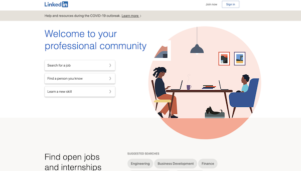
Hex: #35465d
RGB: 0, 119, 181
Vimeo

Hex: #007bb5
RGB: 26, 183, 234
Tumblr
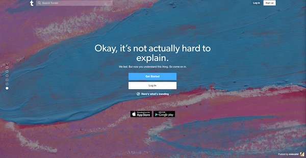
Hex: #32506d
RGB: 50, 80, 109
Foursquare
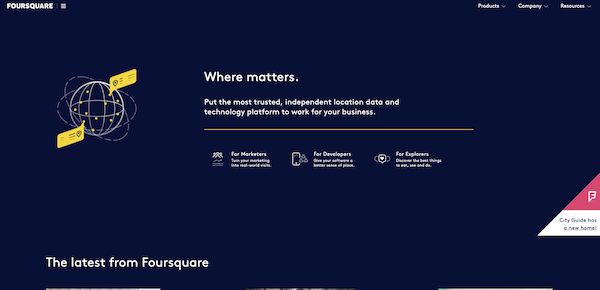
Hex: #25a0ca
RGB: 0, 114, 177
How to Use Blue as a Marketing Tool
As a marketing tool, blue follows a pattern designed to attract customers. This pattern can be traced in three steps:
1. Attract Visitors With a Welcoming Color.
A blue website wants its viewers to feel welcome. They are stepping into a friendly environment that is not intimidating or boring.
2. Portray Safety and Reliability.
With the primary color of a website being blue, the website is thus designed to whisper to the customer, “Look how reliable I am. I am safe as well as both light-hearted and professional. I am comfortable. Look at me.”
3. Make Background Colors Subtle.
Now that the color has done what it was designed to do, it can now take a few steps back to allow the reader to become completely enveloped in the information they are receiving.
How often do you pay attention to the blue borders of your Facebook window or the sidebars of Microsoft Office? Exactly.
How to Use Blue For Your Website
What do you want your website to portray? Natural, comfortable, and reliable elements are all portrayed in the color blue.
As mentioned above, when it comes to using blue as a marketing tool, you want the blue on your website to disappear into the background. A dominant blue homepage can look awesome, but you don't want to use it on every page.
A white background looks super clean and simple on a page with a lot of content, so include your blue in dominant fonts and accent designs to be cohesive but not overly blue.
Any color will work for a website when used in an efficient way, but if you are looking to portray the specifics of communication, then blue is the way to go!


Baylor Cherry
Baylor is an inbound specialist for Bluleadz. As a native Floridian, she enjoys soaking up the Florida sun, buying clothes she can’t afford, and dreaming about one day owning a dachshund.