Facebook began as a way for people to connect and keep up with each other's lives(college students specifically). Today, with over 2.2 billion monthly active users, Facebook has become much more. In the not too distant past, Facebook shifted focus and became actively engaged in building a community of brands and businesses.
In the early days, it was easy to use engagement to drive traffic to your Facebook page and from there send them to your website. Today, the community is there, but posting on Facebook alone isn't enough.
One method of a successful Facebook marketing strategy that's effective at connecting with your audience is to create targeted Facebook ads. By directing your ads at your ideal buyer, targeted ads can help you spend your click advertising budget wisely and drive traffic, increase engagement and see a positive return on your investment.
Let's look at the four components that make up a successful Facebook ad and five examples of brands that are doing optimized ads the right way on the platform.
Four Key Components of a Successful Facebook Ad
All successful ads on Facebook share and successfully implement these four key elements. By incorporating them into your Facebook ads, you can increase engagement, drive traffic and maximize return on your PPC budget.
- Successful Facebook Ads Are Visual
Visual content is more favorably treated not only within the Facebook algorithm, but among viewers. Visual content is more likely to be remembered than text. No matter what type of ad you create, make it visually appealing. - It's Relevant To Your Target Audience
Relevance is critical in all aspects of content marketing from blogging to PPC advertising. Remember, you're only spending money when someone views your ad or it's clicked on. If you're using ads that aren't relevant to your targeted audience, you're wasting time and money. You most likely won't see success with any type of advertising.
Facebook introduced a tool in 2015 that can rank your ads and give them a relevance score, much like AdRank in Google AdWords. The the more relevant your ad image, copy and destination page is to your viewers, the higher your score, and the more favorable Facebook will treat your ads. - It Offers Real Value
Real value tells the reader why they should engage with your ad to learn more about your product or service. How is your offering different? Why should the reader click on your ad and go to your website? The value you offer should be real and believable. Don't oversell! For example saying you have the greatest gourmet coffee in the world won't bring bodies into your coffee shop, but “bottomless cup Tuesdays,” might. - Present a Clear Call-To-Action (CTA)
A great looking ad is awesome, but without a solid CTA your viewer might not know what to do next. Adding an action CTA like “Buy Now and Save 50%” or a sense of urgency like “offer ends soon” can motivate your viewer to immediate action.
Five Examples of Great Optimized Facebook Ads (and why they work!)
These five ads offer great examples of how using these 4 key elements correctly can prove to be extremely effective and really make your ads stand out from the crowd. Use these examples to create more engaging ads for your product or service by incorporating best practices and effective design.
1. Google
We may as well start with the master! Google knows a bit about effective advertising and their Facebook ads are compelling, even to someone with little interest in their offer!
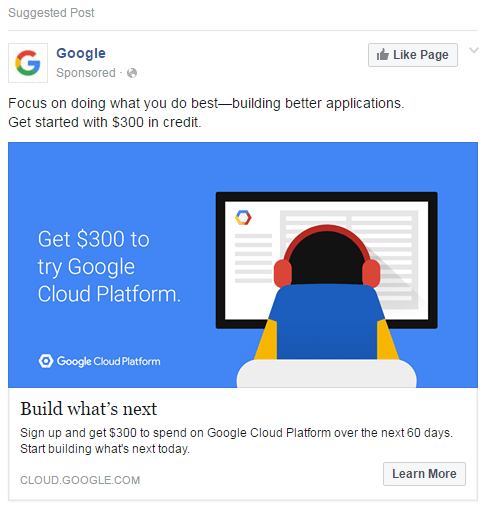
This ad hits the right spots! First, it is offers visual continuity with their other advertising reinforcing their brand identity. Next it uses simple active verbs combined with aspirational wording to create excitement about their cloud computing platform. They could have chosen any number of different features to focus on like security, but instead emphasize “ building what's next” as the hook, which leads the reader to open themselves to the possibilities of the platform. Third, the offer is valuable, $300 to try the platform! Finally, they ad's color is worth mentioning.The vivid blue fits with Facebook's predominantly blue color scheme. Blue also instills trust and stability (it's why so many large tech companies use it).
2. Mizzou Campus Dining
If you have a brick and mortar location, targeting your ads by location (local ads) is a smart strategy. That doesn't mean that you can ignore the key components for success. For example:
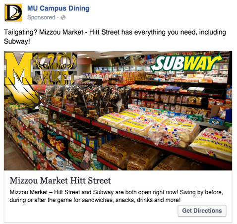
This ad works visually. It emphasizes college pride with logo incorporated into the design, shows an attractive image of a selection of delicious treats, and a well known logo (Subway) to attract their key demographic, hungry college students.
It's relevant. Because it's likely only being shown to college students near the physical location of the store and plays to students primal needs… salty snacks and Subway sandwiches! It offers value telling hungry college students it has everything they need for the big game, or the late night munchies! Finally, it has a solid call-to-action, “Get Directions.” It's an actionable easy to find CTA, and makes it simple for a college student to get directions to a place where they'll find “everything they need for the big game!”
3. Boston Sports Clubs
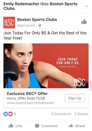
This is a great example of an offer ad that hits on three of the key elements. It's visual with an intense photo using a bold color and clear text that clearly states the offer. It a valuable offer, paying five bucks a month for a gym membership is a great deal. The CTA features an urgency word “hurry” and clearly states when the discount expires.
4. Dollar Shave Club
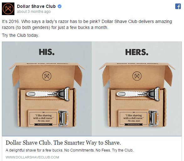
This ad is interesting because it isn't gender exclusive like many shaving ads but attempts to inform readers that Dollar Shave Club is great for both men...and women.
It's visually interesting in its simple use of duplicate images and clear headline text. We all know that blades aren't cheap, so this ad clearly offers users value with a “delightful shave for a few bucks no commitments, no fees” offer and opens it's product line to a new non-traditional audience, women.
On a quick sidenote, I've personally clicked this ad, and purchased their product... One happy customer right here!
5. Shutterfly
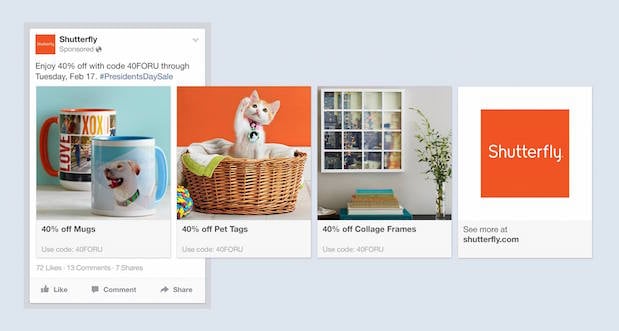
This is an example of a multi-product ad. Viewers can scroll through the images to pick the offer that most appeals to them. This is a great way to maximize your ROI. In this example, it is promoting products, but you can use this format to promote anything like different blog posts, webinars, or white papers.
This ad works visually, the images all use the same color palette, font and mood. To the person who loves taking photos it's completely relevant. There is plenty of value in 40% off of each product advertised. The code and end date are also clearly shown in the ad description. It also has a clear CTA to use the offer by Feb.17th so you're encouraged to act immediately.
These examples can give you an idea of how to maximize your own Facebook ads. By utilizing best practices, and focusing on visual appeal, relevant targeting, providing value and a clear CTA, you too can reap the benefits of Facebook's 1.8 billion active daily users to grow your business with Facebook PPC advertising.

Rob Steffens
I am the Director of Marketing here at Bluleadz. I'm a huge baseball fan (Go Yankees!). I love spending time with friends and getting some exercise on the Racquetball court.