It happens in the life of nearly every creative at some point – a block. Whether you’re overworked and under-inspired, or there are outside stresses at play, if you can’t come up with anything new, look to the world around you for some inspiration.
Psychologists point out that creative blocks can last mere days, but can also last for weeks, months, and even years. Knowing that a block has the potential to be that extensive demands a solution to the problem. After all, you can’t put off building a client’s website for years simply because you are in the middle of a block.
You can gain inspiration and fight against the dreaded blocked creativity flow by studying the work of other designers. Below, you’ll find nine clever web designs that will inspire you and help you get out of your design funk faster.
1. Video Background
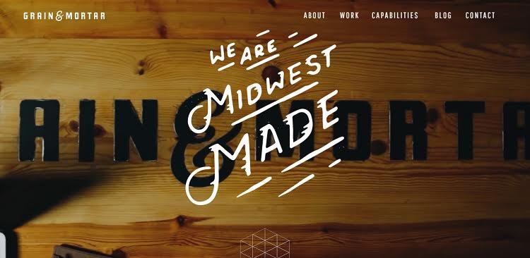
Adding a video to your landing page increases conversions by as much as 80 percent. Users tend to engage with video, so this is a smart design move that can also inspire the rest of your overall design.
Grain and Mortar uses this video conversion statistic to their advantage by adding a video to the background of their landing page. The video features different shots of their offices and the staff at work. The overall effect is one of movement.
2. Unique Typography
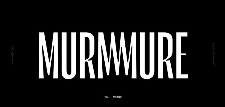
Sometimes you can gain inspiration from something as simple as unique typography. This French website has a fairly simple design at first glance. The background is black and the letters are white. But, then you realize the typography is quite striking, with the M doubled and intertwined and the weight of the font balancing perfectly on the page.
The use of type to say it all is quite inspiring. Note how the other elements on the page are kept to a minimum, so the focus remains on the typography.
3. Beautiful Images
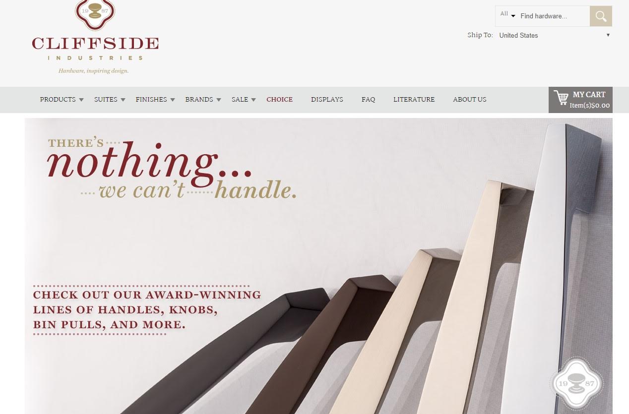
Take a look at the design work for the Cliffside Industries website. The company sells handles, knobs and bin pulls, among other kitchen hardware. They utilize images of their beautiful hardware to draw the site visitor in.
The images rotate through a slideshow that shows the product in action. The colors on the page and the overall simplicity of the design point to the kitchen hardware without distracting from the simple beauty of the product.
When using beautiful photos for your designs, keep the focus on the images as much as possible. Any text should complement the photos and provide contrast to the background.
4. Matching the Product
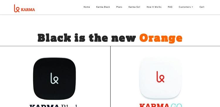
Matching the design to the product itself creates a simple but powerful statement that has a sense of cohesion. Note the way the Karma logo is repeated throughout the design. The color palette is kept simple and ties into the overall design of the product, using black, white, orange and a splash of blue.
When focusing on the product image, keep the colors as simple as possible. A white or black background is a good place to start.
5. Product Focus
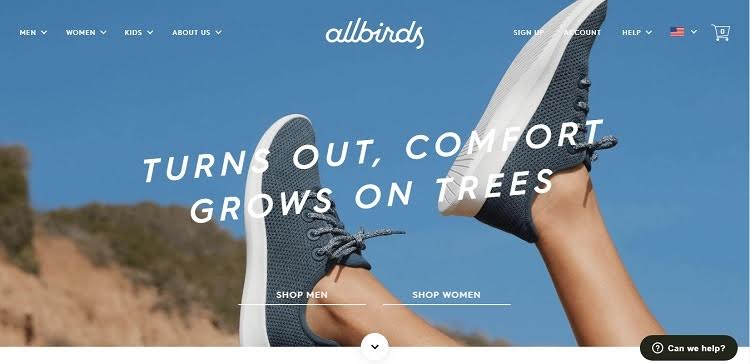
Allbirds puts the focus on their product with a big image as the background, showing off their shoes on a model. The image is taken at a unique angle, showing that their shoes can go anywhere. It adds some life to what would otherwise be a flat image.
6. Flat Design
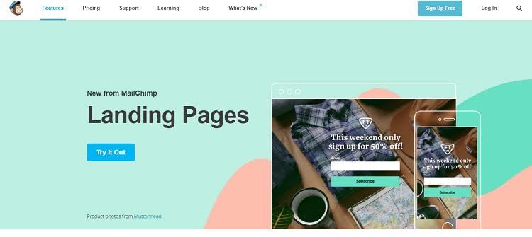
Inspiration can often be found in the simplest of designs. Flat design trends have taken the design world by storm over the last couple of years, and MailChimp embraces this trend with simple, flat designs like the one on the page above about their landing pages. Even the colors used are within a limited palette and the graphics are simple, flat and the site loads quickly.
7. Offer Options
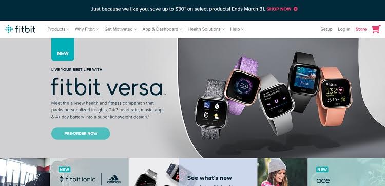
When in doubt, offer options in your design. Complicated sites for companies that offer a number of products can be tricky, so take the time to figure out your main categories. Note how Fitbit accomplishes this on their site by offering six basic categories and images of their top selling products.
8. Keep Navigation Limited
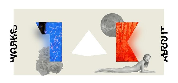
The last thing you want to do is have the navigation take over the entire design. There are times when the focus should be on the creative aspects of the design, such as in the example above. The navigation is limited and pushed out to either side of the screen, so it does not interfere with the overall aesthetic of the look.
9. Inspired by Art
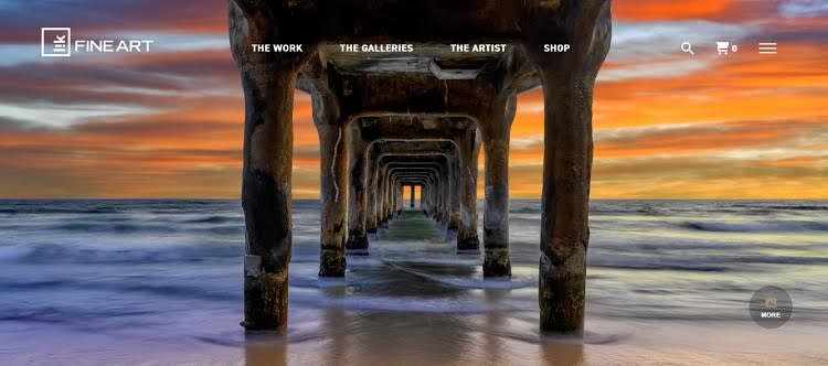
Images can provide a lot of inspiration for every type of artist. The screenshot above of the Lik Fine Art website showcases a beautiful beach scene from the perspective of under a pier.
The colors are vibrant and the ocean appears to be in motion. The photo is the inspiration for the design of the site. The entire focus is on the photo and the rest of the site falls in alongside that image.
Overcoming Creative Blocks
Overcoming creative blocks isn’t always an easy task. However, there are deadlines for projects and designers simply need to do the best they can.
When it comes to web design, you can always develop a simple design and then go back and tweak it once the block has passed. In those circumstances, focus on user experience and making the design as functional as possible.

Lexie Lu
Lexie Lu is a freelance graphic designer and blogger. She keeps up with the latest design news and always has some coffee in close proximity. She writes on Design Roast and can be followed on Twitter @lexieludesigner.