There are approximately 7.6 billion people on the planet, and more and more of them are getting online. The world is large and impersonal. People often feel overlooked by companies. However, you have the opportunity to change that perception with your website by integrating strong user experience (UX) design strategies.
As much as 94 percent of the first impression a site visitor has of a website is related to the overall design, and those who are not satisfied are highly unlikely to return to the site. You’ll also gain a good return on investment (ROI) for every dollar you spend on UX design.
With that in mind, you’ll want to consider integrating these UX design strategies as we head into 2018.
1. More Negative Space
As people increasingly use their mobile devices to access the Internet, web designers are beginning to realize the UX of negative space. Creating more space around elements allows for responsive designs and material that is quick and easy to skim. Think about the way you look at content on your phone. You likely scroll and look quickly.
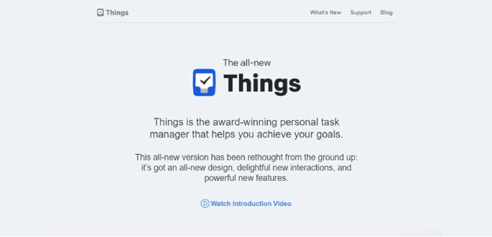
The task manager called Things uses negative space in a smart and interesting way. They keep the elements on the page clean and simple, and don’t try to fill every square inch of space. The design draws the user’s eye to the center of the page.
You can repeat a similar design by choosing just one single focus for your landing page and placing it in the center with plenty of negative space surrounding it.
2. Adding Bots
Companies can now use bots to push messages to users via Facebook. In 2016, Facebook had about 30,000 active bots, but once they opened it up, it has grown quickly to 100,000. Companies have jumped right on this bandwagon and are using the bots to help customers with everything from offering customer service to chatting in real time, all via Facebook.
3. Moving Away From ‘Hamburger’ Menus
Those three horizontal lines called a “hamburger” menu are just the type of thing people love to hate. While they won’t go away anytime soon, people are starting to seek alternatives to the hamburger menu. However, do keep in mind that those who access your site via their mobile devices may expect to see the familiar three-line icon, so if you plan to use an alternative, it must be clear it is a menu. One suggestion is using tabbed navigation options – which can also increase clicks by as much as 30 percent.
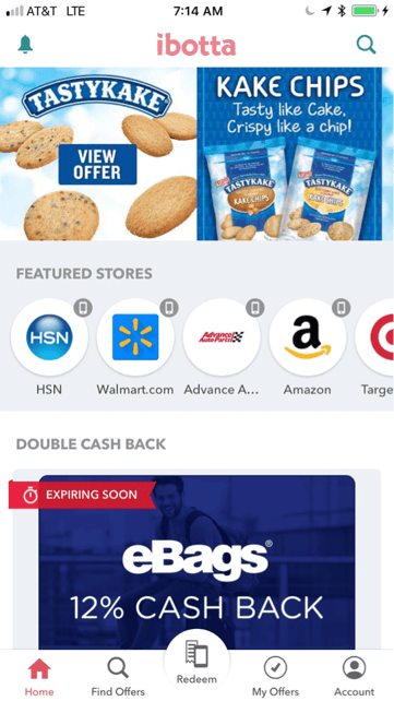
A good example of this is the rebate app Ibotta, which moved away from a hamburger menu and now has navigation at the bottom of the page labeled “Home,” “Find Offers,” “Redeem,” “My Offers” and “Account.”
4. Big Words
One design trend that is making the rounds is that of big words. These bigger words can appear anywhere on the page and serve to emphasize certain words to help the user home in on them easily. It is an interesting new UX technique that helps readers find what they’re looking for quickly and easily. It also is a way to subliminally direct users where you want them to go.
5. Focus on UX From the Development Phase
When companies focus on the user experience before even starting the website-building process, they reduce the number of project alterations, which can save money in the long run. Also, several UX case studies show developers abandon about 15 percent of IT projects, and that programmers spend time fixing problems that were avoidable if they’d only considered UX in the first place. Spending less time on edits reduces the cost of programming and can increase overall ROI.
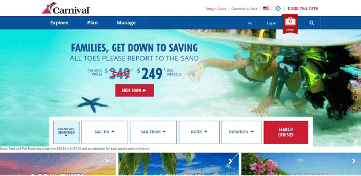
One example of a website with a well-thought-out UX design is Carnival Cruises. The site is very intuitive and UX-based. From the minute you land on the page, it is very clear where you need to go and what steps you should take to book a cruise to the destination of your choice. Ask your designer to use a framework to plan out your site, and take time to look at the plan through the eyes of a potential customer.
6. Customized Experiences
More and more retailers are beginning to realize the value of micro-interactions and highly personalized shopping experiences. Asking customers a series of questions allows you to greet them personally and tailor the experience to each customer. Also, you can use this information for highly targeted email campaigns for those who are signed up for your mailing list.
7. Create an Easy Hierarchy
Simplicity is the name of the game when it comes to UX. Even though most of your site visitors will be Internet-savvy, they are also extremely busy and don’t want to waste time figuring out how your site works. Within seconds of landing on your site’s page, the visitor should know how to use features and move around. Everything should be located intuitively.
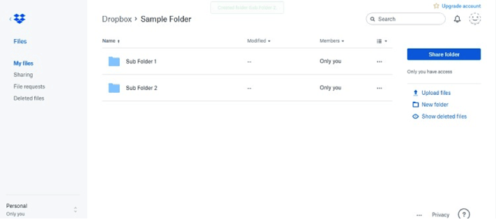
Dropbox offers one example of this type of design. They use a simple file structure that’s similar to what you’re used to seeing on your computer. Anyone who has ever owned a computer should be able to figure out easily how to organize and navigate the files. You can repeat this type of structure by figuring out what your main folders are and what your sub-folders are on your site.
8. Bold Fonts With Bright Colors
Many experts believe 2018 will bring a trend of bolder, bigger fonts in bright colors, which will replace images. This design scheme works well with mobile browsers, because some networks can be slow to load images, but will load text rapidly. Speedy loading increases the overall UX.
9. Brutalism Is Sticking Around
Brutalism — which uses chunky, simple features and masculine, deep colors — seems to be sticking around into 2018. Sites such as Bloomberg have brought this trend back, and it is catching on — likely because of its simplicity, which makes it very easy for users to navigate a site and find what they want.
You need to figure out what your target audiences want most, and how the site will work for them. Trends constantly change, so designing your website for a particular trend is never a good move. However, designing your website with the overall UX in mind is just good business sense.

Lexie Lu
Lexie Lu is a freelance graphic designer and blogger. She keeps up with the latest design news and always has some coffee in close proximity. She writes on Design Roast and can be followed on Twitter @lexieludesigner.