Interactive maps invite your site visitors to engage with your website and discover more about your products and services.
Whether you use a map to show them your store locations or to give them an idea of how they can use your product, you're adding an element that involves them in the page and makes visiting your website a bit more interesting.
Interactive content is attractive to business owners. Around 87 percent of marketers feel interactive elements help grab the attention of users in a flooded marketplace.
Maps are just one type of interactive content you may or may not have considered yet. However, anything you add to your site to engage users is a plus for your brand.
Here are some reasons your site visitors want more interactive maps and ideas for incorporating them into your web design:
1. Add Vital Statistics
If you're a real estate agent or own a security company, adding information via a map, such as crimes in an area or location of schools, can help sell a house. Adding a crime map to your website or embedding one from another location shows your buyers you want them to have the features they most desire in a home and a neighborhood.
Offering upfront information can also build a level of trust between the agent and the client.
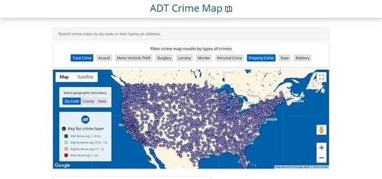
ADT offers crime maps of different neighborhoods to show the user what a particular neighborhood's statistics are. Potential leads may discover there is more crime surrounding them than they realized and decide to go ahead and install a security system.

The map gives users the ability to search by address or zip code. They can then filter by specific crimes, such as motor vehicle theft, assault, larceny, murder, and burglary.
No matter what type of business you own, think about the reasons why users might try your product or service. Then, come up with a map that encourages them to take action sooner rather than later.
2. Break Up Boredom
There are approximately 1.7 million websites on the World Wide Web. Most of those sites are very similar in layout and features. There is a formula that works, but it can also create boredom as users continuously see the same thing over and over again.
However, if you add an interactive map, you've added something unique to your business and kept your visitors engaged.
3. Highlight the Action
Animated elements in your design allow the user to see that something might happen if they click on a map or illustration.
Some interactive maps use motion graphics to draw the attention of users and show them the offerings they have, different locations, or even simply that clicking on that area of a map provides a change.
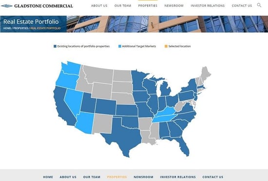
Gladstone Commercial offers its commercial real estate portfolio in the form of an interactive map. Note how they first separate the states and show where they have existing locations of portfolio properties.

Click on any state, and a list of the properties available pulls up and the user can then browse each commercial location.
What can you learn from this website? No matter what type of business you own, you can use a location map to break down areas you serve, office locations, or other location-based information.
4. Consolidate Huge Blocks of Information
If you have a huge repository of information, such as historical photographs or educational books, you can show the immensity of the collection in the form of a map with dots and then let the user expand into the areas which most interest them.
Instead of feeling overwhelmed and not knowing where to navigate, users engage with your map and move through your site more efficiently.
Old San Francisco is one site that uses this method. When someone lands on their site, they see a map with black dots.
Begin clicking on the locations, and the user starts to see old photographs of that specific location. This allows users to start with a location they know well and then expand into other areas of the city, learning the history along the way.
5. Teach Users
Interactive maps are an interesting way to offer details about your website and give site visitors a chance to learn more without boring them. Who can resist clicking on an interactive map and seeing what happens next?
It's almost like creating your own educational cartoon. You've likely noticed this technique on travel sites and even on educational sites.
For example, the Civil Rights Trail website features an interactive map that lets you click on civil rights movement hotspots in the U.S. and learn more about their historical connections to the movement.

If you offer detailed information on your site, use a map to break it down so users can click on specific spots on the map to collect more information.
Make Your Site Sticky
Your site doesn't have much of an impact on visitors if they land on it and bounce away. Interactive maps are just another way of making your site interesting or sticky, so the user stays there a while and explores what you have to offer.
If a map fits in with the overall theme of what you do as a business, then you should add an interactive map today. At a minimum, add a map of your various locations and allow visitors to click on the map to get details on that specific store.


Lexie Lu
Lexie Lu is a freelance graphic designer and blogger. She keeps up with the latest design news and always has some coffee in close proximity. She writes on Design Roast and can be followed on Twitter @lexieludesigner.