The Best Thank You Page Examples
- 1. HubSpot
- 2. Optimizely
- 3. Wordstream
- 4. Wistia
- 5. Teamwork
- 6. Udemy
- 7. AWeber
- 8. Copyhacker
- 9. Unbounce
Conversions are key to achieving continuous business growth. Whether you're B2B or B2C, you need visitors to convert on your website to retain a steady flow of prospects and customers.
Most businesses have mastered their landing pages – the pages that visitors are sent to, where they fill out a form to receive some sort of offer. However, they might miss the mark on their thank you pages.
Although the amount of content they contain is typically minimal, thank you pages play a pivotal role in the lead generation and nurturing process.
What Is a Thank You Page?
A thank you page is a page you redirect visitors to after completing some sort of goal on your website (e.g., downloading an ebook, making a product purchase, signing up for a newsletter, registering for a webinar, etc.), typically after filling out a form.
Its purpose is to, obviously, thank them for their action.
The Basic Structure of a Thank You Page
At its core, the purpose of a thank you page is to offer a lead other relevant content to continue their buyer's journey.
There are tons of ways you can design a thank you page. While every thank you page will be unique to the visitor's conversion path on your site, most thank you pages follow this basic structure:
- The thank you message
- Conversion details (purchase amount, what was downloaded, etc.)
- What the visitor should expect next from you, such as a follow-up email where they can download their resource or print their tickets, a call in the next few business days, etc.
- Another conversion opportunity that creates an additional way for the visitor to engage with your brand, further building a relationship and converting down the funnel.
4 Benefits of Thank You Pages
Here are four reasons why landing pages are better than a simple confirmation pop-up.
They Serve as a Confirmation of Their Conversion.
While pop-up confirmations are quick and to the point, sometimes more detail is required to confirm and acknowledge the conversion your visitor just took.
Thank you pages provide the space you need to confirm a user's download or purchase and share any and all necessary details regarding their conversion, like when they can expect to receive their purchase, how they can contact you, and more.
They Create a Personalized Experience.
With the help of personalization and imagery, your thank you pages can create a completely unique experience for each visitor that converts on your website.
On your thank you page, you can tailor your messaging to provide more detail about their conversion and show them the next steps they should take with your brand. By speaking directly to them, you are building a human connection – not just popping up a big "thanks" on the screen and leaving the rest to them.
They Make Analytics Easier.
This benefit is pretty simple, but it has a big impact on your business. With thank you pages, it's easier to analyze conversion rates from your landing pages.
Confirmation messages can limit the amount of data you are able to pull, including how many visitors submitted the form, how many saw the form but didn't fill it out, and even what pages people visited on your site before filling out the form.
Collecting vital data from thank you pages helps you review and improve your website over time to optimize conversions and bring in more leads.
They Keep Visitors Engaged.
By sending visitors to another page to confirm their recent conversion, you not only provide more valuable information to them to help them, but you also keep them engaged and can facilitate further action.
This is where additional calls to action and cross-sell opportunities come into play. We will discuss this in more detail in the next section.
10 Tips For Maximizing Your Thank You Pages
1. Show Gratitude and Enthusiasm.
Make sure you include a thank you message that is genuine and sincere. Thank your leads for the specific action they've completed – they should leave feeling appreciated! We also recommend including personalization, like their name, to make each experience on your thank you page unique.
2. Add a Human Touch.
Add credibility and authenticity to your page by including an image of your team, your leadership, or even a video showing thanks for their conversion and sharing next steps with them. This can help build loyalty and trust and can encourage visitors to come back.
3. Ask For a Referral or Review Request.
Referrals and reviews drive business. In fact, 74 percent of people say word of mouth is a primary key influencer when deciding on a purchase. So, it doesn’t hurt to ask your leads to write a review or provide a referral after converting.
4. Include Links to Relevant Content.
Continue to educate your leads by including relevant links to blogs, product information, and more. This will ensure they have all the information they need and more once they convert.
5. Add Another Call to Action.
You should always be looking for upsell and cross-sell opportunities. Whether it’s for another ebook download or another best-selling product they might like, encourage further conversions by placing at least one CTA on your thank you page.
6. Encourage Them to Follow You on Social Media.
Encourage your leads to follow your company on your social platforms to further engage them. You can also include social share icons that allow them to share a post about your company.
7. Add Social Sharing Icons.
A great way to build more awareness and increase conversions is to add social share icons to your thank you pages. This encourages leads to spread the word about their recent conversion – whether it's a download, purchase, registration for a webinar or event, and more.
8. Include Social Proof.
Avoid buyer's remorse by including social proof on your thank you pages. This will let your leads know that they made the right decision when downloading, purchasing, or signing up.
Testimonials have a big impact on purchases and brand loyalty – 72 percent of consumers say positive testimonials and reviews increase their trust in a business.
9. Conduct a Survey.
Feedback is essential to understanding your buyer's needs and modifying your marketing over time to increase conversions and sales.
After visitors convert on your site, include a quick survey on your thank you page. It doesn't have to be long – even a simple, "How was your experience on our site?" can make a lasting impact and help you identify areas of improvement in your business.
10. Offer a Free Consultation or Demo.
If you sell software or services, offering a free demo or consultation is an excellent way to nurture leads down the sales funnel. Once they've converted on your site, your business is still top-of-mind – so jump in with an offer they can't refuse and see if they are willing to build an even better relationship with your brand.
9 of the Best Thank You Page Examples
1. HubSpot
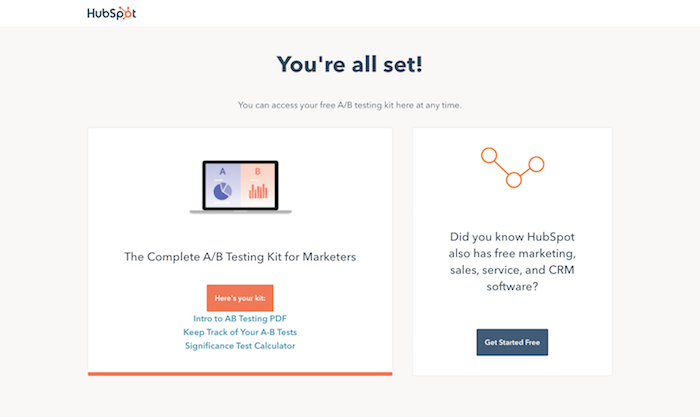
HubSpot is a prime example of a company with an optimized thank you page. After downloading an offer on their site, visitors not only have immediate access to their download by clicking on the orange button. HubSpot also links to relevant content below it to further educate their leads.
Plus, they have an SQL-driven CTA on the page that encourages visitors to get started with HubSpot for free.
2. Optimizely
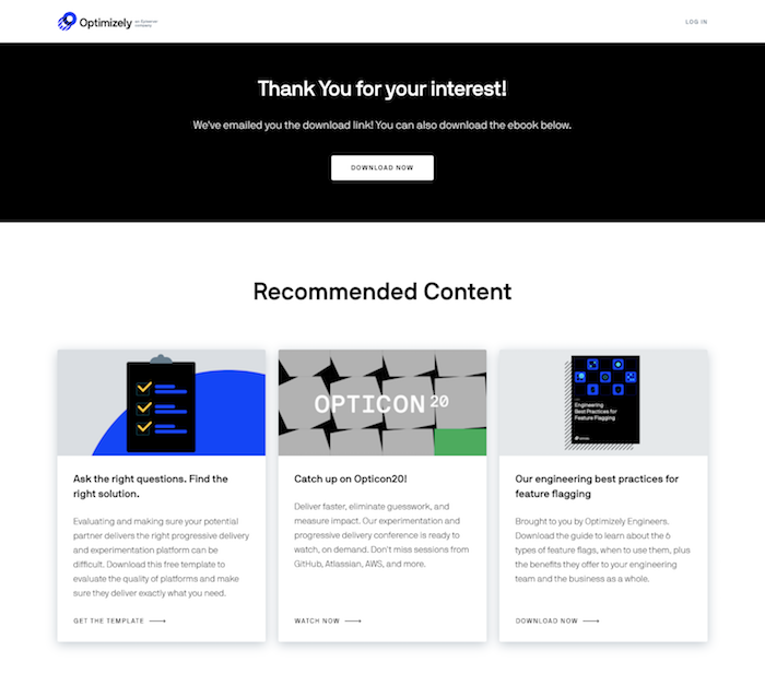
Optimizely's thank you pages are clean and organized while providing additional content to continue to educate leads and send them further down their buyer's journey. This thank you page format is super simple to execute but still effective.
3. WordStream
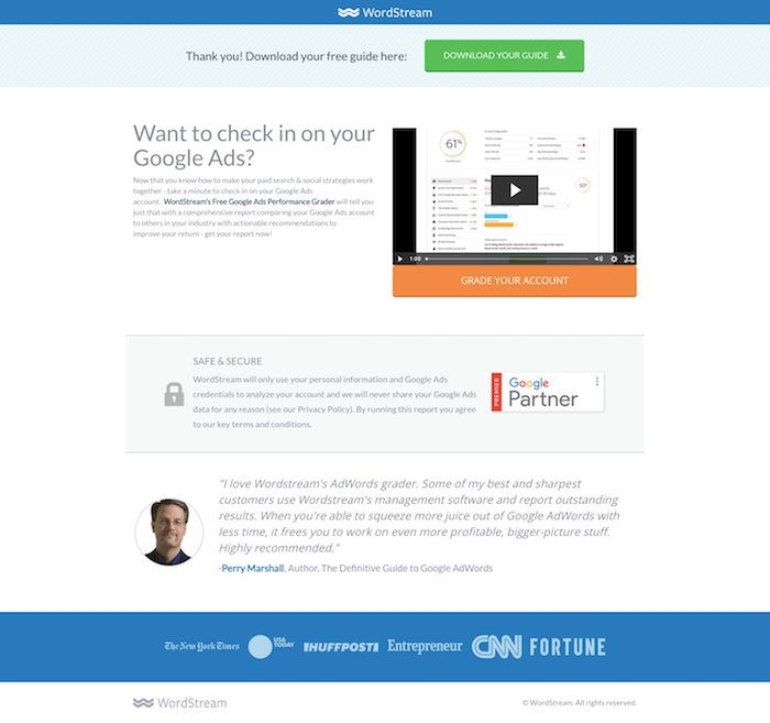
WordStream incorporates a lot of great elements into their thank you page. Beyond giving immediate access to downloads, they provide a helpful video encouraging visitors to use their Google Ads performance grader as well as a related customer testimonial that provides social proof.
4. Wistia
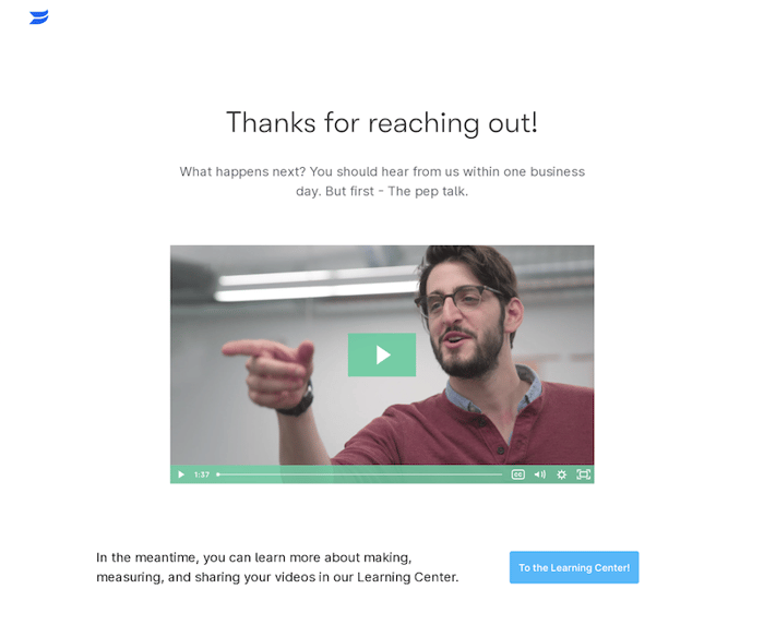
Wistia is another great example of a company that includes videos on their thank you page. After filling out their contact form, they acknowledge that they received the inquiry and let visitors know they will reach out within one business day.
But, then they also add a human touch with a "pep talk" video to further educate them. Plus, they offer a quick way to navigate to their learning center for more information.
5. Teamwork
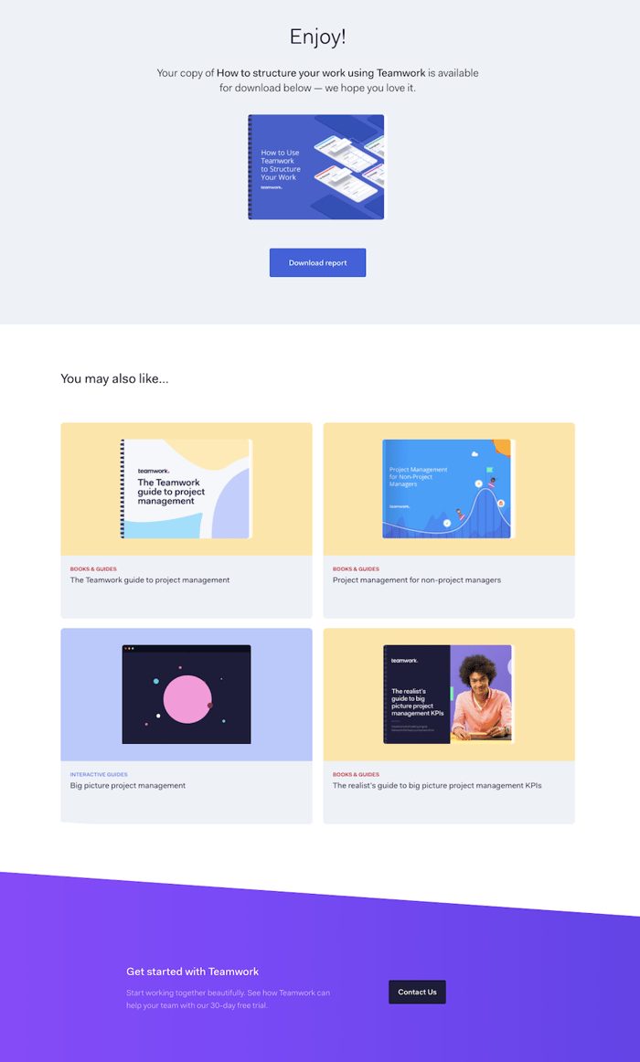
Teamwork's thank you page is chock full of additional resources and more conversion opportunities. After downloading an offer, Teamwork makes sure to provide four more offers to help teach you more about a related topic. Plus, they give you an easy way to reach out to them with a contact us button.
6. Udemy
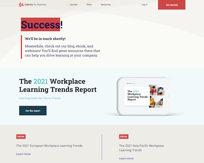
Just because you reach out via Udemy's contact us page doesn't mean they want to stop the connection. Their thank you page highlights a recent report as well as two additional ebooks. A simple, clean design tops it all off.
7. AWeber
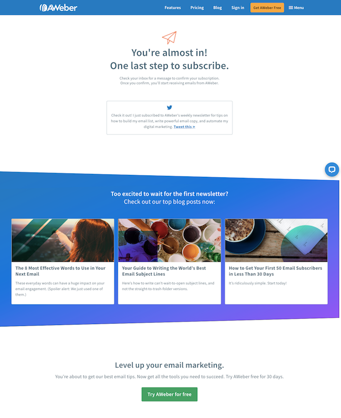
Another beautiful design worth talking about! The thank you page on AWeber's site is broken up really nicely.
First, they share a subscription confirmation (and a social share to easily tweet the news!). Then, they add top blogs, just in case you wait for the next newsletter to come out. And lastly, they try to push for more SQL conversions with a free trial CTA.
8. Copyhackers
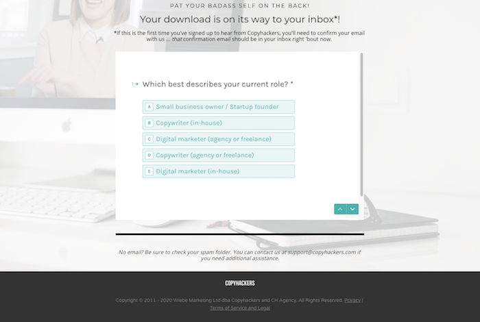
We honestly saved two of the best thank you pages for last – and one of those is Copyhackers. Their thank you page aims to learn more about the lead after they've already converted.
By asking what their current role is, Copyhackers sets themselves up to better nurture their leads in the future. Plus, once you answer the question, they also offer the user the chance to get a free tutorial.
9. Unbounce
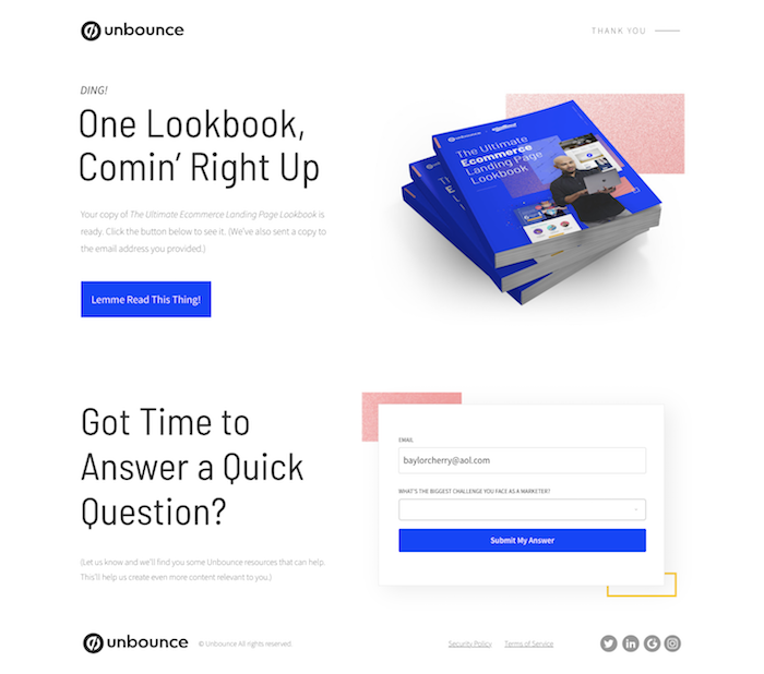
After downloading an offer on Unbounce, you are navigated to this thank you page. It looks pretty simple, with a CTA to download the offer, and a super quick, one-question survey.
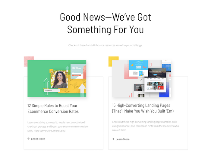
But, the magic happens when you submit the answer. After choosing your biggest challenge, a collection of resources load on the page specifically targeting that challenge. The headline reads, "Good News–We've Got Something For You." It's good news indeed.
As the last impression visitors have of your brand, you don't want to lose out on the potential your thank you page can bring. Create a page that educates, promotes brand loyalty, and builds stronger relationships with your leads.
Utilize these tips and examples to build a thank you page that builds your brand and boosts conversions.

Baylor Cherry
Baylor is an inbound specialist for Bluleadz. As a native Floridian, she enjoys soaking up the Florida sun, buying clothes she can’t afford, and dreaming about one day owning a dachshund.