The Best Websites Built Using HubSpot CMS
- 1. Hive
- 2. Core Technology
- 3. Stellar
- 4. Tribes
- 5. Plum
- 6. Fitting Box
- 7. Perfect Price
- 8. Cognism
- 9. Tempo
- 10. Onshape
Finding a good hosting platform for your website is no easy feat.
You've likely tried to build and edit your website in hosting platforms that were difficult or complicated to use. Some of them may have even required you to seek help from a developer to figure out.
Since websites are a living tool, acting as a first impression for your audience, you should be able to build, update, and edit it with ease anytime you want. After all, your website is your best salesperson, built to continually attract qualified traffic, convert those visitors into good fit leads, and close them into happy new customers.
The HubSpot CMS allows you to do just that. Let's take a look at some of the CMS Hub features and review a few of the beautifully designed websites that have already been built on this robust HubSpot tool.
What Is the HubSpot CMS Hub?
HubSpot CMS Hub is a content management system that makes it easy for users to build, manage, and update their website, all in one place. With the CMS Hub, you can take advantage of the variety of supercharged features that go far beyond basic CMS platforms when used with other HubSpot tools, such as the free CRM.
This robust CMS platform offers flexible themes and a code-free drag-and-drop editor for beautifully designed webpages. It's built to help marketers make changes with minimal need for a developer.
Some other notable features of the CMS Hub include:
- Adaptive testing
- Contact attribution reporting
- Smart content
- Content staging
- Chatbots
- Secure web hosting environment
- SEO and content strategy tools
Simply put, the HubSpot CMS Hub is sure to stand out among competitors like Drupal and Wordpress with its easy-to-use features.
The two CMS Hub pricing tiers are professional and enterprise. Each comes with a different set of features and capabilities depending on your needs for the size of your organization.
HubSpot CMS Hub Tiers: Professional vs. Enterprise
If you want to create a great website that is responsive, reliable, and aesthetically pleasing, without needing a developer for edits, look no further than the HubSpot CMS. It's great for teams of marketers who want to build and grow a website without a lot of coding knowledge.
Mid-sized to large teams work best with CMS Hub. Starting at $270/mo., the professional tier provides up to 10 teams access to 100 custom reports, 25 dashboards, and 25 filtered analytics views. This tier allows your teams to collaborate efficiently on a variety of projects.
For instance, marketers, copywriters, developers, and agency partners can easily log into the CMS and add content, build out pages, and incorporate design elements.
In many cases, HubSpot handles the needs of growing businesses well and is flexible to scale to a variety of team needs. If your company ever outgrows HubSpot CMS Hub Professional, you can upgrade to the enterprise tier for $900/mo.
This tier offers 500 custom reports, code alerts, 50 dashboards, memberships, and additional brand domains. Your large team will do best with these additional features that can handle hierarchical team structures.
The 10 Best Websites Built on HubSpot CMS Hub
Review our list of the 10 best websites built on the CMS Hub to inspire your website design.
1. Hive
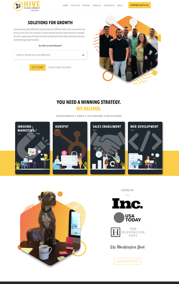
Hive Digital Strategy has a well-laid-out website that is responsive and user friendly, which makes it easy for site visitors to navigate so they can find exactly what they need. Their use of color is consistent with their company logo in a way that makes their website stand out from others.
They list their services in a clear and creative way that allows users to select what they need themselves. Hive also includes a link to their press reviews and case studies for users to explore to help encourage trust in their brand.
2. Core Technology
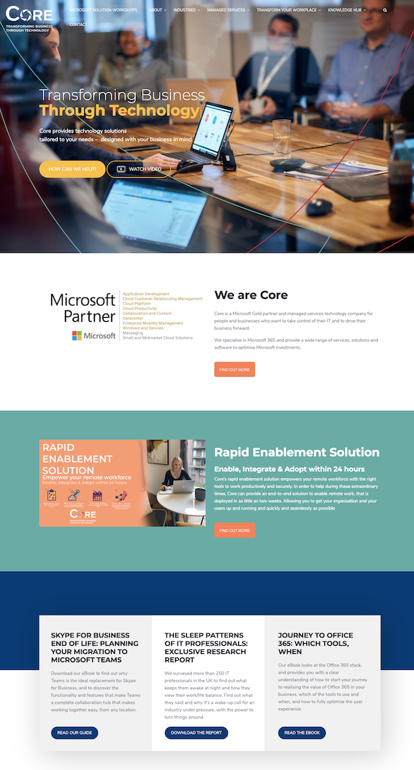
Core Technology started building their website in 2019 and has made some updates over the past year. They used a modern theme to create a striking header that entices new visitors to want to learn more.
They also include a link to a video that explains what they do in a creative and visual way.
3. Stellar
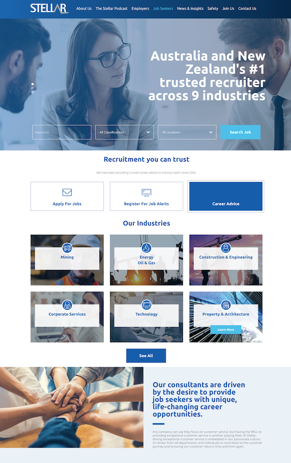
Stellar is a recruitment company with an awesome website design that uses real photos of their employees to demonstrate their authenticity. They use blue text throughout their text to make some of their messages more prominent.
Stellar's messaging is clear and straightforward so the visitor doesn't feel overwhelmed. And as the visitors scroll down, they can see an outline of services and select one to learn more about it. Their navigation is simple and ensures a streamlined user experience.
4. Tribes
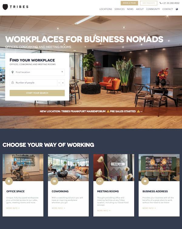
Tribes is a modern and clean design that is highly functional, which makes it easy for people to browse and navigate. They have a variety of well-placed CTAs in the menu bar and in the main header image.
The Tribes website allows users to search for what they want as soon as they enter the website, which improves their user experience. The website template also includes a lot of pictures that help the visitor to determine which type of working space is right for them.
5. Plum
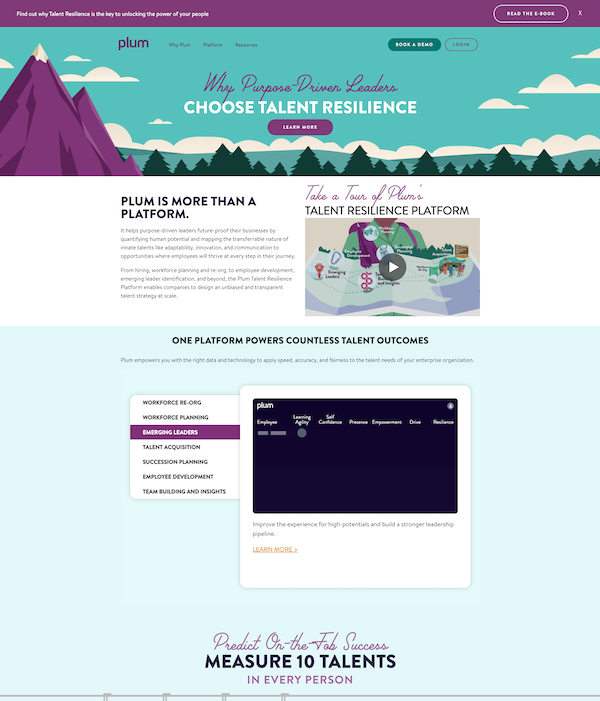
Plum has a unique color palette that stands out from the rest of the websites on this list. They use a plum and turquoise color that matches their logo and is consistent throughout the webpage.
They also include visually pleasing graphics that instantly draw the site visitor in. Another awesome feature of this deign is the video that takes users on a tour of Plum's Talent Resilience Platform.
This site is simple and responsive, allowing users to click on and learn exactly what they need to without an overwhelming amount of text or information.
6. Fitting Box
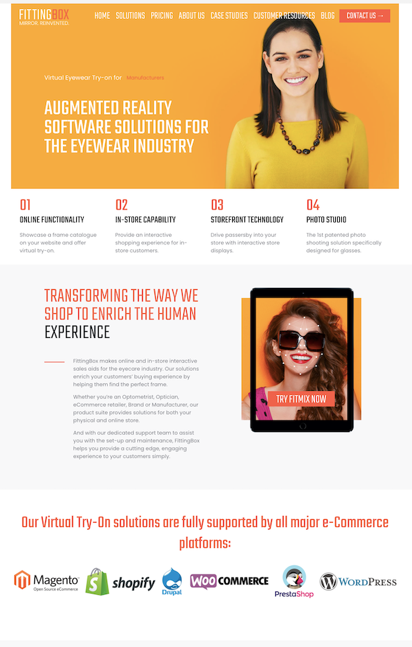
Fitting Box uses a slightly different website design layout than the rest of the websites on this list. They start off with a strong and bold orange color with their hero image that draws visitors in and provides them with a sense of excitement.
The main header tells users what they do in a few lines without cluttered copy. The site is also easy to navigate and includes simple CTAs that are straightforward and easy to understand.
7. Perfect Price
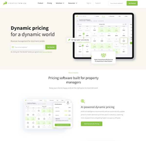
Perfect Price is a pricing software company that has a simple website telling visitors what they do in a clear and concise way. They include screenshots of their platform with short and meaningful copy that educates and informs users about how their product works and how it can help the target audience of property managers.
They also include two CTAs that ask for the users' email addresses, which is a great tactic for lead generation.
8. Cognism
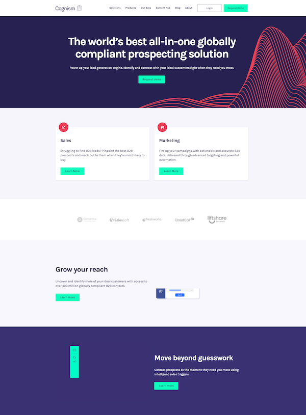
Cognism has a good deal of whitespace on their website with sections that deliver their messaging into simple, easy-to-digest pieces.
They include two options for each of their target audiences right away, sales and marketing. This makes it easy for users to identify where they need to go to learn more about what the product can do for them.
Cognism also does a great job with their mint green CTAs that stand out against their dark purple and light grey backgrounds. This shows users exactly where they need to click.
9. Tempo
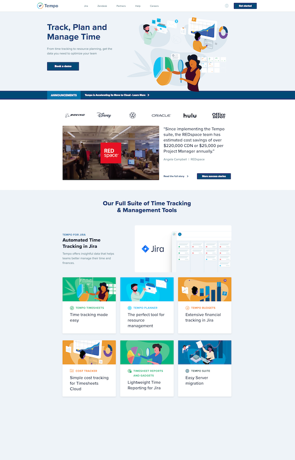
Tempo has a beautifully designed site that includes a variety of colorfully animated graphics demonstrating some of their services with ease. They also include a testimonial along with the logos of the companies that use their product right below the hero image.
This way, users get to know what Tempo is about and how they've helped others right away before scrolling any further.
10. Onshape
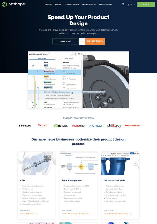
OnShape sells a more complex CAD (computer-aided design) product that must have a careful and meaningful website design. This allows for multiple pictures, animations, and more text. Onshape does a great job of sectioning off their website by listing their features in a block-by-block layout.
The attention to detail on the website is noticeable with great 3D images and other animations that complement the brand's messaging well.
Great websites require consistent work to help you gain more conversions. Your CMS should help you to make and edit beautiful websites in the easiest and most effective way possible.
Get started using a great tool like HubSpot's CMS Hub today so your website can create an excellent user experience for your ideal buyers.


Erika Giles
Erika is a Marketing Copywriter at Bluleadz. She is a huge fan of houseplants and podcasts about conspiracy theories. She spends most of her free time reading, writing, and enjoying the outdoors.