Marketing involves a myriad of different components, but many of them are centrally focused around the human experience.
People make emotional connections with brands, so there are a lot of psychological elements that need to be considered within your marketing framework. While this might seem like a more unusual approach, understanding human psychology can lend you and your business a major advantage in your industry.
With this in mind, one of the most important and overlooked considerations is color psychology.
What Is Color Psychology?
Color psychology is the study of colors in relation to how they impact human behavior. Different colors stir a range of emotions and spark reactions in people, and color psychology closely analyzes these trends.
Color experiences vary for each person, based on the context of the situation and each person’s own personal experiences, preferences, and history. No two people will experience a color the same way. And while you might not believe color is an important element within marketing, think again.
In fact, one study revealed that 84.7 percent of consumers claim that color is the primary reason they purchase a product.
Use of color has a huge impact on how consumers perceive and interact with brands – a 2006 study revealed “the relationship between colors and brands and the effectiveness on purchasers really came down to whether people felt that the color being used for the brand was appropriate for what the brand represented, i.e. did the brand fit what was being sold.”
Dissecting Color Theory
Color theory can be a complicated concept to understand, and in order to understand it from a marketing perspective, we’ll need to closely dissect it.
Let’s start by breaking down some of the most important terms and concepts for you to know.
Essential Terms of Color Theory
Chroma
The more common term for chroma is “saturation.” It refers to how vibrant or dull a color is. High chroma and highly saturated colors are, to put it bluntly, more colorful. On the other end of the spectrum, low chroma and low saturation colors are dull and flat.
Hue
Hue refers to the base color, such as red, blue, or yellow. However, hues can vary based on whether you add white, black, or grey to it. These create tints, shades, and tones. But we’ll expand on that more later.
Value
Value refers to how light or dark a color is. High value colors are lighter, while low value colors are darker. This is where you find the difference between light green and dark green.
The Color Wheel
In order to understand color psychology and theory, you first have to acquire a base knowledge about the color wheel.
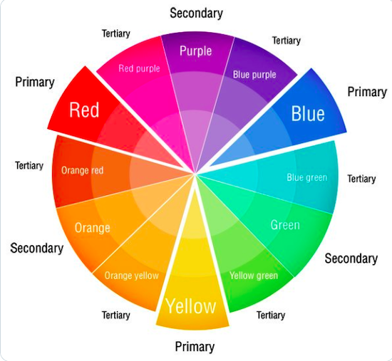
3 Part Color Wheel
Source: Twitter
The first color wheel was developed by Isaac Newton all the way back in 1666, and it’s composed of three tiers of colors – primary, secondary, and tertiary. In total, the color wheel is composed of twelve colors.
Primary
Primary colors cannot be made by combining any other colors. There are three primary colors that make up the base of the color wheel – red, yellow, and blue.
Secondary
Secondary colors are made by combining two of the three primary colors. Secondary colors include green, orange, and violet.
Tertiary
There are six tertiary colors on the color wheel, and they’re created by mixing a primary and secondary color. These colors include yellow-orange, red-orange, red-purple, blue-purple, blue-green, and yellow-green.
Basics of the Color Wheel
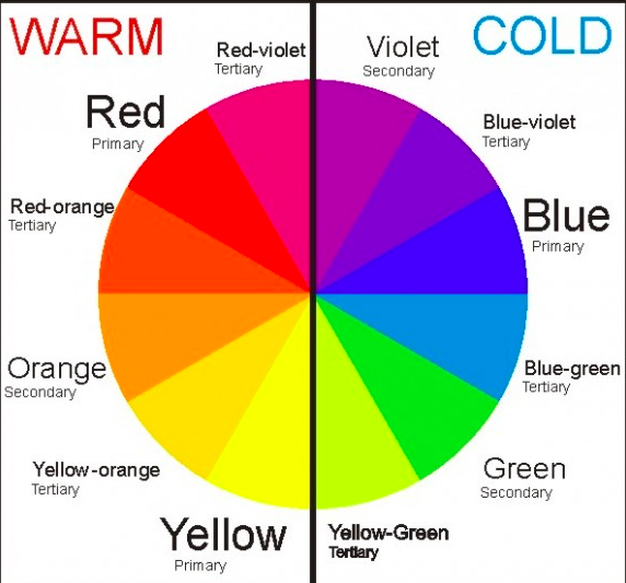
Warm and Cold Colors
Source: Hommes
Warm and cold are associated with color temperature. If you draw a line down the middle of the color wheel, you’ll separate the two categories – warm colors (red, orange, and yellow) and cold colors (blue, green, and purple).
Shade
When you add black to a hue/color, you make a shade. This produces a darker variation of the color. For example, if you add black to blue, you get navy.
Tint
On the opposite end of the spectrum to shade, when you add white to a hue, you create a tint. It results in a lighter variation of the original color. For example, if you add white to red, you create pink.
Tone
Smack dab in the middle of shades and tints, you’ll find tones. A tone is created when you add grey (or black and white individually) to a color. This causes the resulting color to appear less saturated.
Color Harmony
Color harmony refers to how multiple colors utilized adjacently in an aesthetically pleasing way. This is the point at which color theory finally starts to take shape within design.
Color Schemes

Source: mchsart
Schemes are used to develop style. In its most basic form, a color scheme is simply two colors that look appealing together. But there are many different kinds of schemes you can create.
Complementary
Complementary colors are those that are directly opposite each other on the color wheel. These sets of colors have the greatest amount of contrast, and thus both are made to appear more vibrant as a result.
Analogous
Analogous colors are adjacent to each other on the color wheel. In analogous color schemes, there’s a root color that is dominant, and two supporting colors similar to that of root. Analogous color schemes are often used throughout design, as the hues compliment each other.
Triadic
Triadic color schemes are composed of three colors that are evenly spaced throughout the wheel. It employs a similar theory to complementary colors by using contrast to create the appearance of more vibrant hues.
Color Mixing Models
Color mixing models are associated with how we perceive and create color and how light plays a role in the whole process. There are two primary color mixing models – RGB and CMYK.
RGB: Additive
RGB stands for red, green, and blue. This mixing model involves mixing light (as that’s how we perceive colors) and allows you to create colors by mixing various hues of either red, green, and blue light.
This is known as the additive mixing model because the more color lights you add, the brighter the colors become. If you mix all three colors, it results in pure white light.
RGB mixing models are used for colors that are going to be published online – basically, for viewing on screens – computers, phones, iPads, TVs, and more.
CMYK: Subtractive
CMYK stands for cyan, magenta, yellow, and key/black. This mixing model is used for color on paper. It’s referred to as subtractive because the more color you add to a piece of paper, the darker it gets.
So it subtracts lightness, rather than adding it. If you combine cyan, magenta, and yellow on a piece of paper, you get black.
Originally, this mixing model was composed of red, yellow, and blue. But as color printing emerged with the development of technology, it shifted to become what it is now. You’ll probably notice that cyan, magenta, yellow, and black are the printer inks that you commonly need to buy.
When you’re creating materials for your brand, it’s important to know the difference between these two mixing models, as you’ll always want to keep your exact brand colors consistent.
You wouldn’t want to use a RGB mixing model for a print campaign because the colors would appear different once printed on the page.
Applying Color Psychology and Theory to Your Flywheel
Whether you realize it or not, color impacts every aspect of your business. It defines the image of your brand, and ultimately determines how your audience views your company.
Let’s take a closer look at the impact color can have on branding,marketing, and your flywheel so you can understand how to best implement it into your strategy.
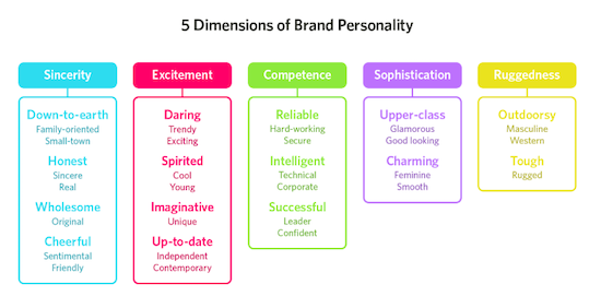
5 Core Dimensions of Brand Personality
Believe it or not, colors reflect the personality of your brand and how your audience perceives you. In fact, research has shown that predicting peoples’ reactions to colors is a far more important element in your marketing strategy than the actual color you choose.
The colors you choose will closely define the vibe and appearance of your brand. While you might focus on just one color to uphold one primary core element of your brand, you may also combine two or more to create a more dynamic brand personality.
Let’s take a closer look at some of the five core dimensions of brand personality.
Source: HelpScout
Sincerity
Blue hues are associated with sincerity and convey down-to-earth sentiments. If you want your brand to appear wholesome, trustworthy, and inclusive, consider using blue hues in your branding.
Excitement
Red hues are commonly associated with excitement and can be daring. It’s typically a color associated with youth, so if you want your brand to be seen as active and bold, consider using a red.
Competence
Greens are commonly associated with competence. Being the color of money, it’s only natural that people also consider it to be the color of success as well. However, green is also closely tied to ideas of nature (for obvious reasons), reliability, and intelligence.
Sophistication
Purples are commonly associated with sophistication, which can most likely be traced back to the use of purple as a color for royalty in previous centuries. It’s seen as glamorous, feminine, and smooth, so if any of these qualities sound like how you want your brand to be represented, consider using purple hues in your branding.
Ruggedness
Hues of yellow are commonly associated with outdoorsy ruggedness and masculinity.
How Color Impacts Your Marketing, Sales, and Service
Now that you have a greater understanding of color theory, let’s cover how this specifically ties into your marketing and brand identity. For starters, color can be used as emotional triggers to align with the core dimensions of your brand personality.
As we’ve already discussed, colors actually play a big role in people’s purchasing decisions, whether they consciously realize it or not. A simple variation in color can determine whether or not a lead takes a desired action on your website or makes a purchase.
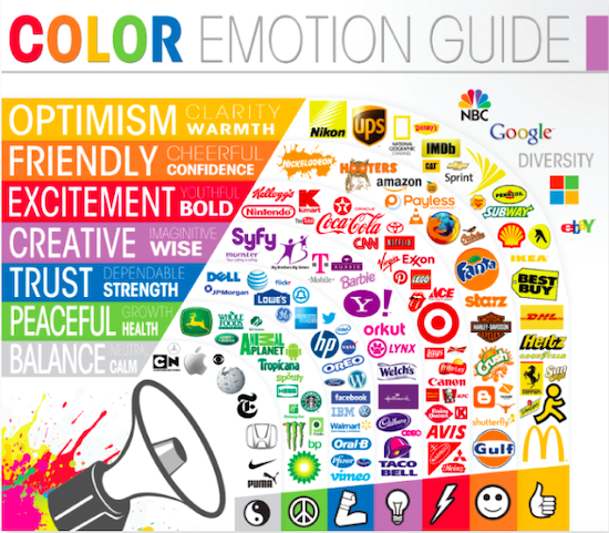
But in addition to this, colors are also how people remember and identify brands. Think of some of the most popular brands – Coca-Cola, Spotify, and Amazon. What comes to mind? Red, green, and orange – the primary colors of each brand.
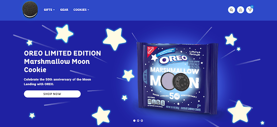
When you're looking for Oreos on a shelf at the supermarket, you search for that iconic blue packaging. Colors stick in our minds more than anything else.
Source: CoSchedule
With this in mind, it’s important to know that many colors can have both positive and negative effects on your audience, and you’ll need to consider this when carefully selecting your brand scheme.
Here’s a closer look at how individual colors can boost sales and drive marketing results in their own unique ways:
Blue
Source: Oreo
Blue has long been associated with tranquility and calmness, and it invokes a sense of stability and security within people. Because of this, it’s a very popular color throughout many different brands.
It’s great for easing the anxiety of your audience, so it’s a good option for high-stakes products and services, especially for financial and insurance companies. It's also a great option for service portals.
However, blue is a cool color, so it can sometimes appear uninviting. If you want to create a hospitable, homey feel for your brand, you’ll need to be careful with your use of blue.
Purple
Purple – the color of royalty and wealth. However, it’s also commonly associated with spirituality and creativity and is usually a color preference for women over men.
Keep this in mind when considering your use of purple – you need to tailor your color scheme to your target audience just like everything else, and if you offer gender-specific products or services, that’s going to be a big part of it.
Purple is a great accent color, but it might be a little overwhelming as a primary color due to its boldness (depending on the hue you choose). It’s often used with white and black, but is also complementary with yellow-green.
Black
Black is a powerful color often associated with luxury, sophistication, and independence.
Just like you have to consider that purple is typically a female-geared color, black is typically preferred by a male demographic. Regardless, it’s still a very popular color and makes for good website accents and framing when used sparingly.
It can be used to create a very sleek black website background, but only if you really master the design. Otherwise, it can look low-quality and unprofessional.
It doesn’t make for great action buttons because it’s often hard to see and hard to overlay text with.
It’s also important to consider the negative connotations of black – it’s a heavy color that’s also commonly associated with death, darkness, depression, night, and evil. In general, be careful with your use of black, as it can have a big impact on your audience.
Red

Source: Red Bull
Ah, red – the color of power and danger. Red is commonly used to indicate sales because it’s attention grabbing and expresses urgency.
However, red is a color that should be used in small portions, as its tendency to indicate danger can create a sense of hostility.
Using red sparingly, such as for buttons, arrows, or website accents, emphasizes its attention grabbing effect. However, take note that red is also associated with "stop." Sometimes, people actually shy away from clicking on red website buttons.
Green
Naturally, green is associated with the environment, so if your company is looking to appeal to a nature-loving audience, then you absolutely need to use this color in your branding. However, there’s more to green than the environmental factor.
It’s also associated with creativity and balance, and as we all know, green means go. This not only makes it a solid base brand color, but it’s also a good option for website buttons for purchasing and downloading, or taking any action at all really.
Pink
Naturally, pink is commonly a feminine color, so it makes for effective marketing toward a female audience. It’s associated with compassion, love, sensitivity, and hope.
However, it’s important to be strategic with your use of pink – too much can appear somewhat juvenile. With this in mind, it’s a great accent color for brands.
Brown

Source: UPS
There’s a lot of pros and cons to using brown within your marketing. It’s seen as a very safe color – earthy, secure, and structural. It’s a warm color that can be extremely inviting and create a homey feel.
However, it can also easily be perceived as boring, so you’ll need to carefully consider the overall color scheme you’ll be creating to complement your use of brown. It often goes well with other earthy colors, such as green and blue.
Gold
There’s no two ways about it – gold has a reputation. It’s the color of treasure, winning, charm, wealth, and luxury. But too much of it can be a bad thing, at least when it comes to brand aesthetics. An excess of gold can appear haughty and overdone.
So unless you want your audience to roll their eyes, it’s best to use gold as an accent color rather than a base.
Orange
Orange is like red’s chilled out cousin. It tends to be a less common choice for brand colors because it’s sometimes abrasive to the eye, but that’s what makes it attention grabbing. Despite the fact that it’s rarely chosen as a favorite color, it’s often associated with positivity and rejuvenation.
It’s a great option for action buttons and website accents, as long as you pick the right hue to fit the color scheme of your brand.
Yellow

Source: Nikon
Yellow is an upbeat color often associated with positivity, fun, sunlight, and friendliness. The color of daylight, it’s inviting and warm and often enlivens people. It’s often used in symbols of hope and optimism.
However, yellow is also a color that can sometimes stir anxiety within buyers. With this in mind, it’s a good idea to use it in coordination with its complementary color – purple – or even blue to counteract this effect with a sense of tranquility.
It’s also commonly paired with black to create a sharp sense of contrast within brand colors.
White
White is one of the most utilized colors within marketing and branding and for good reason. It’s associated with a whole bucketload of sentiments – minimalism and simplicity, cleanliness and purity, new beginnings, and even a blank page for creative freedom.
Surely you’ve heard the term “white space” – good websites have a good balance of it. White can work with just about any other color, and it makes for a solid base.
However, just like with every color, there can be drawbacks. Too much white can invoke a sense of isolation and loneliness. So make sure you accent it appropriately with other colors to add some life.
Choose Colors Carefully
As we’ve explored, color plays a huge role in how your audience perceives and experiences your brand.
A color scheme can shape the entire identity of your company without you even realizing it. It can attract your audience, drive sales, and ultimately define the growth success of your business.
With all this in mind, make sure you carefully consider the color scheme you select to represent your business when you’re developing your company or going through rebranding.


Claire Cortese
I am a content creator here at Bluleadz. In my free time, I enjoy hugging dogs, watching reruns of The Office, and getting sunburnt at the beach.