Branding is a key piece of the puzzle in your company's identity and recognition. It has real impact on your company’s revenue, so you'll want to execute it successfully.
Your brand color palette is a part of that bigger picture.
It may seem a bit frivolous and laced in nuance, but those colors are actually carry a lot of influence over brand recognition.
This is evident in the field of color psychology.
Psychology of Color
Color psychology is the study of how colors impact human behavior. Different colors can influence different emotions, triggering reactions and sentiments.
Consequently, we'll associate certain brands with certain emotions based off the colors they use in their style guides.
Take Dunkin' as an example. Their brand colors use vibrant orange and pink, which is contrasted by brown and white. Each of these serves a purpose, whether it be a representation of coffee, or the joyful and bright feeling of a sweet snack. In 2021, Dunkin' even partnered with a paint company to push their brand beyond a donut shop using their colors.
The right color scheme or palette affects how we interpret messaging. And marketing is all about your company's messaging, right?
This is why you need to fully understand everything that goes into brand color palettes.
Brand Color Palette Elements
Aside from the more popular and recognizable colors in the color wheel, there's still a lot to consider when designing your brand's palette. There is way more to this process than ROY G BIV.
Tone
Tones are created when you add either black or white to pure colors. Think of it in the sense of intensity.
If a color is pretty saturated, or "intense", then it needs to be "toned down" with black. And vice versa with dull colors and adding white.
Tint
Kind of a subset of tones, tinting occurs when you add white to a pure color, creating a lighter variation of it.
For example, adding white to red makes pink.

Shade
On the opposite side of the spectrum, shades are created by mixing black with a pure color. You'll end up with a darker variation.
For example, black and red together will create a more burgundy shade.

Hue
The colors that come to mind are better described as hues, or dominant color families. In the examples above, the tints and shades we see are all part of red hues, or the red color family. This is the broader scope of color, and tone, shade, and tint all serve as adjustments to the primary hue of a color.
How to Choose Brand Colors
Even though there's a bit of pressure in picking the perfect colors to represent your brand, it can actually be a ton of fun. Here's how to choose your brand colors in five easy steps.
1. Assess Your Brand Personality.
You've got to factor in what it is your company values and what it stands for. The colors you wind up choosing should reflect the culture and nature of your brand.You can help establish this by putting together a list of words that relate to your company.
For example, McDonald's red and yellow scheme reinforces its fun, family-friendly persona.
2. Gather Inspiration Research.
Social media platforms are a great place to source color inspiration for your brand's color palette. After examining your brand's personality, you'll likely have at least one or two colors in mind to get you on the right path.
Even as you start building a mental mock up of your color scheme, it's important to do your research and cross reference what those colors will mean for your company.
Examine what hues your customers prefer, what your competitors use and why, and if the colors you're leaning toward fit your industry.
3. Define Your Color Combinations.
At this point, you should be able to choose at least six colors to define your color palette.
From those six, start looking for different color combinations that will be attractive and also match the "vibe" you're looking to achieve for your brand.
Are you looking for something a bit more mature or professional? Pick out the more neutral tones from what you've collected so far.
If you have mostly warm colors, but are aiming for something a bit more vibrant and dimensional, then throw in some cool tones for contrast.
4. Balance Your Shades and Tints.
Here's where you need to get a bit nit-picky with what you've gathered so far. A common mistake is building a palette that doesn't have any contrast or depth to it.
All of the colors match each other and blend together, making a bit of a dull presentation.
Well designed palettes have a balanced mix of shades and tints that play off each other. Having a variation between light and dark tones will enrich your palette and provide versatility for your audience.
5. Select Your Dominant and Accent Colors.
Now that it's all come together, you're ready to pick your keys and accents.
You'll want to pick one to two dominant colors that will be the foundational hues for your brand's logo, website, and other similar collateral. You're not always going to use every single color on every single piece of marketing content, so it's important to choose which ones will be key.
The accent colors will be great for highlighting and complimenting those dominant colors on collateral.
Best Free Tools to Help Create Your Brand Color Palette
We mentioned searching for inspiration for your color choices online, but it can be hard picking where to start. We found some great tools for you to use while creating your brand color palette.
The social site has become the world's go-to spot for inspiration and how-to guides. All you need to do is create a secret board and start pinning images that appeal to you. You should start to see a trend in the colors, shades, and tones that really draw your eye.
Pinterest is a wonderful way to create an inspiration board for you to reference while using some of the other tools below. It's a wonderful cornerstone to the whole project.
Adobe Color CC
Adobe is well known for its visual and graphic software, but their Color CC tool isn't as well known as the rest of the roster, like InDesign and Photoshop.
This is a real shame considering it's free, easy to use, and allows you to generate a palette with the click of a button.
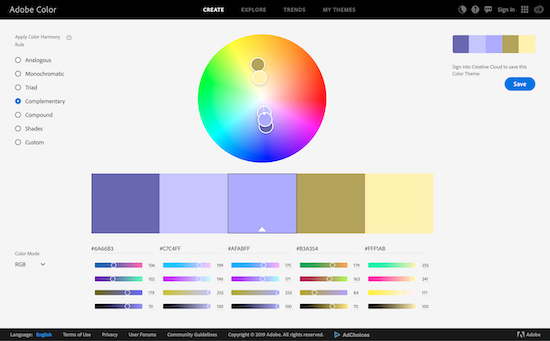
Just choose your desired colors on the color wheel and pick the type of palette you'd like to see. It will supply you with each color's color code, and you can even save it to your Adobe Creative Cloud if you have an account.
Paletton
Paletton is another simple interface tool that allows you to pick and choose your preferred color theory and specific hues, and you can even generate palette examples for proofing.
You can play with the color wheel however you'd like, experimenting with shades and tints to test out different concepts and ideas.
ColourLovers.org
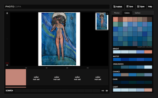
While ColourLovers.org has a color wheel and build-your-own-palette generator like the rest of them, this tool is a bit different. Not only does it have a ton of pre-built palettes available for use, it also has the ability to pull palettes from uploaded photos.
So, if you have a particular image that you've pulled serious inspiration from, then you can upload it and receive all of the noteworthy colors!
Coolors
Sometimes, you might not know where to start. But, you might know when you see something you like. That's what's great about Coolors. This free online tool randomly generates color palettes when you hit the spacebar on your keyboard.
When you see a color you like, you can lock it in and continue to shuffle through colors in the other slots. You can also add and remove slots as needed until to land on a palette that works for you.
Canva
In the world of free creative tools, Canva is a mighty player. Their color palette generator, similar to ColourLoveres.org, allows you to upload an image and it will generate a recommended palette. There are also pre-set color combinations that you can work with.
Popular Brand Color Palettes
Thankfully, color theory isn't a new concept and the path to picking the perfect brand colors is well worn. Certain palette styles have been defined for a while, providing a sort of template for designers and marketers.
Here are some of the popular brand color palettes and examples to go with them:
Monochromatic Colors
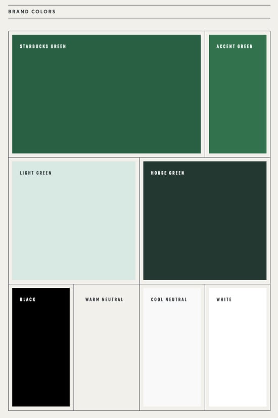
This palette choice is great for brands that have one primary focus or personality trait that it focuses on. It's built by various shades and tints of the same color, creating a much more minimalistic feel.
This kind of color palette works wonders for brands like Starbucks.
Source: Starbucks
The green, according to the brand, is their "most identifiable asset." And it's true. The Starbucks green is seen everywhere. Even the other tones and shades used in their brand colors do a great job of making that true green hue stand out.
Complementary Colors
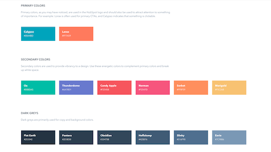
Complementary colors appear opposite each other on the color wheel. They contrast each other, creating a more dynamic and dramatic look.
HubSpot has a complementary color palette that contrasts orange (Lorax) and blue (Calypso).
Source: HubSpot
The colors may somewhat battle each other, but each one matches the software company's personality and feel.
Analogous Colors
When using colors that live next to each other on the color wheel, that's an analogous color palette. They complement each other since they have similar hues and emotional influences.
British Petroleum, also known as BP, uses this color theory to "suggest heat, light, and nature" according to their brand style.
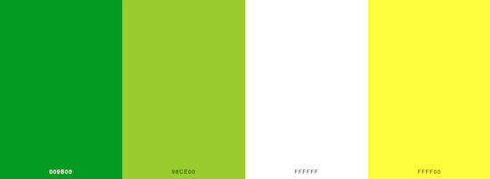
Source: SchemeColor
Triadic Colors
Triadic colors are pulled from all over the color wheel, providing you with versatility in design and concept. This palette is a little harder to balance, matching shades and tints in an appealing way, but it allows you to define your brand however you want.
Slack does a great job with this. Most of their core colors don't directly correlate with one another, but they do create a story and recognizable personality.
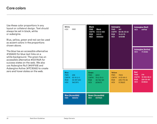
Source: Slack
Knowing how colors can influence us (and particularly your audience), hopefully you can recognize just how important it is to take your brand palette colors into careful consideration.
Have some fun with it! See what creative, new combinations you can come up with while digging for inspiration and playing with color wheels.


Jackie Jacobson
Jackie is a Copywriter at Bluleadz. She graduated from Elon University with a degree in Creative Writing and is currently living in Charlotte, NC. If you need her, you can find her exploring the city or relaxing with a good book.