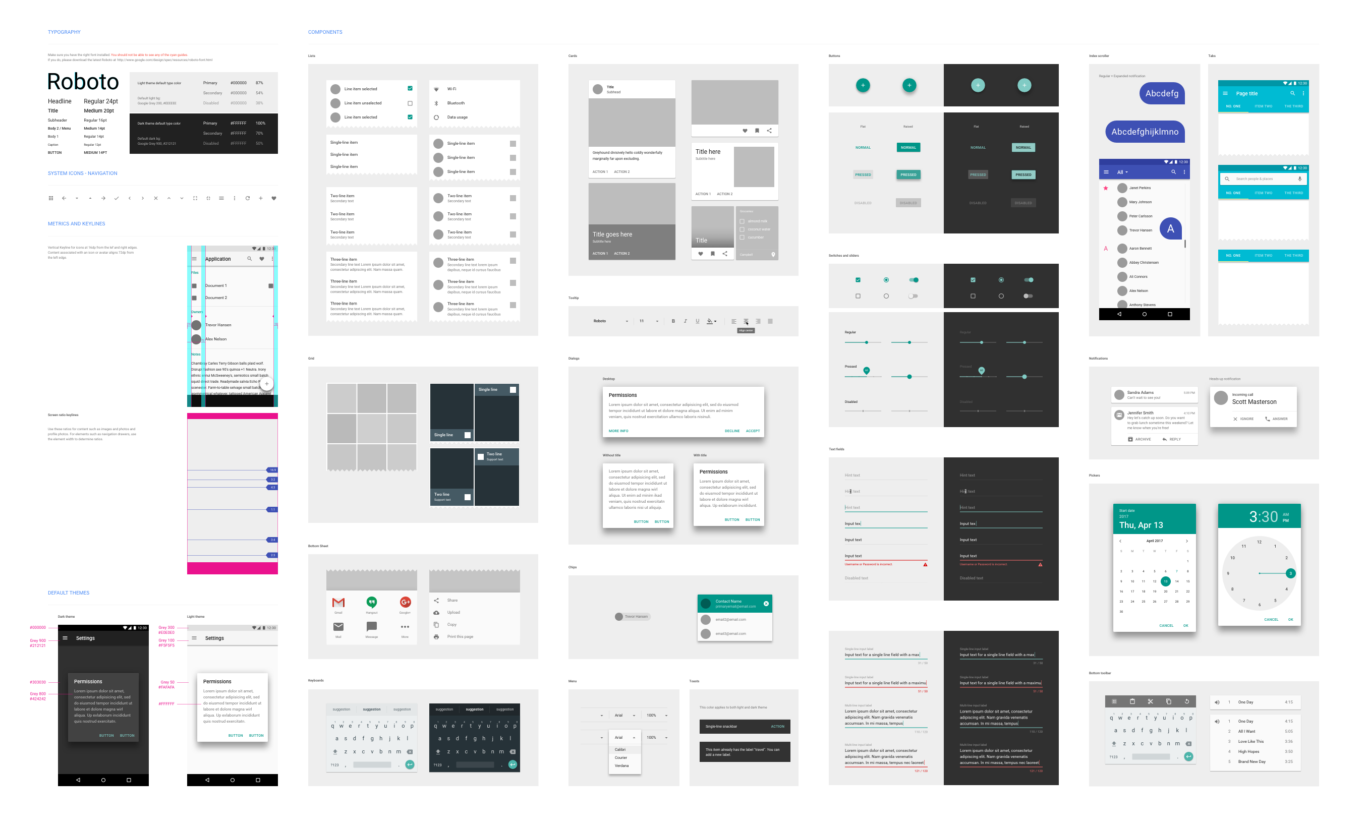
Not too long ago, it was common practice to mock up pixel-perfect renders of every page of a website during a redesign. Hell, we still do full mockups ourselves.
They certainly have their place, but the way we build websites and even the apps we use have evolved with the web, and many designers are left wondering if these artifacts are necessary.
There are certainly pros and cons to both sides, with big names in the industry pushing either option. We're going to look at one of the largest sticking points for the debate—client buy-in.
The Mockup-Driven Workflow
Traditionally, the designer would mock up all of the pages in a site, or at least all of the unique layouts. From here, the developer would set out to faithfully recreate the mockup in code. This was great for setting expectations of everyone involved.
The client knew exactly what they were getting, the designer knew their design would look exactly how they wanted it to and the developer knew what was expected of them.
Then, the web got flexible. The responsive web largely invalidated the pixel-perfect mockup. Still, we adapted and built flexibility into the design; we mocked up phone and tablet views and continued on.
The system worked—it still does. The fact that the mockups set expectations became even more important. Design, in general, can be hard to articulate to someone who doesn't think in that space; then you add in the complexity of a responsive website, and some clients just wouldn't get how it all worked together.
Having mockups for common device widths helped to alleviate this. The importance of this can't be understated. In this regard, full mockups are still the superior option.
The Disconnect
As the web continues to grow and screen sizes become more and more varied, these mockups increasingly become a less accurate representation of final websites. Sites no longer need to look good at a few sizes—they need to look good at a nearly infinite number of sizes.
Mocking this up would be radically impractical. So, with mockups not being a true representation of the site, designers and developers are left wondering why we even make them anymore.
Couple that with the rise of scalable design systems and adoption of a more component-based workflow, and seems inevitable that there would be a cry for a better way to do it.
Adopting a More Modular System
As I've alluded to, people much smarter than myself have been racing to find a solution. One of the prevailing alternatives is a website style guide. You could think a style guide as a sort of UI kit coupled with a dash of branding guidelines. In these sorts of systems, you shift the focus from the micro to the macro.
Use Brad Frost's Atomic Design system as an example of a design system, consisting of the smallest elements of a page (atoms in his metaphor) and you compose those into progressively larger units until you have a full page.
It gets you to the same place in the end, but also attacks the problem from the opposite end. This can save time (and money) by putting less emphasis on something that will ultimately not be a part of the final product.
It's not all sunshine and rainbows, however. If selling a full design to a client is like building a wall, then selling them on a style guide is like trying to build a wall without nails. Even clients who have little to no tech experience can 'get' a traditional mockup with a bit of help.
When showing them a collection of elements that would make a page rather than pages themselves, the task of educating them rises exponentially. Not only that, when creating pages, you'll also need to make sure your style guide is clear about how and when to use certain components so that they get used to how they're intended.
Further Reading
This article largely focused on only a single facet of the topic—whole books are written on the subject. So that you can make your own educated decision, below is a list of resources on both sides of the debate:


Steven Kielbasa
Visual communicator, dad, gamer, fixed-gear cyclist, re-poster, random commenter, Art Institute grad, and all around nerd.