Has it been a while since you’ve implemented CTAs on your site and you’re ready to see how their converting? In this blog, we’re going to talk about a few steps that you can take to analyze and improve the statistics of your CTAs—all within the HubSpot COS.
First, we have to understand what a CTA actually is. In the marketing world, CTA stands for “Call to Action.” According to HubSpot, a CTA is “a text link, button, image, or some other type of web link that encourages a website visitor to take an action on that website, such as visiting a landing page to download a piece of content”.
If you are currently using HubSpot as your CMS (Content Management System), then you can experience the magic of CTAs with the click of a button. HubSpot has done a fantastic job of making it easy for just about anyone to create, customize, track, and analyze awesome smart CTAs. Smart CTA? I know you are probably wondering what that is, but no worries, we will get to that good stuff soon enough.
Analyzing Your CTAs in HubSpot: Where to Go
To start, you should be analyzing the CTAs you currently have in place. For this, you need to be logged in to the back-end of your site’s HubSpot portal and click “Content” from the main navigation. You’ll see a drop-down list that includes “Calls-to-action.”
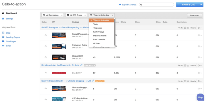
When you get into the page of all your CTAs, don’t become frazzled. There are rows of numbers, links, icons, and you may start to think “what in the world is all of this.” Fear not, because these are just the stats of each of your CTAs; how many times they’ve been viewed, clicked, where they’re located, and how many submissions they have garnered.

When analyzing your CTAs, it’s best to have a plan of attack. Bluleadz has done it’s best work by first analyzing the top CTAs on the site; in this case, the most viewed CTAs. By default, you may see your CTAs filtered by “This month to date.” You’re are going to want to change that to “All time” and then click on “Views.” This will rearrange the list in the order of “most viewed” to “least viewed.”
Have you clicked the button? Great! Here is where you can use these statistics to your advantage. Look at the numbers and you’ll begin to understand how your visitors are seeing the CTAs. Are they getting clicked? Are they an old design that hasn’t been updated in 2 years? Maybe a person should see something different, and at different locations. These are all questions you should start to think about when analyzing your CTAs.

Let’s look a little deeper into this first CTA as an example. We can immediately see next to the title that this specific CTA is a “Smart CTA”. Let’s quickly explain what a Smart CTA is and why YOU SHOULD be using them.
Introducing: Smart CTAs
A Smart CTA is a great tool to utilize to offer dynamic content based off the visitor viewing the page. Essentially, we can set “rules” that say: if this user has done this or downloaded this, then show this specific CTA. This comes in handy when you want to continue to display new upcoming offers to frequent visitors.
A better example would be if you have 3 offers and 3 different CTAs for each. You can set a rule that if a visitor has not downloaded offer #1, then display CTA #1. If this visitor has already downloaded offer #1, then show CTA #2. If a visitor has already downloaded both offers #1 and #2, then display CTA #3.

What if you don’t necessarily need to create a Smart CTA, but still want to explore two different buttons or graphics related to the same offer? You are in luck, because HubSpot has just the tool for that, as well.
Introducing: CTA Variations
To create a test variation for a specific CTA, you should click on the cog wheel icon located inside the row of the already created CTA (see image above). This will bring up a cloned version of the CTA where you can change the link, upload a new graphic, change button text, customize a new style, etc. Just make your changes, save, and voila! You’ve just created a variation. Now in a few weeks, days, or however long you want to run the test, you’ll begin to see new stats on clicks and conversions and decide which CTA is the winner.
The way that a variation works that it intermittently changes the CTA. It’s a great way to utilize subtle changes in a CTA and see what verbiage works best for your visitors.
.jpg?width=712&name=cta--details%20(1).jpg)
Clicking the “Details” link in the row will show you a CTA preview and the conversion of views to clicks. Now, you can better understand the magic of Smart CTAs. They are a fantastic way to be sure your site doesn’t become dull to visitors, and continue create opportunities for new offers on your site.
CTA Conversions and Understanding Them
Let’s imagine that you are looking at your CTAs and you see that you have 7,393 views, 149 clicks, 74 submissions, a conversion rate of 2.02% views to clicks, and a rate of 49.66% clicks to submissions. What these stats tell us is that 2% of the 7,000+ visitors who have see this CTA have clicked it. A good conversion rate is between 1-3%. When we look at the second part of this, of the 49% that submitted to download this offer, the other 51% decided to leave and not complete the download.
How Can You Improve Your CTAs?
You’re probably wondering, “Well, now what? What can I do to add some extra sugar and spice?” Here’s a few things that you can begin to ask yourself.
- How old is the design?
- Can I utilize a Smart CTA in this scenario?
- Does the landing page content need to be updated for the visitor to better understand the offer?
- What kind of questions are being asked on the form?
All these are great questions and can have completely different answers based on each individual CTA. However, as someone who is in the marketing industry and who frequently visits the same sites over and over again, I cannot express how important it is for a site to be fresh.
By this, I mean: new offers, new CTA designs, new BIG and BOLD colors, and new placement on pages. I have seen many sites create different CTA graphics with the same design structure. Even this can hurt your conversions. When a visitor is skimming your site pages, your CTAs will begin to look the same even if the words are different. Don’t be afraid to add a splash of bright orange, a vibrant blue, or any other color that doesn’t follow your site’s color palette.
I encourage you to try something new with designs, add smart scenarios to your CTAs, and explore new ways to create “rules” so your visitors can continue to receiving valuable offers from your site. Don’t forget to use HubSpot’s CTA tool to track and analyze your CTA statistics, so you can have the data and continued knowledge to move your site in the right direction for your company and your visitors.


Jackeline Baez
Jackeline is a web designer and front-end developer here at bluleadz. She’s been a computer geek since the early 2000’s and loves fueling her creative juices. She has an addiction to Netflix, all Marvel movies, mini vacations, and everything John Mayer.