You can’t survive without a proper inbound marketing strategy, it’s just not feasible. Part of that strategy is deploying engaging, lead-generating landing pages. You can further improve their efficiency and impact by implementing a variety of promotional campaigns and techniques. Alone, however, a well-crafted landing page is always going to be more beneficial than an ambiguous one. It’s about directing your customers or potential clients on a journey, which, hopefully, will result in the outcome you want.
That explains why there’s a push to increase landing pages that your audience may or may not encounter. According to a Hubspot benchmarking report, brands and organizations can expect a 55 percent increase in leads, simply by boosting the number of landing pages from 10 to 15.
Creating the Best Landing Pages
Of course, it’s not just about increasing the total number of landing pages you have. It’s also important to ensure every single one of them is effective and makes an impact. What good is an extra landing page or two if it contributes nothing to your bottom line?
Here are some tips to make those landing pages work for you:
1. Scale Your Content
Before putting together the design for your landing page — or the redesign of an existing one — consider the content and materials you will be presenting to your audience. Too much copy, as in a great wall of text, will scare visitors away. Not enough, however, and you risk losing them, too. Finding the perfect balance is the key, but it’s not exactly what you’d call simple.
Judge the scale of your content and copy by creating, editing, trimming, and testing. Then, when you’re sure you’ve optimized it the best you can, rinse and repeat the process.
Use A/B and focus testing to find the ideal solution for your audience. What do they want to see? What is missing or what do they have the most questions about? What is too complex, and what takes too long to review?
2. Ask Less of Them
These days, every site from an e-commerce platform to a customer service portal asks you to provide a vast quantity of personal information. Customers must share their email address, physical address, account and identifier details, and much more. The problem is that a lot of this is unnecessary, not to mention people don’t really like being hassled.
Asking a simple question, for instance, does not necessarily call for having a customer login or require them to provide a detailed description and offer up their complete history. Sometimes, it’s okay to just reach out through live chat and ask a question anonymously.
Cut down on the amount of information and interactions you require from your audience. Keep registration forms simple and consisting of one or two major fields. Polls and questionnaires should be three or four questions at most. Reaching out to support should only take a single form or level of engagement, not twenty.
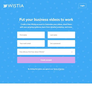
A landing page is the first thing a new customer will see anyway. Often, there’s no reason to have all these forms, requirements and details exchanged. Wistia realized this for their sign-up page, and they kept things simple. To create a new account, you only need to answer five questions — well, technically four because two of those five are your first and last name.
3. Responsive Design Should Be Standard
Yes, mobile surpassed desktop use a long time ago, but that doesn’t mean it’s obsolete. That doesn’t mean you should put more emphasis on desktop, either. That’s the beauty of modern, responsive design — you don’t have to choose. A responsive design is meant to scale appropriately to the resolution and device a user is browsing on. All text and media content is scaled down for mobile, and up for desktop and higher resolution devices.
All of your landing pages should be responsive. End of story.
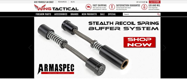

Visit Wing Tactical first on desktop and then again on mobile. You’ll notice the images, text content, and visuals scale nicely no matter what platform you’re on. That’s because their design employs a responsive system.
4. Establish Trust
Often, as is common in marketing, your copy ends up containing a variety of claims, stats and promises with little to no actual proof to back it up. That’s not to say you’re lying or that you’re trying to deceive anyone, but it’s important to establish a rapport with your customers.
On your landing pages especially, you need to provide a variety of trust elements or credentials. This can include testimonials and reviews, customer success stories, social profiles and discussions, client and award logos, security badges and much more. Furthermore, it’s not always a good idea to place this information at the very bottom of a page — it’s not exactly what you would consider visible to most. Find a good location placement for the details, and make sure your audience knows who you are, what you stand for and what they can expect from you.
5. Above All Else, Communicate Value
Having an impressive and captivating call to action or CTA is Marketing 101. There’s not likely a single professional in the industry who doesn’t understand the value of this marketing element. You need a call to action. You also need it to be effective, and you need it in one of the most visible locations on all your landing pages.
But you need something else to complement that CTA or offer. You need to convey value to your audience. Why would they subscribe to your service or purchase your product? What will it do for them? What will it give back?
One thing that every single one of your landing pages must convey is value. Look at the gist of your copy and media. If it contributes nothing in terms of value, get rid of it.
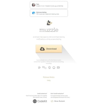
Muzzle has done this perfectly on their landing page. It’s a Mac-based app that helps users silence on-screen notifications. Without actually telling you this, the front page includes an endless stream of embarrassing notifications you wouldn’t want others to see. Right away, you understand the need for the app and what value it can offer you.
6. Your Offer Must Be Relevant
You could provide the best product or service in the entire universe, but it won’t make a lick of difference if you don’t entice your audience with a relevant offer. But guess what? Landing pages that contain multiple offers can actually decrease conversions by as much as 266%. Fragmentation is not the only thing that can cause offers to fall short, though.
Consider a pool cleaning service. Albeit niche, it just wouldn’t make sense for them to advertise computer repair services their employees can offer on their landing page. No one is going to be visiting their webpage looking for computer help. They’re looking for pool cleaning and maintenance services. Now, it might be a good idea to run a collaborative marketing campaign with a local computer repair service to bring in more business, but that’s a different matter entirely.
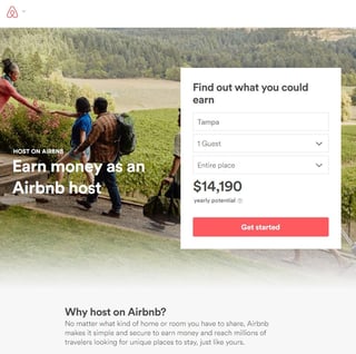
The point is that you must keep your offer and focus relevant to your business and products — like how Airbnb, for instance, reveals how much money potential hosts could earn through the service.
7. Your Headlines Must Steal Attention
There’s a reason blogs and news sites often utilize sensational headlines — they work. That’s because they captivate and steal the attention of audiences, even at a glance. Often, the headline is the first thing your visitors will see on a landing page. Therefore, make it work in your favor by delivering something compelling.
Landing pages are essential to the success of your website. It takes a bit of effort to get them looking and operating their best, but spending the time to accomplish it can help your business succeed in a competitive online world.

Lexie Lu
Lexie Lu is a freelance graphic designer and blogger. She keeps up with the latest design news and always has some coffee in close proximity. She writes on Design Roast and can be followed on Twitter @lexieludesigner.