So, you’ve set up a website, you have a sales team, and your marketing department is cranking out content like crazy. How do you measure your results? Reviewing reports of sales and marketing department performance is crucial for assessing how effective your efforts are and what your opportunities for improvement are.
After all, how can you improve your sales and marketing efforts if you aren’t measuring what is or isn’t working? This is where HubSpot’s reporting tools can prove to be priceless.
Let’s go over what these tools are, how they help businesses, and how you can use them for your organization.
What Is HubSpot Reporting?
HubSpot touts their reporting tools as “a single source of truth for all your data.” What does this mean? It means that HubSpot reporting tools gather a wide variety of data about a business’ sales and marketing efforts to collate them into a cohesive whole that can be used to make more informed business decisions.
These reports can be organized and displayed in a variety of ways to accommodate different reporting needs. For example, you could create a HubSpot dashboard with line, bar, area, pie chart, or funnel-style graphics to make it easy to visually interpret your data.
What Are the Business Benefits of Using HubSpot Reporting Tools?
So, how does using the reporting tools available in HubSpot help a business? There are countless possible answers to this question. Some of the most important ways that using reporting features in HubSpot can help your organization include:
- Enhancing Traceability for Performance Shifts. Even the best-made marketing plans or sales efforts can suffer a sudden and seemingly inexplicable failure. What can you do when your efforts fail to generate results? Dig into your data to try and discover why. For example, did a drop in performance coincide with a policy change or alteration to a specific step in a workflow? If so, that change could explain the drop. When looking at sales and marketing data year-over-year, are there times of the year when performance consistently improves or drops? If so, you’ll have the data you need to adjust future plans and expectations.
- Improving Accountability for Team and Individual Performance. In addition to making it easier to track when changes in performance metrics happen, using HubSpot’s data reporting tools makes it easier to track who is or isn’t meeting their process and performance goals. For example, you could create a report showing how many calls a sales team member has completed, how many customers they’ve signed, and more. Then, you could compare this data to their goals to see if they’re meeting them. This helps you identify which team members are having trouble meeting their goals so you can help them course correct sooner rather than later.
- Identifying Highly Successful Sales or Marketing Campaigns. Is there one piece of collateral that really drives engagement and influences contacts that close deals? Checking your reporting metrics for your campaigns and seeing what content pieces your leads are engaging with can help you identify these MVP content pieces.
- Learning Your Target Audience. Who are your customers? What kinds of devices do they use to browse your website? How long does it take for them to move between lifecycle stages? What kinds of content do they most frequently consume? Analytics data from your HubSpot reports gives you access to the information you need to answer all of these questions. This, in turn, helps you better understand your audience and what you can do to better appeal to them.
These are just a few of the potential benefits of HubSpot reporting—which can help to drive long-term success for any organization that seeks to drive continuous improvement and growth.
What Are the Best Features of HubSpot Reporting?
You might be wondering what the best features of HubSpot’s reporting tools are. Here are a few personal favorites of mine:
- The Ability to Create Custom Dashboards. This is, hands down, my favorite feature of HubSpot’s reporting tools. This feature offers the ability to create your own custom dashboards to organize a series of reports that you can quickly look through. In turn, this helps you to get all of the information you need to make more informed decisions about a particular marketing or sales effort, give your key stakeholders a convenient place to review the analytics data most important to them, or generate a more detailed analysis of the data to present to others.
- Custom Report Generation. HubSpot offers a ton of different default reports for you to use. However, sometimes it can help to look at data from a specific date range or there may be a data set for a custom property you created that isn’t included in the default reports. This is where being able to create custom reports with different visualizations can help. If I need to visualize data a certain way to make it easier to parse (or to meet a client’s expectations), I can. While there are limitations on what visualizations you can apply to specific data sets, the sheer breadth of options available offers a lot of freedom to suit your (or your client’s/key stakeholder’s) preferences.
- Access Control. Want to share your dashboard with just a select few people? Control who has access to your reporting dashboards with only a few clicks. Just select the users and teams you want to have access to the dashboard and set their permissions (edit or view-only). This helps you ensure that only the people you want to view your dashboards can access them.
- Sharing Features. Need to make sure someone reviews your custom dashboard of reports? The “Share” feature lets you send a custom dashboard to others via email or certain connected social media platforms like Slack (if you connected your account and have downloaded the related app integration).
Which Tier of HubSpot Unlocks Reports?
So, you want access to the Reports feature? How can you get that access? While dashboards that leverage your HubSpot reports are available to all HubSpot accounts, specific report features are restricted to certain subscription types.
For example, to create a custom report, you need to have one of the following subscription types:
- Marketing Hub. Professional or Enterprise-level.
- Sales Hub. Professional or Enterprise-level.
- Service Hub. Professional or Enterprise-level.
- Operations Hub. Professional or Enterprise-level.
- CMS Hub. Professional or Enterprise-level.
Basically, you need any Professional or Enterprise-level HubSpot subscription to create custom reports. Additionally, you need to have “Create/own” and “edit” report permissions in your HubSpot portal. If you do not see an option to create reports or edit them, contact your HubSpot portal admin to verify your access privileges.
Some other features may be restricted to specific subscription types. For example, to create a custom analytics view, you need to be on Marketing Hub or on CMS Hub at a Professional or Enterprise subscription level.
How Much Does HubSpot Reporting Cost?
So, how much does reporting cost? Basic reporting features with default reports is available to all HubSpot subscribers on a Starter account—which can be as low as $23/month for a CMS Starter account subscription (and $45/month for Marketing, Sales, Service, or Operations Hub Starter accounts).
The number of dashboards you can build and reports you can have on each varies by subscription type:
- Starter Hub Subscription: you get a total of 10 dashboards with 10 reports per dashboard. $45/month for a Marketing Hub Starter subscription.
- Professional Hub Subscriptions: You get 25 dashboards and 30 reports per dashboard. $800/month for a Marketing Hub Professional subscription.
- Enterprise Hub Subscriptions: These accounts can have up to 50 dashboards with 30 reports per dashboard. $4,180/month for a Marketing Hub Enterprise subscription.
Additionally, the Enterprise and Professional accounts get the ability to build custom reports to help you meet specific reporting needs not met by default reports.
How Do I Set Up a HubSpot Reports Dashboard?
So, how can you create a HubSpot Reports Dashboard view in your HubSpot portal? It’s actually pretty simple.
All you have to do is:
- Click on the “Reports” button in your HubSpot portal menu navigation.
- Click on the “Dashboards” option.
- Click on the “Create dashboard” button in the upper right of the screen.
- Either select one of the pre-made dashboard templates with preset reports in it or start from scratch with a blank dashboard by clicking on “New Dashboard.”
- Give your dashboard a name in the field that appears to the right.
- Set your user access privileges to the new dashboard.
- Private owner: Allows only you and those you specifically choose to view the dashboard or edit it.
- Everyone: Let every user in your HubSpot account view the dashboard.
- The “everyone” permission has two further divisions—“view and edit” or “view only.” View only allows all users to view (but not edit) the dashboard.
- Only specific users and teams: This Enterprise-only feature allows you to set view and edit permissions on a user-by-user or team-by-team basis.
- To finalize your selections (don’t worry, you can edit the dashboard and its permissions later if you make a mistake or need to change settings after you make it).
Here’s a quick video showing the process:
From there, you’ll want to either edit the existing reports in the template you chose or add reports that align with the key performance indicators (KPIs) that you want to track. So, how do you create new reports in HubSpot?
How Do I Create Custom Reports in HubSpot?
Okay, so you want to create your own custom report in HubSpot because you can’t seem to find an existing report that tracks the exact piece of data you want to track. It’s time to start experimenting with the custom report builder in HubSpot.
Before making a report, consider what kind of information you want to track and how you want to track it. This should help inform which data sources you select and how to visualize them.
Here’s a quick overview of the basic process for creating a custom report in HubSpot:
- Go to Reporting > Reports or to one of your HubSpot dashboards.
- Click on the “Create report” button.
- Go to “Create Report from Scratch” in the Custom Report Builder or use the “data sources” and “visualization” options to search for an existing template.
- Choose your data sources or start with a pre-prepped data set.
- When choosing data sources manually, you’ll be presented with a selection of “Primary” data sources, with secondary sources to choose from as well.
- Select a visualization based on how you want to display your data in the report.
- Note: This is important as the visualization you choose may affect what fields and display axes there are. For example, a pie chart doesn’t have a typical “x” and “y” axis display. If you change visualization methods, your data selections may be cleared automatically.
- Add fields based on the data sources you chose in the previous step.
- You can filter the fields you see by clicking on the Filter tab, and then click on the Filter Rules dropdown menu.
- You can also type in the name of the field you want in the search bar to find it more quickly.
- To add a field, click and drag it from the left sidebar into one of the slots in the Configure tab or click “Actions” and click on “Add to [report].”
- Click on “Save report” in the upper right to save your report. You’ll see a menu slide in where you can name your report, give it a description, and choose which dashboard to add it to.
- Click “Save & add” to finish.
Here’s a quick tutorial video:
This is just a simple outline of the basics of creating a custom report in HubSpot. There are many other features to explore in this process, such as the Chart settings.
How Do I Customize My Chart Settings in the Report Builder?
- In the Custom Report Builder, after selecting a visualization type, click on “Chart Settings.”
- Your options may vary based on chart type. For example, a line or bar chart may have settings for setting the scale of an axis of the chart. You can also set minimum and maximum chart values, select color palettes, and more.
Here’s a quick video showing the chart settings menu and how to edit these settings:
[Placeholder for Customizing the visualization for a report]
In the video, for the bar chart, you see that, when I click on the cumulative option, I get an error message. That’s because, for the cumulative option to work, the data field for the y-axis in that case has to be a date or time value.
How Do I Create Custom Analytics Views in HubSpot Reports?
If you’re on Marketing Hub or CMS Hub at a Professional or Enterprise subscription level, you can create custom analytics views. Before you create a custom analytics view, it’s important to know two things:
- It Only Captures New Data Moving Forward. An analytics view cannot provide historical data before the date it was created.
- Sessions Are Only Tracked if They Start on the Location Specified in the View. If you create a view for one domain’s landing page, but not on a different page, the session will only count if they start their interaction on that specific landing page.
Here’s the basic process for how to do it:
- Go to your settings menu by clicking on the gear icon in the upper right of your HubSpot portal navigation.
- In the left sidebar, go to “Tracking Code” under “Tracking & analytics.”
- Click the “Analytics views” tab.
- Click on “+ Add another view.”
- Enter a view name in the right sidebar.
- Click the filter options to segment your data. Options include:
- Country—visitor country based on their IP address information.
- Subdomain—the subdomain of the page being viewed.
- Brand Domain (only on Enterprise subscriptions)—filter based on your brand domains.
- Top-Level Domain—the end domain after your brand domain. For example, the “.com” in “Bluleadz.com” would be an end domain.
- URL Path Starts—the starting path of the URL for the page being viewed.
- URL Path Contains—filtering URLs by them containing specific text.
- Click on “Apply filter.”
- Click on “and” to add additional properties to the filter.
- Verify that you’ve named your view
- Click on Save.
Here’s a video showing how easy this can be:
From this settings tab, you can also edit an existing view by clicking on the “edit” button that appears when highlighting that analytics view. You can also click on “delete” to remove an obsolete analytics view.
What’s the Use of Analytics Views?
So, why should you create an analytics view? You might be looking for where you can use the data you collect after creating an analytics view. To do this, you need to go to your traffic reports in your HubSpot portal.
- Click on your “reporting” dropdown in your HubSpot nav.
- Click on “reports.”
- Go to “traffic.”
- In the screen that appears, go to the “Sources” tab and click on the highlighted text next to “Analytics view.”
- Choose the analytics view or source you want to analyze from the list.
- To export the analytics data to a report, click on “Save report” in the upper right and choose between “Save chart” and “Save table.”
Here’s a quick video tutorial:
How Do I Create Attribution Reports in HubSpot?
An attribution report tracks the interactions that your contacts have made with your brand along their customer journey. This helps you identify which pieces of content and interaction types are the most helpful for guiding your prospects along your sales pipeline—helping you streamline your processes and improve conversion rates.
There are three kinds of attribution reports that can be created—though two of the three are exclusive to Marketing Hub Enterprise subscription accounts.
- Contact Creation Attribution Reports. These reports help establish which efforts create new contacts for your business.
- Deal Creation Attribution Reports (Marketing Hub Enterprise Only). These reports help you find out which efforts lead to the most deals.
- Revenue Attribution Reports (Marketing Hub Enterprise Only). This helps you discover which activities generate the most revenue for your business.
So, how can you create an attribution report? Here’s how:
- Click on the “Reporting” option in your top nav.
- Click on “Reports.”
- Click on “Create report.”
- In the Create Report menu, click on the “attribution” card.
- Choose the type of report you want to create from the contact create, deal create, or revenue sections of the page that appears. The cards each describe the type of attribution report you can create.
- Click “Next.”
- Start configuring your report
- Add a name to your report.
- Click on the “attribution model” dropdown menu, then select the attribution model or models you want to track.
- Click on the “dimensions” dropdown to choose how to assign conversion credits.
- Choose filters for the report to limit the data displayed. Some filter examples include asset types, campaigns, or interaction sources.
- Click “Save” in the upper right, then give your report a name and description. You can also choose to add it to a dashboard.
- Click “Next.”
- Choose the access privileges for this report: Private owner, everyone, or only specific users and teams.
- Click “Save” in the bottom right.
Here’s a quick video walkthrough:
How Do I Manage Reports in My HubSpot Reports List?
To manage an existing report in your HubSpot portal, go to your reports list—you can reach this by clicking on “Reporting” in your top nav in your portal and clicking on “Reports” in the dropdown.
From the reports list, search for the report you want to manage. You can do this by using the search bar. You can also filter reports in the list by dashboard, business unit, or owner.
- Mouse over the report you want to manage, you should see an “action” button appear.
- Click the “action” button.
- Choose an option from the menu that pops up.
- Customize: This lets you edit the report using the report builder tool.
- Clone: Create a clone of a report that you can edit. Useful for creating variants of existing reports without impacting the original.
- Export the report to a CSV, CLS, or SLSX file to share.
- Share to Slack: Send a link to the report to a Slack channel (requires an installed Slack integration and for you to connect your Slack account in HubSpot).
- Manage Access: Change access privileges for the currently selected report.
- Change Owner: Reassign ownership of a report to someone else.
- Set Business Unit: Associate the report with a specific business unit.
- Add to Dashboard: Add the report to a dashboard (if the dashboard isn’t at the report display limit).
- Delete: Delete a report from your reports list and any dashboard it is currently attached to.
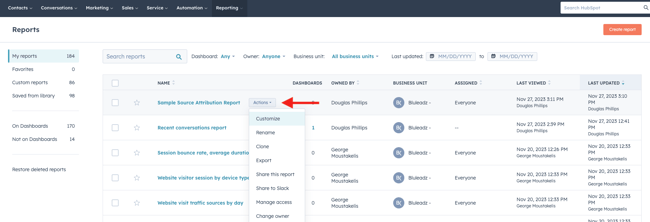
You can also restore a deleted report by clicking on the “Restore deleted reports” option on the left of the reports list. Note that this must be done within 14 days of the deletion.
How to Use HubSpot Reports for Your Internal Teams
Okay, so, how can your internal marketing, sales, or service team use reports? The most important use of these reports is to gather data that you can then use to inform decisions amongst your team.
For example, you could look at attribution reports to see which types of content are creating the most new contacts. Using this information, your marketing team could tweak future content strategies to focus on higher-performing content types.
Alternatively, your sales team could use reporting dashboards to track progress toward process and results goals. For example, you could track conversations tool data to see how many conversations your sales reps are engaging in or track deal data to see how many deals are being closed and how much revenue is being generated.
Exported conversations tool and ticket data could also help you keep track of service department interactions with customers. You could create and track adherence to SLAs with regard to incident response times and ticket close rates to see how effectively the service team is meeting its goals.
What reports should you create for your internal team dashboards? Here are a few suggestions:
Top 3 Reports to Create for Your Marketing Team
Multi-Touch Marketing Report
This report tracks every marketing action’s impact on revenue. By tracing multiple marketing interactions and their impacts on revenue generation, marketers can define the ROI for their efforts and identify what kinds of marketing efforts have the biggest impact on the company’s bottom line.
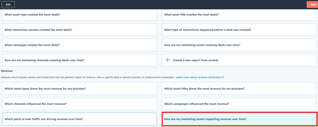
You can create a multi-touch marketing report quickly by going to the report builder, selecting the “Attribution” report type, and choosing the “How are my marketing assets impacting revenue over time?” option under the “Revenue” heading. This gives you a premade report that shows different marketing channels and their impacts on deals that you’ve recently closed.
Traffic Source Report
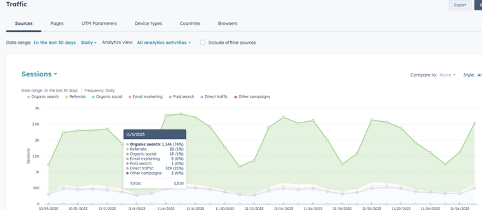
This is a report that shows you where the traffic to your website is coming from (email, organic search, direct, referrals, email, etc.). You can find this data in your traffic analytics report tool. You can find traffic analytics by clicking on the “Reporting” dropdown in your HubSpot portal navigation, and then clicking on the “Analytics Tools” option.
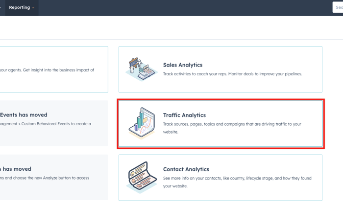 In some portals, you may instead need to mouse over “Reports” under the “Reports” dropdown, then click on the “Traffic” option from the menu that pops up.
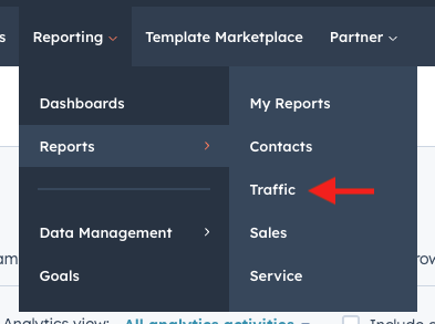
From here, you’ll be able to see a breakdown of sessions, new contacts, customers, or other data by their traffic source. You can export this data to a dashboard by clicking on the “Save report” button in the upper right once you have the data you want to track.
New Contacts by Persona Marketing Report
Hopefully, your marketing department has already created some detailed buyer personas that closely align with the identities of your ideal customers. If not, it’s probably a good idea to do so as soon as possible so that your marketing efforts can be aligned with the type of messaging that most resonates with your ideal clientele.
If you have buyer personas and have added them to your HubSpot portal, you can then create a special marketing report for your team that helps divide your contacts by their persona. You can set this up in the report builder by plotting contacts by create date and using personas to break down the report.

This helps you find out what’s driving traffic to your site and what your biggest opportunities for improvement are.
Top 3 Reports to Create for Your Sales Department
Sales Pipeline Report
This is a report that can help you discover which deals are likely to close and which ones aren’t so that you can assess the impact to your bottom line. It details how many deals are in each stage of your sales pipeline, their value, and who the owner is for each deal in the pipeline.
You can view this report by going to “Forecast” under the “Sales” dropdown in your main HubSpot portal navigation. Then, you can create pipeline reports by clicking on the “View Report” button in the upper right. You can select from the reports there, then click “Save Report” to export it as a report that can be shown in a dashboard.
Here’s a quick video showing the process:
You can also find these reports under your Sales Analytics under the analytics tools menu of your HubSpot portal.
Conversion Rate Report
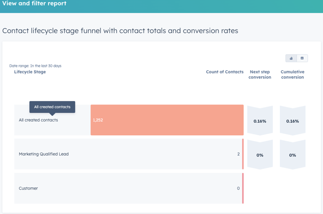
What percentage of prospects are being converted from prospects into leads and then from leads into opportunities and opportunities into customers—or whichever specific lifecycle stages your business uses in its sales pipeline? Having an accurate assessment of your conversion rate helps you understand the health of your sales pipeline and temper your forecast estimates.
For example, if you know that only 10% of opportunities convert into customers, to meet a goal of 100 new customers, you would need to generate 1,000 opportunities. Having the conversion rates for every step of the process leading up to that point helps you set the goal for lead creation that you would need to meet your new customer targets.
Additionally, you could dive into individual sales rep data to see who is underperforming or who is overperforming. This could be useful for creating a mentorship program to help low-performing reps learn from your top performers.
Here’s a sample image of a conversion rate report:
Average Time to Close
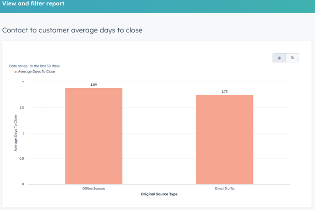
How long does it take to close a deal with a prospect? Having this information is crucial for creating an accurate projection of your revenue for a given time frame. For example, if you know that it takes 60 days for your deals to close on average because your business has a particularly long sales cycle that requires buy-in from multiple decision-makers, then you’ll know that a deal that your sales reps just started on in June probably won’t close until August at the earliest—so deal started in Q2 wouldn’t hit the books until mid Q3.
If you look at your average sales cycle length and see that it’s too long or that some reps seem to be struggling to stay close to the average, it might be time to refine your sales process to streamline it.
Here’s an example of a report that compares the average time to close for contacts between online and offline sources:
Top 3 Reports to Create for Your Services Department
Ticket Level Reports
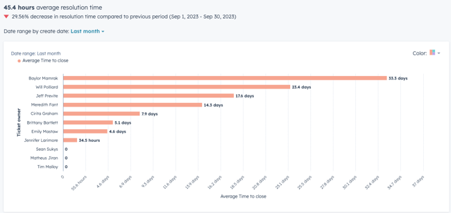
How many tickets is your service team opening and closing in a given time period? Knowing how many tickets are being opened and how many your team is closing helps you identify if you’re consistently meeting the SLAs you need to keep your customers delighted and coming back for more.
Here’s a quick example of a ticket status report you could build in HubSpot using the report builder—just set ticket status as one axis of the chart and count of tickets as the other.
Note: All of the ticket statuses in your HubSpot portal will be reflected. So, it can help to clean up your ticket statuses to avoid having too many ticket statuses shown in the report.
Activity Level Records
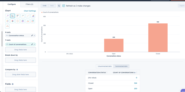
How is your service team handling customer interactions? Are they keeping up with calls, emails, meetings, and other interactions in a timely manner? It’s important to keep track of service activities in your HubSpot portal to ensure that your team is staying on top of these interactions.
Here’s an example of a conversation status report that shows a count of open and closed conversations in HubSpot:
Customer Distribution and Retention Reports
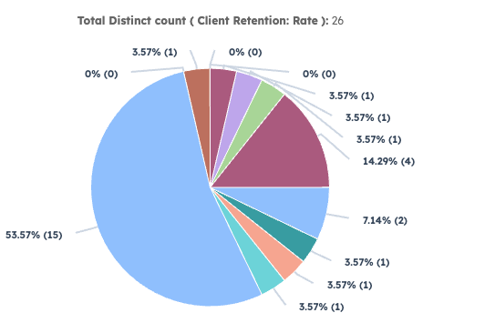
How successful is your service team at retaining clients long-term? How many clients are different teams managing in your HubSpot portal? Creating reports that show you how many customers you currently have assigned to different teams or individuals and how many have stopped being customers can help you rebalance workloads to optimize efficiency and see which teams have a higher churn rate, which customers are leaving, and possibly even why they’re leaving.
Here's an example of a pie chart showing the potential distribution of customers by employee:
Can You Create a Report for Your HR Department in HubSpot?
Human resources departments are responsible for ensuring that organizations have enough personnel to meet the organization’s overall goals. Being able to attract the right talent and retain it is critical for any business.
To help ensure a healthy pipeline of talent and keep the company well-staffed, it can help to track the number of job openings in the organization, average employee retention, and other statistics about recruitment. Unfortunately, HubSpot does not natively support this function—it is not an HR software solution. However, it is possible to use HubSpot to track new hires as a deal type!
For example, you could create a deal for “New hire/Recruiting” with distinct deal stages for:
- Meeting Scheduled
- Interview Scheduled
- Interview Completed
- Reference Check
- Second Interview
- Offer Made
- Offer Accepted
- Offer Rejected
- Closed/Lost
- Closed/Not Hired
This could be paired with a workflow to set up reminder tasks for hiring managers to complete each step of the process and update the deal stage for job applicants that triggers when someone completes a form on the website related to a job opening at the company.
Essential HubSpot Reports Resources
- HubSpot Academy: Reporting
- HubSpot Reporting
- SEO Reporting
- Understanding Reporting in Marketing Hub
- Effective Client Reporting
- Reporting, Renewing & Upselling
- How to Report on Sales Hub Starter
- Reporting for Client Success
- Video Marketing Reporting with HubSpot
- Reporting on Your Google Ads
- Managing Your Sales Team with HubSpot Reporting
- Using Reporting to Optimize Your Paid Media
- Crushing Your Quote with HubSpot Reporting
- Driving Growth with Attract Stage Reporting
- Creating Momentum with Delight Stage Reporting
- Unlocking the Power of Engage Stage Reporting
- HubSpot Knowledge Base: Reports
- HubSpot Community: Dashboards & Reporting


Douglas Phillips
Former military brat, graduated from Leilehua High School in Wahiawa, Hawaii in 2001. After earning my Bachelor's in English/Professional Writing, took on a job as a writer here at Bluleadz.