Your website is your digital storefront you present to the world. Many B2B businesses don’t offer a brick-and-mortar location people can visit, but they do offer an online version.
The advantage of being on the internet with your business is that you gain access to some of the 33.1 million small businesses in the United States. If your business is global, your pool of potential business clients grows.
However, just throwing up a B2B website isn’t enough. You’re competing with all the other businesses out there like yours. You likely have at least one competitor, if not more.
If you want to engage potential clients and grow your B2B endeavor, there are some key factors that will make your website stand out.
1. Go Mobile
If your B2B website isn’t already mobile and responsive, now is the time to make it so. About 50 percent of B2B searches are done on a smartphone and that number is expected to reach 70 percent by the year 2020.
Imagine you’re a busy business owner. You have a few minutes between meetings to seek out a solution to a problem you’re having. You jump on your smartphone and surf to see what business services are out there.
If you want this person to stay on your website and learn about your solution to their problem, you must ensure your site is mobile-friendly.
2. Engage the Reader
In order to explain how your service or product improves the lives of business owners, you have to first capture their attention and make them keep reading.
Engaging the reader is the first step in this process. You must grab them from the moment they land on your page and keep them engaged along the way.

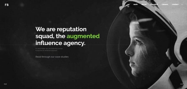
Reputation Squad does a good job of engaging site visitors. They use text with a pop of color to accentuate the key phrase they want to draw attention to.
As you scroll, different images interact with the text to create a story. At any point, you can click for more information or case studies.
3. Create a Clear Funnel
When site visitors land on your page, is it clear what steps they need to take next? A clear sales funnel guides users and converts them into leads. One way to accomplish this is to limit the amount of clutter on your page.
If your focus is getting them to ask for a free quote, their attention should be drawn to a call to action (CTA) that invites them to get a free quote.
Not only should the CTA draw the user’s attention to the action, but it should also be easy to spot in milliseconds. The CTA button should appear in a contrasting color to the rest of the page and situated in a spot where it will draw the site visitor’s eye.
4. Utilize Videos
Using videos in your marketing is powerful. Ninety percent of people believe product videos help them decide whether or not to purchase a product or service.
Videos are a quick way to get your message across. People are also more likely to share videos than other types of content, so it can give your social media marketing an extra boost when utilized on popular platforms.

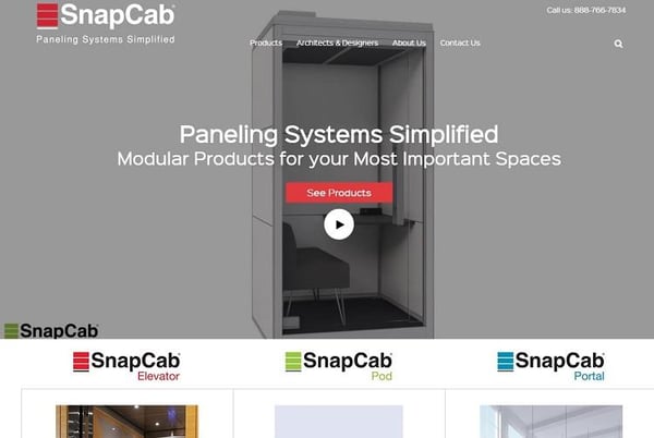
SnapCab sells paneling systems and pods for work spaces. Note how they use a video on their landing page to draw in the site visitor and show the many different ways their product could potentially be used.
The video goes from a pod to paneling systems for elevators to work hubs. You can also click on the play button to see a detailed video with musical accompaniment.
5. Create Excellent Content
Content still matters. Around 67 percent of the process a B2B buyer takes before making a decision whether or not to buy from you is a digital journey.
The better impression you make with your content, the better your chances of turning these buyers into your customers.
Content is so much more than just a good article, though. It includes infographics, videos and even the images you use to highlight your articles.
However, you also have to figure out what needs your typical customers have and how you can answer those needs through your content.
6. Add Beautiful Images
Speaking of images, it is vital that you use brand-specific and professional-quality photos. One study found that content with "compelling images" got about 94 percent more views than content without compelling images.
Your images need to be relevant to the topic at hand and add some value. For example, if you offer a tutorial on how to set up a shopping cart, screenshots of the process add to the overall impact of the content.
Simply adding an image of a grocery store shopping cart adds little value and may even distract from the topic at hand.

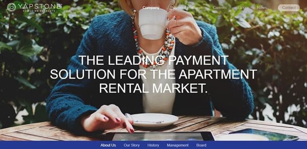
Yapstone uses big, beautiful images that tie into the overall topic. This grabs the reader from the minute they land on the page. In the screenshot above, note how the image is of someone actually using the solution they provide. This shows just one scenario where the service might be used by potential business customers.
7. Know Your Audience
How many times have you heard the advice, “know your audience?” There's a reason this phrase gets repeated so often: it works. Think about your site through the eyes of your typical customer.
When they land on your page, do they know what step to take next? Did you answer the main question most of them have? Did you funnel them to the action they’d most likely take after landing on your page?
The best way to get to know your audience is studying site analytics and polling your current customers. Once you have a basic customer profile, filter everything through the lens of your typical user. This helps with content, design and even what specials you offer and when.
Creating an Amazing B2B Site
The key to create an amazing B2B website is to never stop improving it. If you haven’t updated your site in the past few months, then you’re missing out on opportunities. Consistent changes combined with A/B testing allow your site to improve over time.
In order to truly meet the needs of your customers, you must evolve into a site that gives them a clear path to where they need to go. Your business likely already solves whatever problem the other business has, but now you just have to show them how you solve that problem.


Lexie Lu
Lexie Lu is a freelance graphic designer and blogger. She keeps up with the latest design news and always has some coffee in close proximity. She writes on Design Roast and can be followed on Twitter @lexieludesigner.