The Best Knowledge Base Examples
- 1. Lyft
- 2. Canva
- 3. HubSpot Academy
- 4. Asana
- 5. Rail Europe
- 6. Dropbox
- 7. Shipt
- 8. MailChimp
- 9. Fitbit
- 10. Buffer
- 11. Apple
- 12. Slack
Knowledge bases!
It may sound like a boring topic. Nobody out there describes themselves as the "Michelangelo of knowledge bases," after all. Though if you do call yourself that, please get in touch – we want to meet you!
And yet, with so much information moving online, knowledge bases are more important than they have ever been. With the buyer's journey now guided by the pace decision makers choose, a knowledge base is a powerful central resource.
Just about every enterprise should have a customer-facing knowledge base at the very least. While the concept can and should be extended to internal use, it’s often these public knowledge bases that have the greatest challenges to overcome when it comes to design, interface, and writing.
What Is a Knowledge Base?
A knowledge base is a centralized digital library of information that covers a set of topics related to an organization (such as its products, services, and procedures) in detail. A knowledge base provides your customers with access to important information 24/7, eases the workload of your customer support teams, and allows your customers to self-service.
Knowledge bases act as a central location that holds a host of information where customers or internal users can go to educate themselves on a company's products, services, industry, processes, or organization. They should be well-organized and easy for users to locate the information they need.
Most knowledge bases include information about how to get started with a new product, in-depth information about using advanced features, and answers to common problems and issues.
The Benefits of a Knowledge Base
Let's discuss the benefits of creating a knowledge base for your business.
It Provides Your Customers With Self-Service.
About 70 percent of consumers expect a company to provide self-service tools and 40 percent prefer self-service over speaking with a live person for simple tasks.
Your knowledge base can save your customers the frustration and time they would spend waiting on the phone to talk to someone about a simple problem or request. This, in turn, helps to improve the customer experience and their overall satisfaction.
It Gives Your Customers Access to Knowledge 24/7.
Your customer support team's hours may not be convenient for every customer (or internal user) you have. Providing them with a place where they can find the information they need at any time is a great idea.
It can help to increase their satisfaction and give them the best experience with your products or services.
It Eases the Workload of Your Customer Support.
When you have a knowledge base for all of your customers to find the information they need, your customer support team can spend time fixing more complex issues that may arise.
They can refer customers to certain knowledge base articles that address specific problems, streamlining your customer support process.
How to Create a Knowledge Base
Here is a four-step guide to help you kickstart the creation of your knowledge base:
1. Determine the Focus of Your Knowledge Base.
Before you can begin developing your knowledge base, you need to determine what it will be about and who the intended audience is.
For example, if you're making a customer-facing knowledge base, you might want to try asking your customer support team members about the questions they encounter most from customers to get a good idea about what your focus should be.
You may also ask yourself these questions to help you find your focus:
- Who will the knowledge base be for — internal employees or customers?
- What issues are the most likely to cause confusion or be encountered by my intended audience?
- What aspects do I want my new and existing customers to learn about concerning my products and organization?
2. Select Your Design and Structure.
The design and structure of your site should be organized and have your content displayed clearly like a homepage for support-based content.
Usually with knowledge base pages, you want to create different categories of topics and sort your articles based on which category they fall under. This can help streamline the knowledge base experience to help users find what they need more quickly and easily.
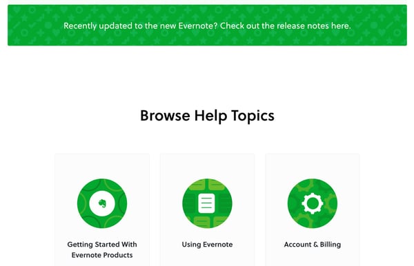
For example, the amazing note-taking app Evernote provides three clear categories with top articles listed below. They even include a search bar so visitors can find what they are looking for easily.
3. Decide What Your Writing and Editing Process Will Be.
Your knowledge base article writing process should be similar to your blog writing process. These articles need strong headlines and helpful instructions. It should also be comprehensive enough for your readers to leave with new information and ideas.
Make sure you know how often you'd like to post on your knowledge base. For example, it can help to make an editorial calendar so you can organize your writing, editing, and posting schedule.
4. Include Visuals That Clarify Your Message.
Knowledge base articles may contain in-depth and technical information. Accompany any difficult-to-understand text with pictures when possible.
For instance, if you are listing steps about how to troubleshoot a product, you may want to include screenshots of each step to help visual learners understand exactly what you are talking about.
You can also add a video for complex topics that need a voiceover or further explanation. Even without audio, having a video that shows where to click can help create a much easier-to-understand "how-to" than just text alone.
5 Tips to Optimize Your Knowledge Base Design
Here are five tips to help you design an effective knowledge base.
1. Write Easy-to-Read Content.
This tip is pretty self-explanatory, but there are some important elements to consider when writing your knowledge base articles.
When people come to your knowledge base, they are looking for answers. Provide them with answers by leaving the fluff and jargon out of your articles. In other words, keep it simple and to the point.
Take time to continuously update your articles to make sure they reflect the most up-to-date information regarding your products or services.
2. Use Data Analysis to Make Your Design Decisions.
If you already have a knowledge base, pay attention to your analytics.
Your analytics provide you with information about which portions of your knowledge base your customers interact with the most. This can help you to get an idea about the areas that may need some additional work.
For instance, you may notice that your customers are bouncing from your main knowledge base page after a short delay. This could mean that they aren't able to find the answers to their questions or that your knowledge base's structure is confusing and difficult to navigate.
Pay attention to your bounce rates and other analytics to help you improve your knowledge base design.
3. Keep Your Ultimate Goal in Mind.
Your ultimate goal should be to help your customers and to provide them with a great user experience. When you go through your knowledge base, ask yourself these questions:
- Does this provide enough information to help customers?
- Once my customers are finished on this page, can they get back to the product page easily?
- Will this answer the customers' questions quickly and clearly?
A new header or article layout may or may not help your customers and make an impact on your analytics. If you believe it doesn't, there is no point in doing it.
If you believe it does, then implement the changes and continue to track it to make sure it provides you and your customers with value.
4. Ask for Feedback.
A knowledge base is a constant work in progress. You may not get it right the first time—and that's ok. Check with your customers to see how they feel about the information you provide and the general structure of your knowledge base.
Make a small pop-up survey at the end of a knowledge base article that asks your customers a few questions, such as:
- Did this article answer your questions?
- On a scale of one to 10, how easy was it to find the answer to your questions?
- Were you satisfied or dissatisfied with the information we provided?
- Why did you read this article?
That last line could be a text field allowing users to more freely communicate the specific issue they were facing that drove them to this article and why they thought that article best aligned with their question or concern.
5. Make Sure It Is Easy to Navigate.
Navigation is a top priority for the design of your knowledge base. The best way to navigate a knowledge base is by using a search bar.
Your customers will usually know what they are looking for when they visit your knowledge base, and the easiest way to find what they need is by typing in their topic in the search bar.
The search bar should be one of the first things they see when they visit your knowledge base. The next thing they should see is a list of popular topics.
Your customers typically have the same questions, and you should do your best to make it easy for them to find what they need.
Lastly, if your customers can't find the information they need, make sure you have contact information for customer support nearby so your customers can get in contact with someone quickly.
The 12 Best Knowledge Base Examples
Let’s look at some of the best knowledge bases around and what you can learn from them.
1. Lyft
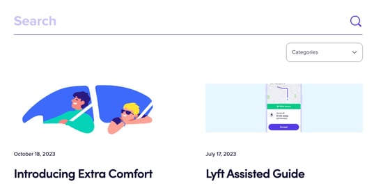
Lyft probably has one of the most famous knowledge bases. The entire structure of the Lyft service and interface is intended to make using it self-evident. When people click over to the knowledge base, they usually have a burning question to deal with.
The Lyft team has questioned how a knowledge base “should” be in two ways. First, there are separate bases for questions riders and drivers – the real power behind the app – may have. Second, the answers are formatted as short blog posts with eye-catching titles and graphics.
The Lesson
- Knowledge bases can be customized for the exact type of user who will need them.
- Presenting your topics as long-form blog posts can help people cultivate their skills.
- Eye-catching titles and imagery will hold users’ interest as they search for info.
2. Canva
Canva is an online graphics design platform that’s become popular among marketers. Many users enjoy its ability to craft banners and digital advertising collateral in a convenient drag-and-drop format. Its toolkit is also versatile enough for designing print materials.
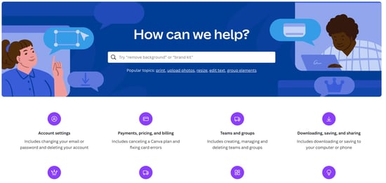
Most users of the Canva software are marketers, not graphic design professionals. As a result, Canva’s knowledge base is laid out in an amazingly effective way that combines nested topics and featured articles, directing people to specific answers as quickly as possible.
The Lesson
- How information is presented should depend on the level of knowledge the user has.
- Users should be able to move deftly from simpler general topics to more complex ones.
- Knowledge bases need to cover things like billing and installation as well as project tips.
3. HubSpot Academy

HubSpot is the maker of the free HubSpot CRM and the originator of all today’s best practices in the inbound marketing world. One outstanding aspect of the HubSpot brand is the way it has cultivated so many different educational resources for marketers and enterprises, which is presented in the form of the HubSpot Academy.
Since HubSpot’s information architects are so attuned to meeting users wherever they are in the buyer journey, this online academy acts as a knowledge base, providing a compilation of many different resources. Its training content spans across a range of videos, interactive demos, and group sessions so there’s a variety of approaches and depth levels.
It's also worth noting that HubSpot's knowledge base for their actual users is an awesome resource. They do an excellent job laying out all the categories for their different products and providing in-depth, informative articles that provide step-by-step instructions about how to use specific tools in the platform.
The Lesson
- A knowledge base doesn’t have to be text only – it can appeal to different learning styles.
- It doesn’t have to be isolated, either: It can lead users to connect with others like them.
- A good knowledge base is interwoven with the other educational resources of your brand.
4. Asana
Asana is project management software that helps teams collaborate better. It’s one of the latest generation of apps that have become popular as sophisticated remote teams have sprung up. Not surprisingly, both project managers and other users need to understand its ins and outs.
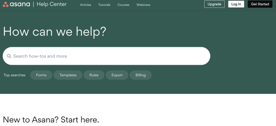
Among the entries on our list, Asana is unique since it deals with inherently complex workflows. It could have been designed in hundreds of different ways, and its knowledge base needs to lay its assumptions bare. With its sleek design, it’s a potent tool for customer onboarding.
The Lesson
- A minimalist, clutter-free design can help people stay focused on the topics at hand.
- Dividing knowledge into broad, sequential topics equips users to teach themselves.
5. Rail Europe

Rail Europe is an app that helps people plan and manage their journeys by train. Although trains aren’t as popular a mode of interstate transit here in the United States, they remain a fact of life for people throughout Europe. Some people even use them for commuting, either within their country or across borders!
This means riders often have to deal with a variety of challenging logistical issues. They could be frazzled, confused, and even lost while standing around in a train station. With this in mind, the Rail Europe knowledge base is built around the unique contingencies of train voyages.
The Lesson
- A knowledge base can be optimized for where it will be used, not just by whom.
- Customized content that pulls from user location data can make things easier.
- It’s vital to understand how users approach a process and where they may trip up.
6. Dropbox
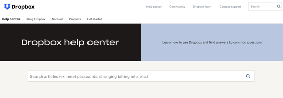
Dropbox is one of the leaders in cloud storage. A pioneer in this area that competes directly with Google for the lucrative enterprise market, its core offerings are remarkably straightforward to use. Its knowledge base benefits from its designers’ deep insight into its user base.
Since there are a few key issues that people can run into while using Dropbox, it can focus on the most likely questions first. It emphasizes the user-friendly nature of the platform by delivering quirky illustrations alongside the information it presents.
The Lesson
- Not all knowledge bases need to have tons of bells and whistles to be effective.
- A “less is more” approach can inform text, layout, and content organization.
- Don’t be afraid to portray your brand using colors, illustrations, and other methods.
7. Shipt
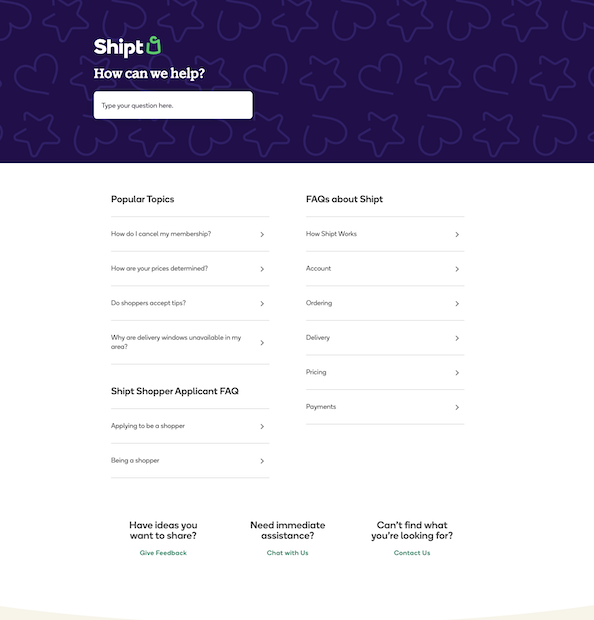
Shipt is a grocery and alcohol delivery app that offers delivery from local stores to a customer's front door. It has a simple, yet effective, on-brand knowledge base that provides several categories for its customers and shoppers to choose from.
Unfamiliar solutions can be difficult to understand at first, and the knowledge bases for these brands must be stacked with information to help their users.
That's why it's great that Shipt covers the basic FAQs on their knowledge base page, using headlines like "How Shipt works."
They even offer the option for users to give them feedback under the subheading "Have ideas you want to share?"
The Lesson
- Don't assume your customers understand the ins and outs of how your product or service works, even if they have a membership or have owned your product for several months. New questions and problems may still arise.
- Asking for feedback is always a good idea to help you improve your knowledge base.
8. Mailchimp

Mailchimp is a company that helps businesses conduct email marketing campaigns. They integrate with many hosts to help streamline the email marketing process.
They have a great knowledge base that lists their most relevant topics first with a search bar right above it. It's simple to navigate and lists out exactly what will be in each article on the left side of their post. Below their most popular help topics, Mailchimp provides a series of video-based tutorials to help walk users through various tasks and common issues with their solutions.
Their writing is clear and concise, providing highlighted notes that feature important information so their customers don't have to go searching for it.
The Lesson
- Make sure to give readers a summary of the information in your articles so they know if they are in the right place.
- Use small steps in lists to break up information so it is easier to follow and understand.
- Video content can be incredibly useful for walking new users through the basic steps of using your product or service.
9. Fitbit
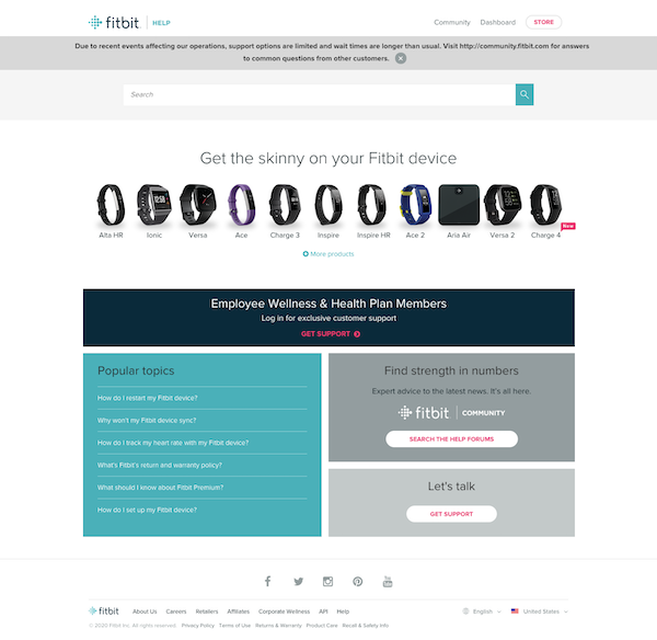
Fitbit is a well-known company that provides smart fit bands that can track exercise, sleep, and other functions to make healthy lifestyle changes fun. This knowledge base has a community feel that encourages people to get involved in help forums.
This is a great approach to a knowledge base because customers are discussing how to use the products amongst themselves with the presence of a Fitbit moderator.
Fitbit also has an excellent design that shows the most popular topics first and provides options on the right for individuals who are still interested in speaking to one of their customer support agents.
The Lesson
- There is more than one approach to a knowledge base – consider building a community where customers interact with each other.
- Give your customers options for how they'd like to receive information.
10. Buffer

Buffer is a software application that allows users to schedule posts for social media and engage with their audience from one place. In addition to having a search bar clearly shown across the top of the help center, Buffer also provides 15 categories of topics ranging from "Getting Started" to "Best Practices."
This makes it easy for their users to find what they are searching for since the articles are segmented by topic categories. Visitors have two options on the Buffer knowledge base homepage that allow them to submit a request for more help if they can't find what they need.
The Lesson
- Define your menu items clearly.
- Use categories for your articles that make it .
11. Apple
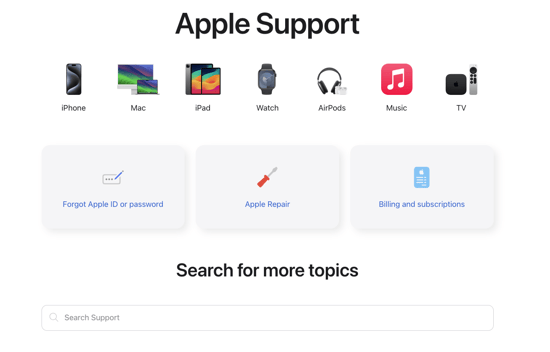 As a company, Apple is the master of making easy-to-use products. So, it shouldn't be a surprise that they made a top-class customer-facing knowledge base.
Their Apple Support page provides quick access to a range of support articles sorted by specific products like their iPhones, Mac computers, iPads, Apple Watches, and more. A search bar and support videos are also included to help users find the information they want even faster.
For users who want that personal touch, there's also a space to sign up for free user sessions at their nearest Apple store where they can learn about new software and device features.
The Lesson
- If your company offers multiple lines of products, separating your knowledge base topics by product type can help funnel users to the most relevant content quickly.
- Creating tabs on the main support page leading to top FAQs about your products and services is also a good idea.
- Leveraging brick-and-mortar locations for tutorials and live support can be a massive differentiator for a business in the digital age.
12. Slack
 Slack is a communication app for organizations that empowers people to collaborate and communicate quickly and effectively even while working remotely. Slack's help center provides tutorials, troubleshooting tips, and general information about the platform for users of all skill levels.
Below the main search bar, users can find a set of six help categories with articles detailing the process for getting started on Slack, using the app's more advanced features, managing profiles and preferences, administrating workspaces, connecting other tools to Slack, and even tutorial videos. There are even a couple of quick "Slack Tips" right on the help center page addressing frequent questions and providing solutions to issues that users might not have even anticipated they would need.
The Lesson
- Quick tips on the help center can be a good way to communicate easily-missed features of your product or service.
- A simple, easy-to-follow layout can help your knowledge base shine.
- Providing quick links to your most-viewed articles in a "Featured Articles" section can help your users find answers to their top questions more quickly.
Putting together a knowledge base can take a lot of time and effort. Still, they can cut down on hours of confusion.
Plus, you’ll save work for both your customers and your teams. In some cases, you can even help convince leads that your solution is right for them by proactively answering their concerns through your knowledge base.
Knowing how to design and deliver information is essential for anyone whose business is driven by online traffic. That’s never more obvious than when it comes to knowledge bases.
There’s one simple way to make them easier: Put yourself in your reader’s shoes and prioritize their needs. They’ll thank you in how they use your work.


Douglas Phillips
Former military brat, graduated from Leilehua High School in Wahiawa, Hawaii in 2001. After earning my Bachelor's in English/Professional Writing, took on a job as a writer here at Bluleadz.