Today marks an exciting moment in the history of Bluleadz. After six months of hard work, we’re finally launching our new website in coordination with a complete rebranding of the company.
It’s taken a lot of long days at the office (multiple offices, actually) and sleepless nights to get to this point, but I couldn’t be more excited to see it all come together now.
When our previous website went live two years ago, it was…okay. Given the limited resources we had to dedicate to the project, it looked about as well as we could have expected, but no one was ever really satisfied with it.
When we settled on the location of our new office overlooking the beautiful waters of Tampa Bay, we decided it was time to give Bluleadz a bit of a refresh.
So we changed everything.
New Location. New Branding. New Website.
Of course, we probably didn’t appreciate at the time just how difficult it would be to undertake a rebranding while building a new website. Most of the website design couldn’t even begin until we’d finalized the new logos and assets.
Armed with the power of final decision making authority, I pulled our talented designers together to start banging out ideas.
We wanted the new branding to have a fresh look, something that suggested movement and agility to represent our approach to inbound marketing. That led us to favor curves and rounded edges rather than straight lines and circles.
Since our new office overlooks the water, we also found ourselves drawn to a lighter, more diverse color palette than we’d used in the past. (Check out some of our new views below)
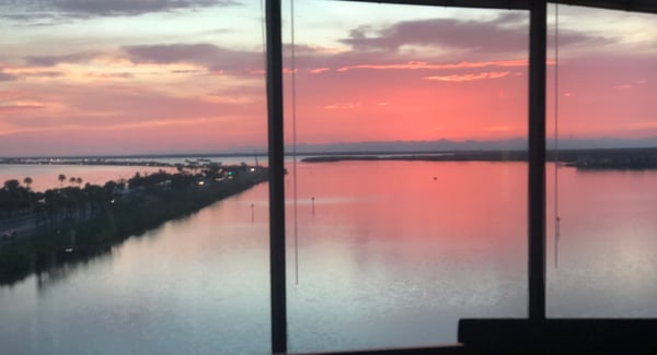
Sunset 🌅

Beach Bar 🏖️
Lighter, faster, and free flowing. Exactly the qualities we wanted to convey.
After finalizing the new logo design and the associated branding, we proudly presented the results to the rest of the Bluleadz team. While the new look had its fans, I’d be lying if I said everyone loved it at first glance.
I get it; change can be hard sometimes. There were some tense discussions along the way. It’s one thing to know you have the power to make the final decision, but it’s quite another when the person you might be overruling is the CEO of the company! 🤦🏻
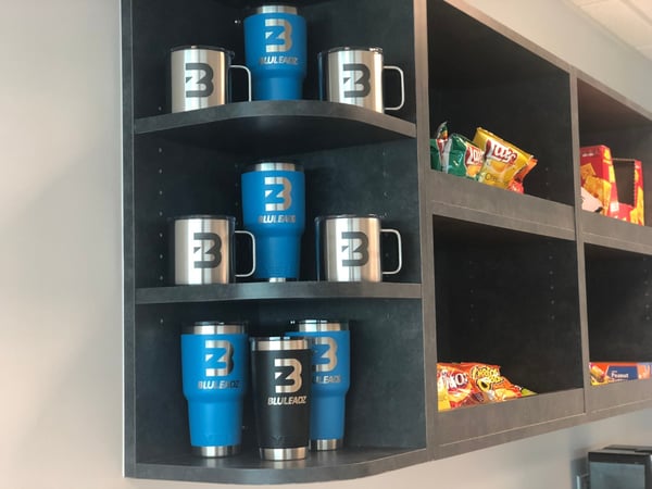
After the initial shock wore off and everyone got to have their say about the new look, the Bluleadz team started coming around. They recognized what we were trying to accomplish with the rebranding and embraced the change. Generous amounts of swag in the form of new Yeti’s, coffee cups and laptop stickers certainly didn’t hurt!
Once the branding redesign was completed, we got to work building the new website. From the very beginning, we knew we wanted the site to be more user friendly and designed with our key buyer personas in mind.
We’d learned a lot since Bluleadz started back in 2009, and we pulled out all the stops to create an innovative, cutting edge website that would reinforce our place as a leader in the industry.
One of the challenges of building a website is remembering who you’re building it for. We had a good idea of what our potential customers look like, which allowed us to construct an interface that allows them to find the information they’re looking for in a logical fashion.
There were plenty of disagreements along the way, though. Not everyone agreed with every design decision, but we could always come back to the question of what our target audience would want.
In the end, everyone got to have a say in the process and because of that, we were all able to set our egos and opinions aside.

The new site has a simplified approach to navigation that emphasizes iconography rather than square tabs or intrusive buttons. We made a conscious decision to stay away from the static blocks and circles found on many websites. Everything needed to flow, bringing a sense of movement and life to each page.
Since our website is in many ways our first and best chance to make an impression on potential clients, we wanted to make sure the new site showcased everything we can do for them.
Everything was designed and built in-house by the Bluleadz team. Since video has become so much more important as a marketing tool, we incorporated it whenever possible to bring that extra level of personalization to the site.
Fortunately, we had no shortage of clients who were willing to record testimonials about how much they loved working with us!
It always bothered me that our old site didn’t feature feedback from our clients, so it was great to finally give them a chance to talk about the great things we’ve accomplished together.
Now that the new website is live and we’ve rolled out the new Bluleadz branding, we’re already looking ahead to building upon successes and making continuous improvements.
While the launch is in some ways the culmination of a long process, it’s also the beginning of a new phase for Bluleadz as a company. We’re excited for the future and looking forward to doing awesome work for our clients!


Rob Steffens
I am the Director of Marketing here at Bluleadz. I'm a huge baseball fan (Go Yankees!). I love spending time with friends and getting some exercise on the Racquetball court.