We’ve all experienced those sites where you have to scroll to the right and left because the content doesn’t fit in the device screen.
These websites are an absolute pain to navigate, which makes for a terrible user experience. If you’re like most people, you’re quick to leave these badly designed sites.
There’s an easy solution to this problem, and it can resolve a lot of headaches – for you and your site visitors.
It’s time to invest in responsive web design.
What Is Responsive Web Design?
Responsive web design focuses on the design and development of a website responding to user behavior and environment. It’s based on what platform the user is on, the size of their screen, and the orientation of that screen.
This is a major focus in the current area of mobile devices, as many websites are often designed for desktop viewing. However, when users visit the site on their mobile devices, the appearance of the website does not adjust to fit the smaller screen.
The purpose of responsive design is to solve this issue by ensuring elements of your site respond accordingly when it’s being viewed on different sized devices, including tablets and smartphones.
Why Responsive Web Design Is Important
Responsive web design can have a myriad of benefits for your business, and you should know about what to expect when you invest in this important development upgrade.
Let's run through the reasons why this modern web design is essential:
More Flexibility and Easier to Manage
First and foremost, responsive web designs come with an increased amount of flexibility, making it much easier to make and manage changes.
Responsive web designs allow you to make updates to your website without having to tap on the shoulder of a developer or designer to make big changes.
SEO Benefits
A few years ago, Google’s search engine switched their crawl preferences to favor the structure of mobile-friendly sites over desktop designs.
That means that your SEO – and thus your SERPs rankings – are largely impacted by how user-friendly your mobile site is.
If your desktop website doesn’t translate well to a mobile screen, this seriously impacts the overall user experience, and you’re likely to end up with a hit to your SEO as a result.
Cost Effectiveness
With a responsive web design, you only need to manage one site that fits seamlessly across multiple devices.
This saves you from having to pay for separate desktop and mobile friendly sites, as all of it is condensed into one. Essentially, your costs get cut in half.
Better User Experience
The quality of user experience (UX) you provide can have a huge impact on your business, and a bad website will really push away visitors.
In fact, 57 percent of internet users say they won’t recommend a business with a poorly designed mobile website.
You need to look professional and deliver a positive experience for all visitors, no matter what device they use to access your site.
Aspects of Responsive Web Design
So what exactly constitutes a responsive web design?
There’s a few elements that go into a website on the development end that are required in order for it to be considered “responsive.”
It's Built on a Flexible Grid Foundation.
The “grid” of your website determines the sizing and framework of elements such as columns, spacing, and containers like text boxes and images on your site.
When your website has a flexible grid foundation, these elements are set to automatically adjust based on the device and screen size used to view your website.
If you’re a developer/designer, you can write your own code for your website grid. But for the rest of us, there are many tools available that provide ready-made grid systems for websites.
Images Should Be Flexible.
Put simply, flexible images resize to fit onto appropriate screens, like when you watch a movie and the opening credits say, “This film has been modified from its original version. It has been formatted to fit your screen.”
However, if your website is image-heavy, having flexible images can slow down your page load speed, which impacts your user experience and even your SEO.
The alternative to this is to use CSS to crop your images to fit on smaller screen sizes, rather than rescaling all of them. This is a useful solution for websites that may incorporate lots of high-resolution images.
Different Views Must Be Enabled in Different Contexts for Media Queries.
Media queries are a feature of CSS that allow your website to be adaptable to various screen sizes, for any “media.”
This is the last essential puzzle piece necessary for developing a fully responsive website.
Responsive Web Design Examples
To help you better understand the concept and spark ideas for your own company’s website, we’ve put together a list of responsive web design examples for you to take a look at:
KlientBoost
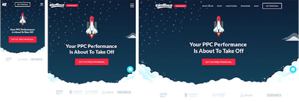
Apart from the fact that having a rocket ship on your website is awesome, KlientBoost’s responsive design works well on all devices.
You’ll notice that the menu becomes condensed into a dropdown on smaller devices, and the main image becomes appropriately cropped.

Source: Invisionapp
The Boston Globe
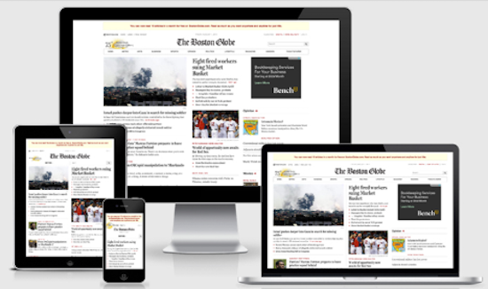
As traditional media has made the transition to the digital world, outlets have had to adapt to these changes.
The Boston Globe is a perfect example, and responsive web design is an incredibly important part to making news accessible to their readers on all devices.
The main change is that columns get cut down from three, to two, to one depending on the screen size. This allows for an uninterrupted stream for their audience.

Source: Telepathy
Change.org
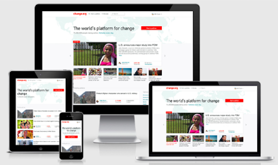
Change.org is an online platform in which people make and sign petitions to take action in the world.
Notice how drastically the web design changes from device to device – while the background image of the world map remains uncropped, the format of the featured stories change dramatically.

Source: Telepathy
The primary difference here is that you go from being able to scroll horizontally throughout the stories on desktop devices, to scroll vertically on mobile devices.
As scrolling is almost always a vertical motion on mobile devices, this responsive design has been made with the mobile user in mind.
Change Your Website With the Tides
Responsive web design is soon to be the norm of the internet.
As search engines adjust to further favor mobile sites and people constantly adjust their browsing habits, your website will either need to adapt to the changing tides or risk falling behind.
Technology is fast moving, and there’s never been a more relevant time to say “adapt or die.”
Audiences quietly demand responsive web design from businesses, and it’s time for your company to get on board.


Claire Cortese
I am a content creator here at Bluleadz. In my free time, I enjoy hugging dogs, watching reruns of The Office, and getting sunburnt at the beach.