No matter how hard you work to make your blog engaging and high-quality, it’s inevitable that some of your subscribers will choose to opt out of receiving new blogs from you.
When it comes to lead generation, unsubscribing is an action that marketers try to avoid at all costs. After all, it means losing the ability to keep sending new materials to the prospect—impacting the chances that they'll convert to customers later. Sometimes, though, it can’t be helped.
Maybe the user has lost interest or their pain point has already been resolved. Perhaps they never meant to subscribe in the first place. Maybe they just want to unclutter their inbox so they don't wake up to 100+ unread emails every morning.
No matter the reason, you should try putting forth one final attempt to keep them in your email list by sending them to an unsubscribe page.
What Is an Unsubscribe Page?
An unsubscribe page is a web page that opens when a user clicks on the unsubscribe hyperlink at the bottom of an email or other electronic communication.
The purpose of the page is to confirm that the user wants to opt-out of your mailing list. It’s your last chance to convince the subscriber that they should stay a part of your mailing list to keep receiving value.
What Not to Do on Unsubscribe Pages
When you’re trying to keep someone from walking away, there’s a long list of things you shouldn’t do. No tantrums, no arm pulling, no swearing, etc.
This still stands when it comes to unsubscribe pages. Here’s a list of "don'ts" to be mindful of when building your company's unsubscribe page.
Don’t Use One-Click Unsubscribe Buttons.
This can lead to all sorts of trouble for you. If the reader can easily just scroll to the footer of your email, hit “unsubscribe,” and be removed from your list, then you’re missing the whole point of trying to salvage your relationship.
Make sure the button leads to an unsubscribe page where they can confirm the cancellation of their subscription.
This also helps avoid unfortunate accidents where the user accidentally hits the link and has no way of undoing the mistake. Think about it: We've all been scrolling something on a mobile phone, only to accidentally trigger a button press or hyperlink as we scroll at least one time. Don't let that misclick lead to missed opportunities!
Don’t Require Form Submissions.
You’re not wrong to ask for feedback on why the user is looking to unsubscribe. It can be a great idea to build an exit survey or pull together data on the matter.
But by no means should you make it mandatory. Requiring prospects to fill out a form just to follow through with unsubscribing is a bad user experience and can push them even further away from your brand.
What hope do you have in trying to win them back if you’ve annoyed them?
Use a polite, short survey that they can complete quickly and honestly without interrupting their day. But more importantly, let them skip it if they don’t have the time or motivation to complete the exit survey.
Don’t Make People Log In.
This can work against you pretty quickly if your users don’t remember their login information. Instead of going through the process of trying to recall a password, they’ll just resort to marking it as spam.
This is an act you want to avoid if at all possible. When your messages are marked as spam, your email deliverability rates are negatively impacted. How so? Being flagged as a repeat offender lets email providers know to start immediately sending your messages into users’ spam folders.
Don’t Send an Unsubscribe Email.
This is a bit counterintuitive, don’t you think?
The user is asking to halt emails from your business, so it’s a bit smug to send a final one. It can come across as a bit petulant or spiteful. Also, it potentially adds to the frustration of the prospect—making it seem as though you're ignoring their wish to stop receiving communications from you.
How to Keep Users Subscribed: Using the Unsubscribe Page as an Opportunity
Of course, the unsubscribe page is meant to give you a shot at changing the user’s mind about leaving. Here are a few tips on how to encourage your subscribers to stay with you:
Offer the Chance to Re-Subscribe.
It happens. Someone might not mean to hit the button or they’re still on the fence about it.
Help tip the scales by presenting a “re-subscribe” button after final confirmation. You may be able to recapture those who were hesitant about walking away from you forever.
Always give the user a chance to turn around and change their mind.
Offer Frequency Options.
In the instances where a user doesn’t necessarily want to cut ties with your brand, but they’re tired of receiving daily emails, allowing them to customize their frequency is the best way to go.
A frequency downgrade will lessen the rate that you enter their inbox while keeping them in your email list. You can offer them different options, like:
- Weekly emails
- Bi-monthly emails
- Monthly emails
- No emails
Offer Personalization.
If you send out regular newsletters, then this is a pretty unique way of getting your subscribers back on the same page.
Allow your subscribers the opportunity to pick and choose what type of content you send their way. Sometimes the problem is that they’re receiving content that they don’t want or can’t relate to.
Let them pick and choose what they want in their inbox. Whether they only want to get breaking news or to exclude a specific subject, give them a chance to piece together their ideal list of email inbox notifications.
Offer the Chance to Keep In Touch Other Ways.
Even if they don’t want you in their inbox anymore, unsubscribing doesn’t necessarily mean that they want to disassociate from your brand entirely.
Oftentimes, a user will likely still do business with you even if they’ve elected to no longer receive your email messages. They’ll want to keep up with any new arrivals or sales going on.
Make sure that you include links to your social media accounts on the page so that they can follow you and stay in the loop. It keeps them updated and gives you an opportunity to stay engaged with them.
You could also allow them to opt into receiving SMS text messages in place of emails for special offers and discounts—but that requires a very specific and clear opt-in to avoid text messaging compliance regulations like TCPA.
12 Great Unsubscribe Page Examples by Category
Need a little inspiration for making the perfect unsubscribe page for your brand? Whether you want to build something simple and to the point, funny and engaging, or just plain extraordinary, one of the following examples is sure to inspire!
Simple Unsubscribe Pages
You don't have to be super fancy with your design and development when it comes to your unsubscribe page. Sometimes keeping it clean, neat, and painless is the best way to go.
Here are a few examples we found of some great simple unsubscribe pages:
Yankee Candle
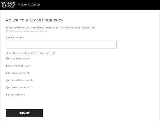
Yankee Candle keeps it pretty short and sweet. They offer the chance to update frequency and even how many emails you want in that time frame. There aren't a lot of frills to it to distract the user.
Bonobos
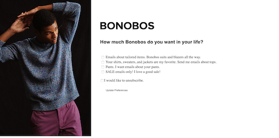
Another great example of offering frequency options, Bonobos works to keep subscribers on their lists with some light humor and a simple page.
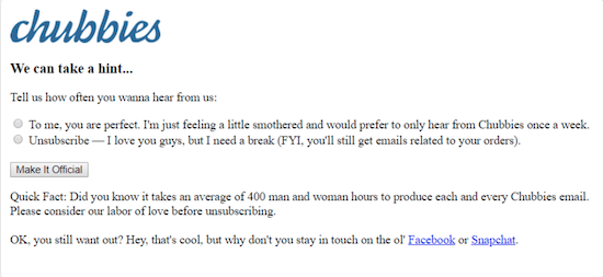
Chubbies
Source: Send Pulse
Chubbies offers only two options, making it easy to make a decision: decrease email frequency or unsubscribe entirely. Their little "quick fact" may seem a bit like a guilt trip, but it works for them since it's clearly hyperbolic humor.
Drop
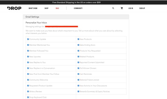
Drop is a company that offers all kinds of goods from boardgames to keyboards, plush toys, novelty dice, and so much more! From practical everyday items to purely decorative nerd stuff, they have a bit of everything. To keep customers apprised of the latest items that fit their interests, they deliver tailored emails to subscribers to see what piques their interest.
They also have a fairly simple and unadorned subscription management page. If someone clicks on the "Manage your email preferences or unsubscribe" link in one of their emails, they'll be taken to a page where they can pick and choose what kinds of notifications they receive in their inbox, or opt out entirely with a single button press.
Busch Gardens/Adventure Island
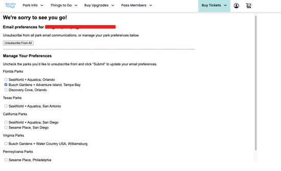 Busch Gardens/Adventure Island likes to keep their unsubscribe page simple looking while giving customers plenty of options for customizing their interactions with the brand.
On their unsubscribe page, you get a quick message expressing regret at your leaving the mailing list, a button to immediately unsubscribe from all communications, and then some options for managing which parks you receive communications for. This gives customers a chance to change which parks they receive notifications for without unsubscribing if they want (while subtly promoting park locations that might be closer to them if they move to a new state).
Stardock
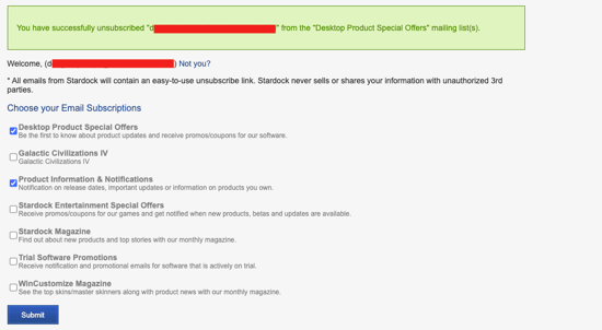
Stardock is the videogame company behind titles like "Sins of a Solar Empire" (a personal favorite!) and "Galactic Civilizations." Their unsubscribe page is very simple and unadorned, but gives users a chance to customize the notifications they receive from the company with ease.
This page, while plain, shows that you don't need a lot to make an effective unsubscribe page.
Funny Unsubscribe Pages
You can tickle your subscribers' funny ones and use a bit of personality to change their mind.
BarkBox
Source: Impact
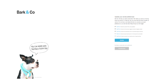
Who doesn't love a cute pup? BarkBox tries to pull on your heartstrings with an adorable dog and a clever blurb. Users can choose what content they want to unsubscribe to rather than removing themselves from the email list entirely.
Groupon
Source: YouTube
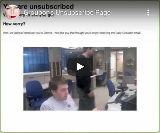
Groupon redirects you to a page with a gif of a man named Derrick when you click to unsubscribe. It's a clever way of humanizing the experience. Even if they commit to unsubscribing, they'll at least leave with a laugh.
charity: water

Source: Vimeo
charity: water has a similar spin as Groupon in using media to keep users onboard. Subscribers are offered the chance to either unsubscribe or douse the CEO of the non-profit with water.
Creative Unsubscribe Pages
For those who want to take a more branded approach, there are some stellar pages that reflect just how creative you can be when dealing with unsubscribers.
Free People
Source: HubSpot
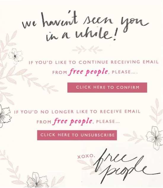
Free People takes a unique approach where they reach out to users before users come to the conclusion to leave on their own.
The clothing company monitors email open rates and if they see that a user has been routinely disengaged, they send a note following up on the user's interest.
Puma
Source: HubSpot
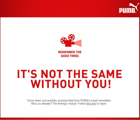
With a light play on emotional marketing and a button leading to re-subscription, Puma makes sure to communicate how much they value their users.
Sidekick
Source: HubSpot
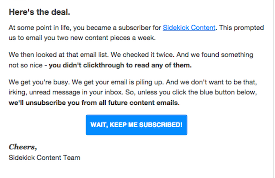
Similar to Free People, HubSpot's Sidekick content blog collects data on who is viewing their material and who isn't. They raise a hand to subscribers to make sure that they're actually interested in their content.
It's a great way of re-engaging subscribers who may have just been a bit busy and also for freeing up space in their email lists.
Unsubscribing from emails isn't something you can avoid, but you can work to redirect it. As marketers, we all know how important those workflows and email campaigns are to our business.
Salvage as much as you can with a well-crafted unsubscribe page and have fun with it!


Douglas Phillips
Former military brat, graduated from Leilehua High School in Wahiawa, Hawaii in 2001. After earning my Bachelor's in English/Professional Writing, took on a job as a writer here at Bluleadz.