Advertising spreads brand awareness. Digital advertising spreads brand awareness across the internet and on all the top social sites.
And, with over 56.1 percent of the world's population on the internet and 45 percent on social media, that's a lot of freaking brand awareness.
One aspect of digital advertising is display advertising. Basically, it's those pesky little ads that appear on websites and apps you're on. But, while pesky, they can also be highly effective for your company.
Display Ads: The Basics + Examples
Like most of digital advertising, there is a lot to say about display ads. Knowing the essentials will help you better understand why you should incorporate display advertising into your digital advertising strategy.
So, here's a breakdown.
What Are Display Ads?
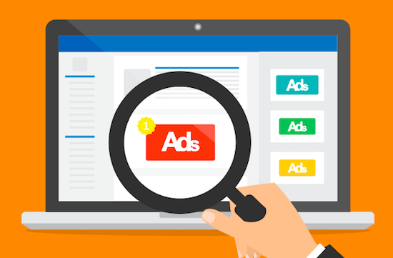
Display ads, also referred to as banner ads, are a form of pay-per-click advertising that appear on different website or apps. They are run through the Google Display Network, a collection of sites that agree to place display ads on their website.
With the Google Display Network on your side, your business has a lot of opportunity to put your brand in front of millions of people. In fact, the Display Network appears on over two million websites and 650,000 apps!
Display ads can reach up to 90 percent of internet users worldwide, but luckily, you can target a custom audience to reach those most interested.
Benefits of Display Advertising You Should Know
You Can Re-Engage Past Visitors.
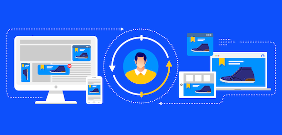
Want to reconnect with visitors who’ve been to your site before? Seems creepy, but remarketing is actually a great and subtle way to refresh their memory about your brand and hopefully bring them back for more.
So, yes, remarketing is the reason why you keep getting ads from websites you were just on.
You Can Reach New Audiences.
Setting up targeted display ads allows you to not only reach out to past visitors, but they can also promote your brand to potential customers who may not have found you in a traditional manner (i.e., search).
You Will Build Brand Awareness.
When all is said and done, putting your name out on the internet can help spread your brand awareness to the people that will actually be interested in you – it's a win-win in our book.
It Can Increase Traffic to Your Site.
With a strong design and powerful call to action, your display ads are sure to bring more traffic to your website, which can even help you generate new, qualified leads to start prospecting!
What Makes an Effective Display Ad?
Simple, Yet Appealing, Design
Clutter is confusing – make sure your design is clean and simple, yet don’t just plaster a boring picture and pop in some arial text.
Use bold colors and fonts that match your branding, and choose a design that will capture their attention as they scroll about their day. It’s kind of like window shopping; make them want to stop and admire.
Bold Call to Action
 What is the point of advertising if you forget to include a call to action? Give your audience a reason to stop what they’re doing and click on your ad.
Every effective display ad will have some sort of call to action on it – words like shop now, download now, purchase day, 50% off, etc. are a few options that typically work wonders to drive clicks.
Redirects to the Right Landing Page
When people click on your ad, they’re expecting to be taken to exactly what they were offered. If you advertise for 50% off purses, you best be sending them to your purse page. If it’s a downloadable offer, take them to where they can download it.
Whatever you do, don’t give them false hope and redirect them to the wrong page. That’ll leave a bad taste in their mouth, which can negatively impact their experience with your company in the future.
Precise Ad Copy
The general rule for display ads is that your ad copy should only take up to 20 percent of the overall design – the rest should be left for the graphics and call to action.
With attention spans getting smaller and smaller, you don’t want to force your audience to read a novel on a small little ad on the sidebar of the website they’re on. Give them what they want, and give it to them quickly.
The 4 Main Types of Display Ads
It's a little tricky to explain the types of display ads available to you, well, because one ad can fall under two (or more) "types" at once.
But, to educate you a little better on what types of display ads are possible, here is a brief overview.
1. Static Ads
These are your most basic ad types. Static ads are designed to fit in a specific ad space you create it for.
Static ads can be sized in various different sizes in many different locations, but the top-performing sizes tend to be:
- 728x90: Best above the main content (the "leaderboard")
- 300x600: Allows more space for messaging and visuals (the "half page")
- 300x250: Can be embedded in text blocks, on sidebars, or at the end of articles (the "medium rectangle")
- 336x280: slightly larger version of the above (the "large rectangle")
2. Responsive Ads
Responsive display ads will automatically adjust size, format, and look in order to fit any available ad space.
With responsive ads, you can include the same information as any other ad, including a headline, description, image/video, and company logo, and Google will optimize your ad’s look depending on the space provided.
3. Animated Ads
Animation is the perfect way to attract more eyes to your advertisements. Animated display ads use motion and video to create more appealing content for an audience. Just keep in mind these requirements:
- They must be 150 KB or smaller.
- They can't be faster than 5 fps.
- An animated ad can be looped, but only 30 seconds at a time.
4. Smart Ads
Smart display ads are the only type of display ads you can't actually control because Google automates everything for you. With smart ads, you'll leave Google to automate your bidding, targeting, and creation.
Wait – so you don't even make your own ad?
Yes, that's correct. Similar to responsive ads, you will note your headline, descriptions, images, and other elements to be included, but Google will automatically optimize it for the ad space available.
5 Ad Examples We Adore – and 2 That Could Be Improved
Image Variety: Stitch Fix


Two different ads, two different styles.
Stitch Fix, a personal style service, does an excellent job of using multiple images in their ads. So, when you see one pop up on the side of your screen, you can experience an entire new style of clothing – this shows how much variety Stitch Fix can provide you if you choose their services.
The headline is short and punchy, and the simple "Get Started" CTA in red stands out against the gray box near the bottom. Doesn't it make you want to get started?
Clean Cut: Jeep

 Ok, so Google knew I've been searching for a new Jeep for a while, so of course hundreds of Jeep ads would find their way in front of me.
But, I have to say, the way they designed their interactive ad for both a horizontal and vertical ad space is great. The colors perfectly suit their brand style guide, and each tab (reputation, capability, and design) highlights a different shot of the 2019 Grand Cherokee.
Plus, with a double CTA available, you have the option to search the available inventory in your area or build your own. Talk about a tailored user experience!
Bright and Vivid: Adobe

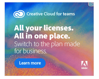 I'm a huge Adobe person, so it's no surprise that I would also love their ads.
A bright, colorful background image immediately catches your eye, while the simple white text features a clear hierarchy from the headline to the description text.
Simple and Sleek: Chipotle

Did you know Chipotle now delivers? Well, now you do.
According to our PPC specialist Corey, lifestyle images work best in advertisements. And, with this high-quality image of an employee cutting up some fresh chicken, it sure does entice me.
With such a simple message – their message of a new delivery option – the food joint opted to keep their ad simple with a bolded "We Do Real" headline. And we think it works.
Captivating Video: vineyard vines + Target
This banner ad featuring the limited-time vineyard vines collection at Target is truly captivating. The video on the left highlights multiple products in use, and they make that beach party look like a grand old time.
The ad is sure to include the arrival date to hype up their audience for the release, and they even provide a simple CTA to let them explore the collection for themselves.
Missing a CTA: Progressive
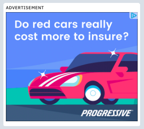
I love Flo, the Progressive lady in all the ads. But, I have to say, this ad could have done more.
Without a call to action, you aren't quite sure where you'll be taken when you click on it. The cartoon-like graphic is great and I'm a big fan of the slightly muted colors, but I just wish they would have told me what to expect.
Going in Blind: Ron Jon Surf Shop

Living in Florida, it's no surprise that I would see some sort of beach-related advertisement when surfing the web. And, it just so happened to be surf-related during my surf.
But, what's the offer being advertised? You don't want to leave people guessing – the offer is what entices them to click on the ad in the first place. Without stating what the offer is, it might not get as much action.
When you understand what display ads are and have a clear goal in mind for yours, you're well-prepared to drive big results. Keep these best practices in mind to execute an awesome display advertising campaign!

Baylor Cherry
Baylor is an inbound specialist for Bluleadz. As a native Floridian, she enjoys soaking up the Florida sun, buying clothes she can’t afford, and dreaming about one day owning a dachshund.