Your website is like a digital introduction of your company to the world, so the first impression is everything. The more appealing your website is to your audience, the more they will want to engage with your company.
Having an unappealing website design can create a negative image of your company and drive away visitors within seconds.
In this day and age, user experience is one of the most important factors to consider when designing your website, so it’s essential for you to implement elements that will attract and engage your site visitors.
When it comes to considering these important elements, parallax scrolling is one of the most popular components in the web design world right now.
What Is Parallax Scrolling?
Parallax scrolling is a special web design element that involves visual effects to create the illusion of depth on a website.
With parallax scrolling, background images move slower than foreground images as you scroll down a webpage, creating a 2D effect.
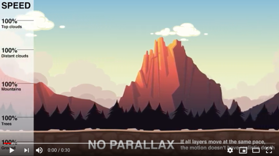
Here’s a quick video to show you the difference between a page with and without the parallax effect:
In the video, you see the difference in pacing of layers in motion within the context of game backgrounds. The video shows how when all layers move at the same pace, there is no realistic depiction of depth.
However, when the layers closest to the viewer move at a faster pace than the background layers, you can see the difference in how realistic the depth feels.
In the video, these background layers are the trees, mountains, and clouds, and they move at a slower speed than the ground, which is the layer closest to the viewer. This is a great example of seeing parallax scrolling in action.
The Benefits and Disadvantages of Building a Parallax Website
Parallax scrolling is one of the hottest elements of web design right now, and there’s a reason for it. But while the parallax effect can have a lot of benefits, it also has a few drawbacks. Let’s take a look at the pros and cons of having a parallax website design:
Pros:
- It creates a pleasing, natural, and fluid movement within an otherwise static, inanimate space. This creates a dynamic user experience and engages site visitors, which in turn means that they will spend more time on your page.
- The parallax effect can actually generate SEO benefits; Google favors websites with longer sessions, so keeping visitors on your page for as long as possible works to your benefit.
- It can draw attention to CTAs and forms.
- The fluid movement of the parallax effect lends itself well to storytelling, creating an ideal, dynamic space for you to share the story of your brand or product.
- Implementing the effect emphasizes the professionalism and creativity of your company. A well designed website is a respected website.
Cons:
- Parallax scrolling isn’t necessarily great for mobile use. It can actually slow down your site on a mobile device, so it’s often recommended to remove the feature from your mobile site altogether.
- The design doesn’t lend itself well to content-heavy websites, and that can actually end up hurting your SEO.
- Older browsers, such as Internet Explorer 8, have a difficult time processing the parallax design.
- It is possible to overdo it. Don’t go parallax crazy; otherwise you’ll risk making your website complicated and confusing to the user. It’s important to have the right balance. Without balance, it will be distracting.
The Best Examples of Parallax Websites
Still not sure about parallax scrolling? Check out these websites that use the parallax effect in unique ways to benefit their company.
Storytelling: Porschevolution
Porschevolution uses the parallax effect to optimize their ability to tell a story, diving into the evolutionary history of the Porsche, all the way from the 1930s up to the present day.
Each decade displays a different model and provides a brief description of the car, which delivers a fun, interactive user experience. The cherry on top is the sneak peek into the future. The page displays 2020s with the new model in the shadows, where it says, "Tradition Future. Since 1963."
This gets the visitor excited to see what the future model looks like. What also makes this website so impactful is the audio experience. Each decade plays snippets of popular music styles that encapsulate the corresponding decade.
The user enjoys a journey from the past to the present, with an exciting glimpse into the future.
Interactive Product Promotion: Urban Walks
Urban Walks is an app that provides custom interactive walking tours of NYC for users. The parallax effect helps to emphasize the accessible, interactive, and user friendly nature of their tours, making it the perfect design for their site.
Another noteworthy element of this site is the interactive iPhone screen in the middle of the webpage. When you hover over it, the CTA button animates, where it says, "Download for iPhone." This CTA sends the visitor to the App Store to drive downloads.
Plus, visitors can click and drag the map on the right side of the iPhone. As you drag over the map, within the iPhone screen, you can see popular destinations and dotted lines on the streets, denoting urban tours that are available.
This interactive element of the website imitate the experience you can enjoy if you download their app and use it.
These little details make a big difference on the user experience – it helps visitors see themselves using their app.
Fun and Promotional: Spokes Pedicab Rides
Spokes Pedicab Rides offers a green solution to the lack of available parking and public transportation in specific areas: pedicab rides!
Their cartoon style, in combination with the parallax effect, entertains site visitors and holds them on their site for a longer period of time, not only improving their SEO rankings, but likely procuring more customers as well.
As you scroll, the animation leads to informative text boxes, explaining what a pedicab is and what the company does. These text boxes fit into the parallax effect perfectly, delivering an informative, engaging user experience.
When you consider your audience and the current website experience you offer, do you see how parallax scrolling might fit into your design? This design element can take your entire website to the next level.


Claire Cortese
I am a content creator here at Bluleadz. In my free time, I enjoy hugging dogs, watching reruns of The Office, and getting sunburnt at the beach.