So, you just released an awesome new offer on your website – a new ebook, whitepaper, guide, etc. Now, you’ve got to get the people to click through, convert, and get it for themselves.
But how can you make sure that it’s a done deal? Have you ever noticed visitors landing on your offer landing page only to fall off without ever downloading anything?
This can be a serious problem, because if you can’t keep the visitor on your page long enough to see what you have to offer, then you lose business. Bounce rates can vary widely by industry, but the principles for improving your rate are quite simple and have to do with the effectiveness of your landing page.
There are a few things your landing page should always have and a few things you should stay clear from in order to encourage and boost conversions.
5 Necessities For Your Landing Page
1. Fast Loading Speed
One of the best things you can do for your landing page – and your website in general – is to improve the speed at which your page loads.
For example, the average mobile user will only wait six to 10 seconds for a website to load before bouncing away. The slower a page loads, the higher your bounce rate will go.
Amazon is well known for its rapidly loading pages. No matter what page you visit on Amazon, it will pop up in mere seconds. Even though it has a lot of different elements on its landing page, it loads quickly.
2. Conversion Funnel

Strong landing pages also have a strong conversion funnel. The user is funneled directly to where the business wants them to go without too many distracting elements. You must decide what the purpose of your landing page is so you can guide users toward that purpose.
Also, remember that each step in the funnel should have that narrow focus. You don’t want to take them from your landing page to a long list of additional choices. Each page should guide them to the next step clearly and firmly.
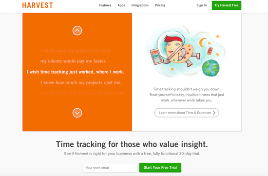
Harvest offers an example of a narrow funnel and focus on its landing page. The image and call to action (CTA) button draw the eye. The CTA words are an action as well: “Try Harvest Free.”
In addition to offering that clear funnel, the site also has “Try Harvest Free” in the upper right corner. That tab is boxed to set it off from the rest of the navigation.
3. Lead Capture Form
A major goal in landing page design is to collect information from your visitors in return for your content. “Gating” your content on landing pages allows you to gain more knowledge on who your visitors are, who they work for, what they do, and more.
It’s a good idea to set up smart forms that will ask different questions to an individual if they download more than one piece of content. They’ll get what they want, and you’ll get even more details on them; it’s a win-win.
4. Great Headline Copy

Headlines are one of the most important parts of your page. They are typically the first thing a user will see and read when landing on your page, setting the tone for the entire page and telling the reader if they’ve landed where they wanted.
A strong headline can also stand out in search engine results as the user scans the top list of results to figure out which site to visit. Great headline copy for your landing page is a must.
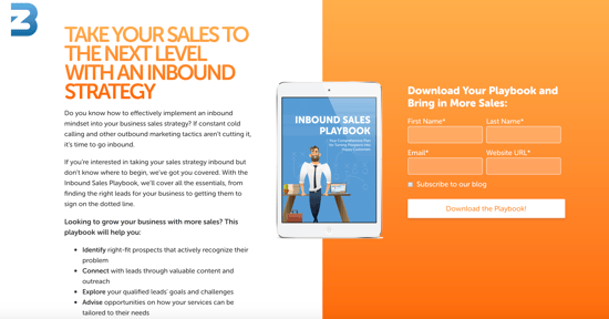
Here at Bluleadz, we always try to write quality landing page headlines that are meant to draw the reader in. In this example, you can see the title, "Take Your Sales to the Next Level With an Inbound Strategy. Once enticed, visitors have the opportunity to read a brief description about the offer they are about to download.
5. Compelling Visuals
When was the last time you found yourself on a website page that didn’t have at least one image, video, or other graphic?
Probably 10 years (at least for us anyways!) – which just proves how important strong visuals are in any website design.
A strong visual should always support your content on a landing page. It can add emotional appeal to an otherwise stagnant site page; it can display the product you’re offering, illustrate what the offer will teach the user, and more.
Don’t limit yourself to only images, either. Experiment with video and even GIFs on landing pages to add movement and animations to your landing page. Adding these punches of action can easily keep a user engaged.
4 Things to Avoid on Your Landing Page
1. The Kitchen Sink
One thing your landing page should not have is everything and the kitchen sink. In other words, your landing page should not be cluttered.
Your purpose and focus should be narrowly tailored to the specific offer on the page so the visitor is funneled directly where you want them to go.
We know it can be tempting to show visitors every single amazing thing your site has to offer, but this can just create confusion. Visitors might grow frustrated and leave your site.
2. A Navigation Bar

This one gets overlooked a lot, but it really can negatively impact your clickthrough and conversion rates.
When you offer up the option to leave your landing page, someone may actually take you up on it. A navigation bar is an easy access point off your landing page.
While it’s important to include navigation on every other website page, avoid using it on your landing pages. Removing it will clean up the overall design and provide a clear path to that lead capture form and amazing offer your visitors want. Don’t let them leave that easily!
3. Stock Images
Companies have gotten into the habit of using generic stock images, which can look nice, but these aren’t the best choice for your landing page.
If you can help it at all, it is much better to feature your own work, your own products, or, at a minimum, an image of your company headquarters. The more personal you can make the images on your landing page, the more visitors will relate to your company.
In addition, you don’t want your page to have the same image as another page, which is a real possibility with stock photos. And, as mentioned previously, you want to make sure your photo properly relates and supports the content and offer on the page – we aren’t so sure all those cute puppy stock photos do that.
4. Multiple CTAs
If you truly understand the purpose of your landing page, you don’t need more than two CTAs – and even those two should be toward the same purpose.
Some sites try to throw in every potential conversion scenario. They will offer a free book, a special sale offer, content, something fun, and on and on. This is not conducive to getting the visitor to where you want him to go.
Instead, keep that focus narrow and use a single CTA and goal for your landing page. This will give you the highest chance of actually converting your prospects. If you have other goals, create additional landing pages. You can never have too many!
Know Your Purpose
When it comes to your landing page, your first step should be to figure out what the purpose of that page is. If you don’t fully understand the purpose of driving traffic to that particular page, then you may wind up with a lot of missed opportunities.
Know what your purpose is and where you want your customers to go, and then design every element on that landing page to point the site visitor toward that conversion goal.
Editor’s Note: This post was originally published in January 2018. It was updated in December 2018 for accuracy and comprehensiveness.


Lexie Lu
Lexie Lu is a freelance graphic designer and blogger. She keeps up with the latest design news and always has some coffee in close proximity. She writes on Design Roast and can be followed on Twitter @lexieludesigner.