Best Business Fonts for Your Logo
- 1. Big Caslon
- 2. Zefani
- 3. Museo Sans
- 4. Indigo
- 5. Oxigen
- 6. Neo Sans
- 7. Steak
- 8. Boomerang Script
- 9. Baltica
- 10. Futura
- 11. Coves
- 12. Rockwell
- 13. Helvetica
- 14. Beckman
Your logo is the crown jewel of your brand, right? It's what you'll put on all of your collateral, from beer koozies to email signatures. And to get the perfect logo, all you need is a neat image!
Well, not exactly. You're missing a piece of the puzzle if that's all you think it takes to create a memorable brand logo.
You also have to consider what type of business font you want to use.
Why Business Fonts Matter
We're not joking when we say that you should take picking a font for your business very seriously. They're not just there for casual aesthetics.
Fonts have the power to reflect your brand's identity, personality, industry, and so much more.
Unfortunately, you don't have the same autonomy for your brand in picking the coolest WordArt effect as you did for your fourth grade science project. (Here's looking at you blue wave effect.)
Instead, you need to consider a more comprehensive list of elements to make sure that your messaging aligns with the rest of your branding.
And then you want to make sure it's pretty.
Elements of Modern Logo Fonts
There's a bittersweet nature to just how limitless the options are when it comes to logo and font pairings. You're truly only restricted by your own imagination (assuming you're in line with what works in your industry).
Thankfully, if you examine certain trends in contemporary logo fonts, you may be able to identify what will work the best in your favor.
Here are some key elements of modern business fonts today.
Serif or Sans Serif
The everlasting battle between these two font types is legendary. Honestly, in our opinion, one isn't better than the other. You have to pick whichever is going to match your brand's identity best.
Do you want the more official looking "feet" of the serif font family? Or are you a bit more casual and find sans serif styles more appealing?
Only you can decide which aligns with your brand's personality, but it is something you should be conscientious of.
Shape
This element requires you to examine your logo graphic in relation to the font.
There's a lot of visual communication that comes out of a logo, and you want that messaging to be clear. So making sure that your graphic and typography work together is important.
Does your logo's graphic rely more on circles, ovals, and curves? You'll want to look at font styles that follow those same lines. The same goes for logos that feature harsh angles, squares, and spikes.
The goal should always be to have something unique and creative, but considering how your font choice compares or contrasts with your graphic's shape and design can make a big difference.
Size
Playing around with the size and weight of your fonts can always give insight into just how dynamic your logo can be.
And depending on your brand, that can be a good thing or a bad thing.
If your brand's style guide is composed mostly of subtle, delicate touches, then you'll want to steer clear of large, bold fonts. And the same goes for the opposite end of the spectrum. A rock band probably shouldn't rely on a thin, cursive font.
Readability
Hands down, this is the most important element on this list.
Nothing else matters if no one can read your business font.
It doesn't matter how cool your font is, it has to be legible. Your logo is one of the main visual elements of your brand that people will remember and associate your business with.
If all they can recall is a jumbled collection of shapes, they're not going to know what to do with it, let alone be able to search you on Google for solutions to their problems.
15 of the Best Logo Fonts
Now, we could try to cover every potential business font choice available, but then this blog would never actually get published because it'd just keep going, especially since new fonts are developed all the time.
Instead, we'll go over some of the most unique logo fonts in different industries that will certainly stand out from the rest of the crowd.
Business
Whether you're a marketing firm or an insurance agency, there's no shame in giving your logo a bit of flair with a cool font in your logo.
1. Big Caslon

Source: Typewolf
A revival typeface from the Caslon group of serifs, this font is a great choice for those who want a more classic style that's adapted to occupying digital spaces. A bold serif font, Big Caslon brings a lot of contrast to a log.
2. Zefani
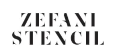
Source: Dafont Free
A gorgeous stencil font, Zefani exhibits an aura of luxury and strength. With bold lines and a pretty hefty weight, you'll definitely be making a statement with this one.
3. Museo Sans

Source: Dafont Free
Based off of the popular Museo font, Museo Sans is an easily legible option that highlights more geometric lines and spacing.
Manufacturing
Manufacturers have a reputation for being pretty rigid and technical. While that may be true to the nature of your work, you can still display some personality in your font choice.
4. Indigo
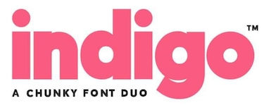
Source: Envato Elements
Indigo is a chunky font that implies sturdiness and strength. A bit more of a creative choice for the manufacturing industry, but that's why we like it. You can flash some style while still appearing solid.
5. Oxigen

Source: Envato Elements
This font looks pretty prestigious. Viewed as a minimalist logo font, any brand will stand out as top-of-the-line with this choice.
6. Neo Sans

Source: Dafont Free
Returning to the more classic, understated roots of most manufacturing logos, Neo Sans leans into the sans serif aesthetic with curved corners and friendly energy.
Food
The food industry is where brand aesthetics get really creative. Your logo can be just as innovative and colorful as your latest culinary masterpiece.
7. Steak
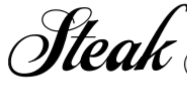
Source: MyFonts
Handwritten or cursive fonts are pretty popular among food brands, and Steak is no exception. For some bold, quirky action, pick this option for a more handmade feel.
8. Boomerang Script

Source: Envato Elements
A more modern take on handwritten fonts, Boomerang Script is a fun font option for alcohol or cafe logos. It's definitely not an option for a high-end restaurant, but if you own a great hangout spot, this font will definitely make customers feel welcome.
Travel
Most travel companies follow a more professional, straightforward look when it comes to fonts. Here are some pretty neat options that fit the bill, but still push the envelope a little.
9. Baltica

Source: MyFonts
Businesses in the travel industry (automobile manufacturers, airlines, etc.) should want to be perceived as trustworthy and reliable. Baltica accomplishes that goal with lean lines and a slab serif base.
10. Futura

Source: Futura Free
An incredibly popular font choice, Futura has been used by the likes of FedEx, Swissair, and other large companies. The font brings a geometric, modern finish to any logo. Perfect for any brand.
11. Coves

Source: Behance
An elegant, minimalist design, Coves' simple curves invoke a sense of peacefulness and tranquility, which is exactly what customers are looking for when they make their travel plans.
Technology
Modern tech companies have adapted to taking on cooler, more dynamic business fonts that communicate the nature of their work.
12. Rockwell

Source: Free Fonts Family
Rockwell is a robust font that comes in several different weight styles. Perfect for branding, its simple shapes make it easy to read and ideal for any tech agency hoping to communicate ease-of-use.
13. Helvetica

Source: Fonts.com
Bear with us here. Helvetica isn't exactly a rare or underused font, but it is a great choice for businesses in the technology industry. It's simple, straight forward, and communicates control and reliability.
14. Beckman

Source: Envato Elements
For something a bit more futuristic and cool, Beckman looks like it came out of a Ridley Scott film. There's no mistaking what industry a company bearing this logo font is in.
There's so much to consider when curating and building your company's brand identity. From color palettes to logo designs to even deciding what business fonts to use.
Thankfully, there are plenty of options out there that you can pull inspiration from. Remember to be creative with the process and create something truly unique to your brand.


Micah Lally
I’m a Content Writer at Bluleadz. I’m a big fan of books, movies, music, video games, and the ocean. It sounds impossible to do all of those at the same time, but you’d be surprised by the things I can accomplish.