A website is your opportunity to showcase your business to the world.
Highlighting the features of a physical product is relatively easy. However, showing potential customers the advantages of a service requires a bit more creativity and focus.
According to Internet Live Stats, there are around 1.8 billion websites. With 4.7 billion internet users, you're competing for the attention of leads with a massive number of businesses. While your direct competition might consist of only a few other companies, you still have to grab people's attention and keep them on your page.
8 Tips for Creating Effective Business Services Pages
If you’re ready to create a business services page that converts visitors into customers, here are eight essential best practices to consider.
1. Know Your Customers.
You’ve likely heard this advice over and over. If you don’t know who your typical customer is, it’s challenging to send a message they want to hear. So research your buyers. Figure out their age, income range, gender and other demographic factors.
Once you have a few basic facts, dig into what drives them toward your type of service. What are the psychographic elements of your buyer persona? What are their pain points? What pushes them to seek a solution in the first place?
Once you understand your user, it will be much easier to create a services page geared to their needs.
For example, you could examine your most popular services and highlight them in a hero image at the top of your business services page. You could then let users click on the call to action (CTA) button to learn more about any of the services listed.
2. Find Your Voice.
Every business has a unique personality. What is the mood you want to set when people purchase one of your services?
The same tone should be readily apparent on your website services pages. Your voice must align with the buyers’ personalities. If your clients are serious-minded, a joking demeanor may not go over well. Either change your target audience or your business attitude.
3. Highlight Your Unique Value Proposition (UVP).
What is your unique value proposition? What makes you stand out from all the other providers of the same service in your area?
Figuring out what makes you different helps you determine your marketing tactics and how you present your services on your website.
Look at your competitors' websites. Once you figure out their UVP, you can come up with something even better for yours.
Is there a service you can offer that no one else does right now? Look for ways to make your customers’ lives better.
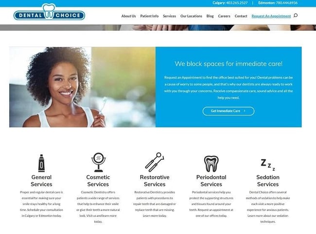
Dental Choice lists out all their different services. However, they also do a fantastic job of highlighting their UVP on their homepage. They share that they block out time for those who need an emergency visit.
If you scroll down, you'll also see a quick recap of other services they offer, including cosmetic, restorative, periodontal, and sedation for anxious patients.

4. Create Separate Landing Pages.
Most businesses have more than one buyer persona. Look at the different types of consumers who visit your pages. Is there a better way to direct them to just the information they need?
You want to keep your landing pages laser-focused. When a person lands on your website, they should get the info they need immediately. While you can’t hit the mark perfectly all the time, you can certainly improve your odds and conversions with more specific audience targeting.
5. Include Reviews.
According to BrightLocal's Local Consumer Review Survey, 82 percent of consumers read online reviews before choosing a local business for their needs. Showcase your business services on your websites through the eyes of the user. Share a link to reviews, or allow customers to post their own thoughts.
Almost Heaven Auto Repair includes a widget on the screen’s right side showcasing reviews about their auto repair service shop. They invite you to share your thoughts by clicking on the box. Users can also read the thoughts of others about their services. They also highlight a few testimonials on their home page.

6. Share Enough Details.
When you buy something, you probably want to know as many details as possible before parting with your money.
Think through all the questions people typically ask before signing up for your service, and answer those queries upfront. Share enough details for the user to know what they are getting and how much it costs.
7. Make Booking Easy.
While some site visitors need convincing, others will have heard about your company through a referral. They may be ready to book an appointment. Make it as simple as possible for them to connect with you.
Put your phone number near the top of the page. Make it mobile friendly so that someone on a smartphone can simply tap the number and call. Include a link to book an appointment online.
For example, say you're an A/C repair company. You could add a CTA button users can click on to book an appointment for a service. You could also add a shadowed box at the top of the page with your phone number and a CTA reading, "Call us now!" If you made the phone number clickable, that could make the site more user-friendly.
8. Add Content.
When people first visit your site, they may not know much about your business.
Spend time creating content that defines what you do and how you stack up to the competition. Utilize articles, videos, and customer input to showcase what you do best.
Don’t Overlook Good Website Design Principles
While the content of your services pages is important, don’t forget basic design elements such as how fast your page loads, the aesthetic value of the design, and an excellent navigational hierarchy. Your site should offer a great experience and be easy to use for even a novice internet user.
With a little intentional effort, your services pages will help you book appointments and grow your business in no time.


Lexie Lu
Lexie Lu is a freelance graphic designer and blogger. She keeps up with the latest design news and always has some coffee in close proximity. She writes on Design Roast and can be followed on Twitter @lexieludesigner.