The work of every marketing team can be broken up and compartmentalized into different topics or categories, and each presents its own set of obstacles.
One of the greatest challenges they face is driving traffic to their site, and then converting those visitors into leads. Compared to other concerns, HubSpot found that it leads by a long haul.
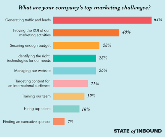
Source: HubSpot
And in order to instigate that conversion, every marketer needs to leverage calls to action (CTAs).
What Is a Call to Action (CTA)?
A CTA is a statement or direction designed to instigate immediate engagement from whoever is reading it.
Typically, you’ll see them at the end of a sales pitch in order to let a lead in on their next steps if they’re interested in the offer. It may seem like an assumed behavior, but CTAs are an extremely important part of the sales process.
Why Calls to Action (CTAs) Are So Important
Calls to action serve both the potential customer and the marketer in a variety of ways.
Guide Visitors Based on Need.
If you have a clear CTA for every offer, then there won’t be any chance that a visitor will wind up looking at content outside of their interest or intention.
They’ll be able to easily find content that excites and appeals directly to them, and your CTA will help them dig even deeper into your offer, leading to a sale.
Ensure Value in Every Offer.
As marketers, we all know the importance of new content. Whether it be blog posts, videos, ebooks, or beyond, there’s a demand for information and engagement. But keeping all of it value-based and relevant can be a challenge.
Attaching an appropriate CTA to the piece can help you keep the content aligned with your overall marketing plan. It’ll ensure that you’re attracting the right audience and converting your ideal clients.
Avoid Customer Confusion.
For consumers who may have a harder time identifying their needs or where they should go next, a clear call to action is a lifesaver.
It can eliminate any confusion surrounding what next steps are or what value they’ll be getting from engaging with your offer.
8 Types of CTAs and Where to Use Them
CTAs are relevant at every stage of the buyer’s journey and sales cycle. Especially as your business grows and becomes more complex, they become incredibly useful tools in emails, blog posts, and more.
There are several different CTAs that you can leverage for different purposes.
1. Product or Service Direction
Your products and services are what make the magic happen, so it only makes sense to have some CTAs directing visitors to content about them.
You’ll usually want to put a noticeable button in a sidebar on your homepage or at the bottom of a pricing page.
2. Lead Generation
CTAs are critical to generating leads, so you’ll definitely want to place some on your high traffic website pages.
Some of the more popular spots for them to live are on blog posts. They can exist as a button at the end of the post, in the sidebar, or even in the middle of the content.
3. Form Submission
In order to actually register as a lead, though, your visitors will need to fill out a form and click a button to submit their info. That submit button is a CTA living at the bottom of the form, but it should call for more than just “submit.”
Trade that basic order for something more direct and actionable that will entice your visitors to engage.
4. Lead Nurturing
These CTAs are meant to set the hook when it comes to leads you’ve been able to generate interest in. By enticing them with an offer that’s aligned with your products or services, like a demo or a guide, you can bring them even closer to a sale.
These work best on pages that you know a lot of visitors head to, like blogs or thank you pages.
5. Read More
Anywhere that you have a populated content feed, you’ll likely want to crop its display on the homepage to save space.
But that shouldn’t keep visitors from being able to access your content in its entirety. A “read more” CTA will guide them to an individual post by featuring the first few lines of content.
6. Social Sharing
Incredibly customizable, social sharing buttons are a non-intrusive way to get your audience to engage with your brand offsite.
By placing them on relevant pages, you can direct visitors and leads to share your content on their social channels or visit your own through social CTAs.
7. Event Promotion
Using a CTA is a great way to promote any event your business may be hosting, both online and in-person. You can make registration easy with a button directing your audience to a sign-up form. It can live anywhere, from the homepage to blog sidebar.
8. Sale Closing
For leads nearing the decision stage of their buyer’s journey, they’ll be looking for a means to act on their decision. Make the next step simple by providing a sales-focused CTA directing them to your sales team or their online basket.
How to Create Calls to Action (CTAs) That Convert
Developing unique calls to action aren’t as difficult as they may seem. Since there’s a ton of software available to help with customization, following the steps to creating CTAs has become easy. Here are some best practices to keep in mind:
Incorporate a Sense of Urgency.
Including a phrase like “limited time only” or “low inventory” will compel your visitors to act quickly rather than get distracted or take on a non-committal attitude.
Make Sure They’re Noticeable.
The most successful CTAs do a great job of attracting attention to themselves through vibrant designs and strategic placement. Use contrasting colors or large font sizes to draw a visitor’s eye.
Present Their Value Clearly.
Don’t present a vague offer. Your CTAs should be direct about how visitors will benefit from completing whatever task the CTA is calling for.
Utilize Actionable Phrases.
You’ll want to use exciting words or phrases that encourage engagement and immediate action. Some of the more popular choices are:
- Buy now
- Try for free
- Learn more
- Join us
- Sign up
Be Conscious of Sizing.
Both the length of the text and the size of the button or image should be kept pretty small. Keep the phrase under seven words, and make sure the design is large enough to be legible, but not take up half the page.
The Best Call to Action (CTA) Examples We’ve Seen
Taking notes from the best is always encouraged, so we looked for some of the most unique CTAs on the market right now.
Officevibe

Located at the bottom of their homepage, Officevibe did a great job with their service invite CTA. It's pretty large in design, but that's pretty low impact when you factor in its spot at the bottom of the page.
The text is short, clear, and pretty low commitment, offering a demo and free use to the user.
Backlinko
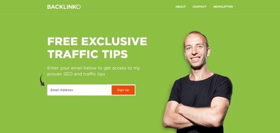
Note how Backlinko adds a simple arrow icon pointing to the form field to get users to sign up for marketing tips.
The purpose of the landing page is gathering leads via a mailing list, and the focus turns toward converting site visitors to subscribers with that one black curved arrow.
National Ticket Company
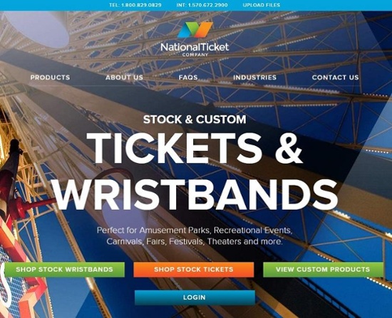
National Ticket Co. does a good job choosing just the right action verb to drive CTR.
The words "Shop Stock Wristbands" makes it clear what happens when a user clicks on the button, but the word shop is a bit unusual, so it grabs attention.
However, it is also an action verb, instructing the user about what the next step is.
Whistle
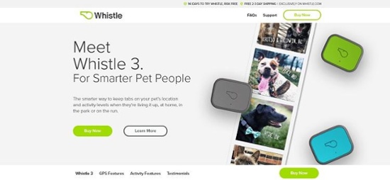
Source: Whistle
Whistle uses a button in the shape of an oval, which contrasts with the square and rectangular elements on the page.
Even though there is another button, it fills in the CTA with a solid background and gives it a bright lime green color to grab the user's attention.
It's clear what will happen when you click on the button – you'll be taken to a page to purchase the GPS pet locator.
Square
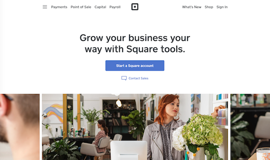
Square is another company that excels at leveraging direct calls to action. Their homepage begins with a single sentence detailing exactly what their services will provide: business growth.
With that knowledge, their visitors can either immediately begin the process of starting a Square account by pressing the blue button or learning more by contacting sales.
Simple, straight to the point, and so very easy.
Paying attention to each and every detail in the CTA is imperative. To really discover which will work best for you, practice in A/B testing. You'll be able to refine them over time and test new ideas.
With a little time and effort, your CTA buttons will create higher conversion rates than ever before.


Micah Lally
I’m a Content Writer at Bluleadz. I’m a big fan of books, movies, music, video games, and the ocean. It sounds impossible to do all of those at the same time, but you’d be surprised by the things I can accomplish.