When it comes to using data effectively, email marketing has some huge advantages.
You can send out thousands of emails in a single afternoon and start getting responses right away. With that in mind, email can teach you more about how your prospects think than almost any other approach to digital marketing. You’ll learn fast and apply those lessons just as quickly.
Depending on the volume and frequency of your email blasts, you can raise email conversion rates in a week. In as little as one quarter, you can learn a tremendous amount about what works for your audience. Instant feedback isn’t just efficient – it also makes things lots of fun.
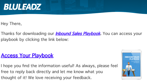
The secret is the A/B test, also known as the split test.
In an A/B test, some subscribers gets one version of an email message while the rest receive a second version. The difference between the messages is small: Usually, just one noteworthy tweak, so you can be sure that fluctuations in conversion rates are attributable to the change.
Once you’ve run a single A/B test, the more effective version of the message becomes the “control.” In a future mailing, another tweak will be made in an effort to beat that control’s results, and so on and so forth. Theoretically, you can do a test every time you send a mailing.
What email A/B tests can you implement fast? Start with these:
1. Headline or No Headline?
Before you start trying out a dozen snazzy headlines, you should ask: Do I need a headline at all?
A lot of split tests will focus on you testing out conventional marketing wisdom and seeing if it applies in your situation. In this case, a stellar headline usually converts better than nothing.
However, some campaigns have shown outstanding results when they drop the headline entirely in favor of the vanilla “(no subject).” Why does it work? Maybe some people just can’t pass up a good mystery. We may never know the exact answer, but an A/B test lets us observe its effects.
2. Greeting or No Greeting?
Here’s another one: Ask 10 savvy digital marketers and most will probably tell you that first name personalization is one of the most powerful customized details you can throw into any message.
And yet ...
Some messages, campaigns, and even brands as a whole might capture better results with no personal greeting. A greeting establishes a one-to-one connection, which is great for authors or entrepreneurs but might not ring true in other cases. Authenticity is key, but it doesn’t sound the same for everyone.
If in doubt, test it out!
3. Images or No Images?

Images are a divisive subject in email marketing. Since so many emails are opened on mobile these days, tons of companies stick with plain text to go light on their customers’ data plans. On the other hand, HTML can create beautiful, fully branded messages that look just like a high quality flyer.
The best approach here is to start with just one lead image. If your testing reveals that people prefer an image to plain text, then you can start iterating and find the image that resonates the most. One test will always lead to more tests ... and more testing means higher conversions!
4. Short Message or Long?
What’s the ideal size for an email message? Well, what is the length of a piece of string?
While the general rule is to go longer for blog posts and shorter for email and social media, this won’t always hold true. The characteristics of your audience and the subject matter will always play roles, so test out different messages in increments of 50 words or so.
5. To P.S. or Not to P.S.?
The P.S. is a mainstay of marketing writing that has been around since the early days of direct response.
The basic idea is simple: People will skim down to the bottom of a message and look at the P.S. since it’s the final piece of text – it stands out from the rest.
While a P.S. is almost universally recommended on a landing page, it might be out of place on an email. If you do discover that a P.S. is better, you have a whole lot of exciting work ahead of you: Finding the perfect postscript in ten words or less is a mighty challenge.
6. Traditional CTA Button or Hyperlinked Text?

It’s easy to take for granted that a CTA button is indispensable: It’s bigger, more colorful, and harder to overlook. In some cases, though, the clean simplicity of hyperlinked text might appeal to users more or work better on the mobile display. It’s another toss-up you should validate with data.
Remember, every message should have a call to action: How to present it is the tough part.
7. Preview Text or No Preview Text?
The first sentence in your email generally appears as preview text before it is opened.
While you can’t know exactly how many words show up for each user, the concept offers rich optimization potential. Sometimes, a preview that cuts off mid-sentence is an irresistible cue to click and resolve that mental cliffhanger.
Two Minutes to Better Web Marketing Results? It’s More Likely Than You Think
Click your favorite stopwatch app and you’ll see each A/B test above takes only a minute or two to set up.
No matter which you pick, you’ll be on your way to better results than you had yesterday. Digital marketing is a marathon, not a sprint, and testing helps you keep the pace steady.
By the time you go through all seven of these options and verify a conversion-driving winner for every one, you could be adding thousands to the bottom line. With testing, you deliver revenue impact and provable ROI all in one convenient, trackable package.


Rob Steffens
I am the Director of Marketing here at Bluleadz. I'm a huge baseball fan (Go Yankees!). I love spending time with friends and getting some exercise on the Racquetball court.