10 A/B Testing Tools
- 1. Google Analytics and Google Optimize
- 2. Optimizely
- 3. Hotjar
- 4. Unbounce
- 5. Kissmetrics
- 6. Crazy Egg
- 7. Five Second Test
- 8. VWO
- 9. Omniconvert
- 10. Convertize
Whether it’s a novel, a painting, a movie, a business mogul, or world champion, we have a tendency to look at a final product, see success, and feel envy or wonder at how it was achieved. We tend to view success as one swift movement, a series of actions that provided win after win.
Logically, however, many of us know that’s not the truth. As any successful business person, artist, or athlete will tell you, success comes with failure. Remember Sunkist Natural? Likely not.
Success means taking risks. In other words, successful individuals, teams, and businesses test, evaluate, and test again until they meet with success. However, that doesn’t mean uncalculated risks.
Your website is no different. With so many elements working in conjunction to bring you the results and return on investment (ROI) you’re after, indecision over which version will be most successful shouldn’t plague your redesign or update efforts.
In fact, you can and should test whether your chatbot appears on the left or the right, whether your CTA should be sticky or not, or which email sign up form gets the most subscribers. A/B testing, when done properly, can provide valuable insight into what features will garner the best results.
What Is A/B Testing?
A/B testing, or split testing, compares two versions or two elements of a webpage or app against one another to determine which performs better.
It’s really not that much different than any other experiment, which includes:
- Variables: Typically one to two webpage/application elements
- Hypothesis: How you think they’ll perform
- The actual experiment: Showing the different variants to different users at random
- Analysis: Using metrics and data to determine which element performed better
Running A/B tests takes the guesswork out of website optimization. As more businesses shift to data driven decision making, your website should be no different. Make site or application changes based on real information and use that information to drive future changes and improvements.
Benefits of A/B Testing
As noted, the primary benefit of A/B testing is to determine, for a particular element, which version will achieve the results you desire. However, using A/B testing comes with several additional benefits.
Bounce Rates Reduce.
If you’re regularly analyzing site analytics, one metric you may be paying attention to is a page’s bounce rates. If you’ve invested time in site design and content development, seeing a high bounce rate is disappointing, at best.
That’s where A/B testing can help. While optimizing the page is the most obvious solution, determining, through testing, which methods work best is the smart way to go about it. Monitoring the metrics of the updated version of the page will reveal which elements earn more engagement, more time on the page, and fewer visitors bouncing.
Conversion Rates Increase.
If bounce rates are decreasing and engagement is increasing, the end result is, typically, to see conversions increase as well.
It’s pretty easy to see, through A/B testing, what elements your audience is responding to and engaging with. Testing provides the opportunity to experiment with content, layout, design, and more while receiving real data on how your audience responds to those changes.
Analysis of that data should reveal what your audience wants. Delivering those elements means you’re likely to see a spike in conversions since you're providing value.
Identifying Opportunities Is Easier.
Optimization is the key to website success. There are so many tools available to assist in the optimization race that identifying opportunities for improved engagement will become much easier. Pairing any of those tools, like heatmaps, with A/B testing will provide a clear picture of what's getting a response and what isn't.
There Are Fewer Risks.
Anyone involved in change management can tell you how receptive to sweeping changes those in control of resources are (hint: they’re not). Major site redesigns and revisions cost time and resources, so approaching changes with a strategy and data-driven decisions is the best route to go.
A/B testing provides valuable insight into visitor behavior and engagement metrics that minimizes risk. You’re essentially ensuring, through the testing, that the changes you make will have maximum impact and provide an ROI.
What Should You A/B Test on Your Website?
Technically, you can A/B test just about anything on your site from the fonts, colors, and logos to site modules and elements like forms.
While it can be fun and informative to test some of the smaller elements on your site, if you’re looking for the elements that drive your leads and build your business, you’ll likely want to start there first.
Whether you're trying to lengthen user session times or increase email newsletter subscriptions, here are some of the most common website elements that have a direct impact on ROI:
- Forms
- CTA buttons
- Overall website design/concept
- Web copy
- Product info and images
- Pop Ups
- Email marketing templates
- Email subject lines
Because all of these elements influence your sales and revenue, running an A/B test helps ensure they’ll yield positive results.
Make sure that you're only testing one variable at a time when looking for results. Testing multiple variables at one time can lead to confusing, skewed numbers and slow down the optimization of your webpage.
10 of the Best A/B Testing Tools
As with anything in digital, there’s no one tool that works perfectly for everyone. However, A/B testing tools represent one area where you want to simplify as much as possible.
Avoid running tools side-by-side as, even under the same conditions, different tools may report different results and you don’t want to render unclear or confusing results.
1. Google Analytics
Google Analytics has established itself as one of the best analytics suites on the web for two reasons. First, it’s supported by the biggest name on the internet. And second, it’s free.
However, due to a complicated interface, many folks don’t know that it can handle A/B testing. In fact, the recent addition of Google Optimize now makes all of this even easier.
You’ll find Google Analytics’ A/B testing tools under the “Content Experiments” menu. Even though it has robust features and deep reporting, the lack of a visual interface is a downside as is the learning curve. If you’ve got the patience for that, this tool is worth it.
2. Optimizely
If you find GA’s interface difficult to navigate but still need or want to start A/B testing, Optimizely is another great choice. In fact, it’s a great choice for those who need or want a WYSIWYG interface. With a less steep learning curve, most digital marketing professionals can pick it up in just one day.
In addition to conventional A/B testing, Optimizely also offers multivariate and mobile testing. This makes it more attractive than the simpler options out there, especially if you are pushing for a premium mobile experience.
Unlike some other options, it gives you room to grow into advanced features as you learn.
3. Hotjar

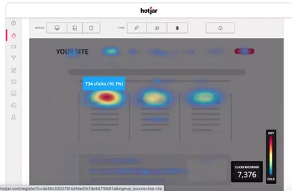
Hotjar, like Optimizely, provides a straightforward, visually focused interface that’s easy to use, but also offers fairly robust features from heatmaps and session recordings to form analysis and conversion funnel data.
Hotjar's heatmaps show you not just where users are clicking, but mouse movements in general and through recorded sessions, you can get a pretty clear picture of the end user experience, allowing you to identify what users are looking for and address those needs.
Looking for A/B testers? Hotjar can provide those too! As an added bonus, Hotjar also works well with Google Optimize so that may be one place where you can overlap in your testing and optimization tools.
4. Unbounce
Unbounce has gotten pretty famous in certain corners of the digital marketing world thanks to its relentless focus on landing pages. After all, your A/B testing efforts should focus on your most important landing pages, especially at the beginning.
Unbounce is a great option if you want some inspiration for creating your landing pages. Each account comes with plenty of page templates and easy integration for the most popular marketing suites out there. It’s quick, effective, and provides actionable intelligence.
5. Kissmetrics
Kissmetrics is one of the higher priced options out there, but it has a novel premise.
It enables its own testing and tracking based on distinct user sessions, allowing you to monitor individuals as they interact with your site. This gives you insights across the conversion funnel.
If you are in the market for a tool that will help you optimize your entire funnel, then Kissmetrics is worth a look. It has more reporting options than many of the alternatives, so it could be a breakout way to translate your results for clients or non-technical executives.
6. Crazy Egg
Crazy Egg prides itself on a visually focused approach that helps you understand exactly what you’re seeing at a glance.
It comes with six different reporting styles and is intended to be the easiest to learn and use. Aficionados say that it can even be fun.
Crazy Egg can be a comfortable way for non-specialists to grasp what’s going on without having to learn the ins and outs of data analytics. It’s also a cost-effective option that will fit most budgets. That said, it doesn’t have the depth or versatility of the more robust options out there.
7. Five Second Test
Five Second Test is one of the rare A/B testing tools that really dives in and focuses like a laser on the most important elements.
Not all aspects of your page are likely to produce noticeable results when split tested, so this tool zooms in on elements that change users’ first impressions.
With three tests to choose from and reporting that gets right down to the nitty gritty, Five Second Test gives you what matters. You’ll discover things like what users are most likely to remember from your page and which elements are easy to navigate.
8. Visual Website Optimizer (VWO)
VWO provides a visually focused interface that’s easy to use, but it also rolls in a number of other tests you may be doing anyway (and some you might not be using but should be).
VWO’s built-in heatmaps provide a clear picture of what’s happening on your page, as you’re able to track user attention and mouse movements. There’s also built-in testing for usability and conversion tracking, helping you keep things centralized.
With detailed metrics, VWO provides information through all stages of testing and even lets you import data. From multi-variate testing to funnel analysis, VWO’s got a lot to offer.
9. Omniconvert

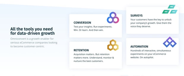
Omniconvert considers itself the Conversion Rate Optimizer for startups and developers. One reason it gives itself that moniker is the availability of both CSS and Javascript tools enabling complete control of coding for all tests.
In addition to those tools, it offers A/B testing, CDN bypassing (ensuring your visitors aren’t using a cached version of your site), and a variety of other features that allow you to personalize, segment, and survey. Factor in that it can be paired with their analytics, UX, and automation software and you’ve got a full suite of optimization tools at your disposal.
10. Convertize

On the affordable for the small guy side of things, there are options like Convertize. It’s easy to use with a drag-and-drop editor, an autopilot mode that shifts traffic to the highest performing pages, and nudges to push your conversion rates.
In addition to the CRO features, you get full analytics to drive the decisions you make about site optimization from your design to your copy.
A/B Testing Tips and Best Practices
With so many tools and so many options or variables, what’s the best way to test? While we might have designed the winning experiment at our middle school egg drop, that doesn’t mean we’re quite ready for the Mars Rover team yet.
The differences are stark, but that doesn’t mean we can’t look at some of the tips and strategies used by experts to help us get accurate and actionable results.
Be Picky About What You Test.
Be selective when testing features on your website. Target elements that make a real difference in generating and converting leads, like About Us pages and resource landing pages.
You’re looking for bottom line items that create opportunities and generate leads for your sales team, so test the elements that truly matter.
Test One Element at a Time.
Or at the very most two.
This can be a difficult rule to follow when you have two very different ideas and want to roll them out in their completed forms. But, be wary of throwing too many variables into the mix at once.
First off, it can muddle your analytics. If you have a lot of data rolling in at one time, it’s easier to get confused on what’s working and what isn’t and why.
Secondly, it’s harder to tell which element is actually making a difference in conversions when you have a lot of different features at play. What’s truly bringing in leads on the page? You’ll never know if you have six different options or CTAs live at once.
Pay Attention to Scale.
Sample size is the number of visitors who will see your different versions.
If you don’t perform your A/B test on enough people, you cannot collect reliable data and pull accurate results. To avoid that risk, identify your ideal sample size. Having an accurate sample size will help you analyze the success of your tests.
Never Make Changes Mid-Test.
This is a hard and fast rule. If you start tampering with things and making changes before it’s over, you’ll ruin the integrity of your results.
If you interrupt the test, none of the data you collect will be reliable. That’s a lot of time, talent, and resources wasted. Let the test run in its entirety, even if you think you know the results. Remember what we said early on about failure?
There is no losing, only learning. You can always test your new idea after you’ve finished the first, and now you’re going into that next test with more data.
Monitor Your Data Consistently.
Obviously you’re going into your A/B testing with a hypothesis in mind. Don’t let that cloud the way you run the test. Results can and do surprise us.
And while sometimes those surprises are welcome, being able to identify what elements lead to the result are a crucial piece of A/B testing. That means that starting a test, walking away, and hoping for the best isn’t a great strategy.
In fact, you’ll want to monitor your data closely and regularly. This doesn’t mean not leaving your screen and watching for each and every user movement, but performing regular checks and data collection will help you notice changes when they happen and help determine why.
A/B Testing Success Stories
A/B testing has helped companies accomplish amazing things and provide even better experiences for their customers.
The proof is in the pudding when it comes to split testing. Here are some great examples of A/B testing done right:
Netflix
The streaming giant leverages a thorough A/B testing program regularly in order to deliver on a truly personalized experience for its customers. Their teams literally split test everything.
It’s primarily used for personalizing homepages. Users have embraced having a Netflix homepage that’s tailored and customized to their viewing habits and interests.
Netflix tinkers with how many rows go on a homepage, which movies or shows go into the rows, which thumbnails are shown, and so on and so forth, all based on streaming history and preferences. They test the different elements on different users and pull results based on activity and engagement and then apply the successful results to the platform.
That’s why your homepage might look pretty different from your friend’s.
Ubisoft
A fairly well-known video game company, makers of Assassin’s Creed, Just Dance, and the Tom Clancy series, Ubisoft noticed it wasn’t getting the conversions on its page for its game For Honor in the same way other games converted. Using heatmaps and other optimization tools, Ubisoft was able to determine that its buy now page involved too much scrolling and too many steps for users to convert with a “buy now” option.
In response, they A/B tested using the existing design as a control and testing another design that limited the steps and limited the scrolling to if that change would create the results they were looking for. In fact, the new design did work. The testing enabled them to increase conversions by 12 percent, a metric they rely on to determine success.
Humana.com
Looking to increase clicks on a banner ad, Humana tested a variety of factors from design and images to the general copy and CTA button text. One version featured quite a bit more text and details about the offer and a narrower niche audience (copy about prescription plans vs. healthcare in general).
In response, the cleaner version with less text, a different image, and a more direct CTA resulted in 433 percent more clicks on the ad.
Booking.com
If you want to talk about a company that truly believes in the power of A/B testing, we have to mention Booking.com. The travel company has hundreds of tests running on their website at any given time, especially when it comes to their copy.
Booking.com employees are encouraged to run tests on ideas that help the business grow and bring more value to customers.
When they partnered with Outbrain in 2017, they rolled out three different versions of landing pages to figure out why customers were falling off during sign up. With variations in copy, social proof, and awards, they were able to see a 25 percent increase in user registration.
While not every website will see wildly successful numbers in A/B testing, numbers do add up over time, and sometimes a small tweak can change the game.
In fact, A/B testing is one of the best ways to optimize your website and get the most out of your design effort. It can save you a lot of the time in what would normally be a trial and error process. Data driven decisions should be leading your strategy and tactics, so investing time in collecting the data is part of the game.
If you’re ready to get started, look for a place where your site or application is underperforming, use the tools and tactics we’ve discussed here, and start testing your way to success.


Jennifer Brown
Originally from the Northeast with stints in a wide variety of places, I moved to Florida just over 2 years ago, and recently joined the Bluleadz team. I’ve been passionate about storytelling since before I could hold a pen or pencil and earned my MFA in Fiction from BGSU. When I’m not writing or reading, I’m likely outside with my dogs, playing tennis, running, or enjoying the amazing Tampa Bay Area.