Designing an effective website requires many elements — coming up with the layout, taking into account the user experience (UX), knowing how to implement certain functionalities, writing content, and incorporating search engine optimization (SEO) best practices, to name a few. And it all starts with a brainstorming session, where all creatives involved get together with a client to determine what they need and what they want to include on the site.
Once all of these requirements are listed, you can move forward in one of two ways: Tell your creatives to get to work doing their part of the project (e.g. write content, design mockups, etc…) and hope to God that you are all on the same page, OR you could create wireframes to ensure that everyone gets to work by following the exact same vision of what the website will look like. The latter can be accomplished by creating wireframes.
What Are Wireframes?
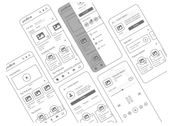
Wireframes are a visual guide of the main web pages to be designed. Its purpose is to serve as a blueprint for everyone working on the project. That way, everyone involved will know exactly where each component will go — Hero banner, navigation bar, headings, subheadings, content, images, video, calls to action buttons, graphs, etc…
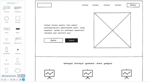
They are pretty simple from a design standpoint. You don’t need to add color or actual images or specific text yet. Instead, you include placeholders for where everywhere will be once the site is finished. This includes squares or rectangles to represent images, lorem ipsum text for content, and H1, H2, and H3 font sizes for headings and subheadings.
Source: Balsamiq
Types of Wireframes
There’s a wide array of ways to create wireframes. You can sketch on a notebook with a pencil if you’d like. After all, this is not something you’re submitting to an art contest. However, if you’re using software to create them, different software programs allow for different types of wireframes:
Low-Fidelity Wireframes
Low-fidelity wireframes display simple images. Intro paragraph goes here. Product description goes there. This square with an X drawn across it is supposed to eventually be a picture of your office with smiling workers who are thrilled to work at your company. You can explain that imagery to your client, but everything on the page is very basic.
High-Fidelity Wireframes
High-fidelity wireframes reflect a more realistic look and feel of what the site will look like. They include actual website content and functionalities — such as clickable CTA buttons that direct the reader to the page the CTA is intended to take them. They can also include logos, typography, image dimensions, etc.
6 Benefits of Creating Website Wireframes
Once you start incorporating this practice into your website design process, you immediately start realizing its many benefits:
1. They Provide a Website Blueprint
You can get 10 people together in the same room to discuss how to design a website. They can all agree on the pages the site will need, the information to include in each of them, and the functionalities that will make the website stand out from the competition. But this doesn’t mean they will all have the exact same images in their heads of what this will look like.
So if content writes homepage text that’s significantly longer than what the web developers envisioned, either the project will be sent back to content to shorten it, or design will need additional time to rework the layout. By having wireframes, this process becomes more efficient.
2. They Let You Better Evaluate User Experience (UX)
Some things sound great in theory, but don’t work as well in practice. Let’s say that your UX designer wants to include X number of items on the navigation bar, along with dropdown menus for child pages. But when everything’s done, you realize that this just makes it confusing.
By putting all elements down on paper, you can see these issues before the design process starts. This way, you can address them at a stage where it’s much easier to do so.
3. They Ensure Everyone’s On the Same Page
Since everyone on the design team knows exactly what each web page will look like before it’s created, they can all go to work with a better sense of direction. And if anyone has any questions or doubts as to how it all would pan out, they can bring it up during that initial brainstorming session.
This process lets everyone hear about concerns and propose ideas together, and thoroughly understand the thought process behind every decision.
4. They Streamline the Design Process
When wireframes are created, there’s no longer any time wasted going back and forth making changes. While this step is still part of any project, having blueprints everyone agreed on before starting the project means that each team member will be able to work more efficiently.
This also means that you’ll take less time working on each website, increasing the likelihood that you finish before the deadline and make your clients happy.
5. They Make It Easier to Develop Website Content
Content writing is a subjective process. Some best practices include following a style guide, brand voice, and writing with specific buyer personas in mind. However, it could still significantly vary in length and format.
Developing wireframes gives writers an idea of how length limits or preferred formatting. You don’t need to specify a word count, but wireframes that show two or three short lorem ipsum paragraphs lets them know to leave the Tolstoy novel for another occasion.
6. You Can Show Your Client Before the Site is Built
One of the most disappointing experiences of designing a website is when you’re all excited about what you’ve created, only to have your client grimace and say that’s not exactly what they had in mind. This doesn’t mean that what you created wasn’t good, but that you both imagined vastly different outcomes.
Creating wireframes lets clients have a pretty clear idea of what a bare bones version of their site will look like before it’s created.
Wireframing Best Practices
Now, while there are different ways of creating wireframes, it’s good practice to follow certain steps to ensure the best outcomes:
Brainstorm With Your Team
As previously mentioned, the first step is to get together with everyone who will work on the web design. This way, you can all throw ideas and let everyone else know the reasoning behind them. Everyone also gets to take into account factors that affect their specific role in the project that may not be on someone else’s radar.
Draw the Ideas First
While you could technically start drawing wireframes on a notebook as you brainstorm (or by using wireframing software), it may be easier to use a dry erase board or even pen and paper to get the first iterations completed. Once done, you can take pictures of them and email them to the team member who will create the wireframes. It’s also good practice to include them in task descriptions on your project management cards, for easier reference.
Source: WhatPixel
Minimize Colors
There’s no need to go into detail about colors and specific images when you’re wireframing. The blueprints are exactly that — bare bones depictions of what the site will look like. You can include notes giving direction (e.g. brand colors here, white space there), but focus on the main design elements.
Make Notes About Functionalities
Make notes about how certain areas of the web page will work. For example, if something’s going to be a dropdown menu, an image carousel, a visitor’s quiz or some sort of tool. General details that will give the web designer clear guidance of what goes where.
Create Desktop and Mobile Wireframes
Every single website should have a responsive design. And since sites don’t load the same way on a desktop computer as they do on a smartphone, create wireframes showcasing how both displays will look. Maybe the navigation bar becomes a burger menu, or cards that were side by side on bigger screens will appear stacked on mobile devices. You may bypass this step if you’re working with a website template that’s already responsive.
What Not To Do When Wireframing
Ok. So now that you know what to do, here’s a list of what to skip.
Don’t Wireframe Every Single Page
The whole point of wireframing is to save time. So if you’re designing a website with 42 different products, just wireframe one product/service page. Then focus on the big ticket item ones, such as the homepage, About page, pricing, Blog, and Contact Us pages.
Don’t Spend Too Much Time Trying to Make Them Perfect
Wireframes don’t have to look impressive. They just need to showcase what the skeleton of the web pages will look like. Expend the effort to beautify them when you’re actually designing the website.
Don’t Include Every Minute Detail
While you should include helpful notes of what every element means, don’t get lost in the details. Be straightforward and move on to designing the next page. Your art director or web designer can expand on everything later on.
Tools to Create Wireframes
Drawing in a notebook is a simple and straightforward process. And by all means, if that works for you, go for it. But for those who prefer easily shareable mediums, there are plenty of software programs you can use. Some of the most popular ones include:
Balsamiq
Balsamiq is so user-friendly, there’s barely a learning curve. It only allows the creation of low-fidelity wireframes, but that’s enough to get the job done. They also offer several tiered plans, and allow collaboration by giving you the ability to invite team members to watch you create them in real time.
Adobe XD
Adobe XD lets you design high-fidelity wireframes, and enables you to give clients access to the wireframes. They can then leave notes giving their feedback for each element of the wireframe, without actually making any modifications on them. It also comes with tutorials to improve UX and UI design.
 Source: xd.adobe.com
Sketch
Sketch is available only for Mac users. (I mean, it is what it is). It lets you collaborate with your entire team in real time to create high-fidelity wireframes. And while it doesn’t have a template library, it’s compatible with many plug-ins.
MockFlow
MockFlow is a digital drawing tool that feels like sketching on a dry erase board. They also include a vast template library, and lets you export the wireframes into other platforms, such as PowerPoint and Adobe PDF. They offer a free version, but the paid tiers include a lot more useful tools.

Source: MockFlow
Framer
Framer is a good tool for startups and businesses with a tighter budget, since it offers a free option with a wide range of tools. You can also build basic wireframes that you can keep in your library and reuse as layouts for future projects.
Time is gold; and when it’s lost, you will never get it back. Implementing wireframing into your web design process will help you use it more efficiently. Work smarter. Avoid frustrations. Complete your projects faster. It’s a win-win solution, no matter how you look at it.


Alejandra Zilak
Alejandra Zilak is a content writer, ghostwriter, blogger, and editor. She has a bachelor's degree in journalism and a Juris Doctor. She's licensed to practice law in four jurisdictions and worked as an attorney for almost a decade before switching careers to write full time. She loves being part of the Bluleadz team and implementing SEO best practices with her content. When not working, she loves to read, write fiction, and long distance running.